
When your service icon is a hamburger menu already
When your service icon is a hamburger menu already
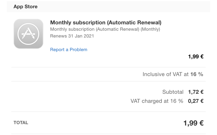
Thanks Apple for saying “Monthly” three times, “subscription” two times and “renewal” three times. Maybe consider next time saying what it is for?
# Top worst UIs this year
First place: Big Sur
By a mile. So many bad decisions, so many regressions in things that were already good, things Apple was knonw for. This year Apple made me seriously consider Linux. Congratulations!
Second place: Zoom
Not created this year, but finally brought into spotlight, Zoom is a living proof that horrible UI is not an obstacle to popularity.
Third place: Yandex GO
One of the biggest russian IT companies decided to move all its services into a single superapp: taxi, meal delivery, food delivery, parcel delivery, car sharing, public transport map, self-advertisement, and of course stories. Seems like not a single person was happy about that.
# Branding fail of the year: Google icons redesign
Apps need icons so you can tell them apart. Google seems to not know that. Post: grumpy.website/post/0TEo2tudd
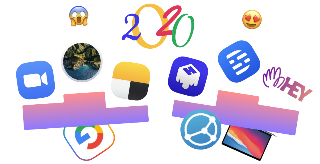
# Great new products of the year
First place: Descript.com
For opening my eyes to how much computer can do for you, and how convenient it can be. And for making me feel computers can be magic again. Make sure to watch their intro, it’s fantastically directed youtube.com/watch?v=Bl9wqNe5J8U
Second place: 👋 Hey.com
As with anything new, Hey! is a mix of good and bad UI. But it has lots of great insights too, which is always great to see. Watching Jason Fried presenting Hey was almost like watching original iPhone reveal (video here: youtube.com/watch?v=UCeYTysLyGI). Thanks for making us question status quo!
Third place: mmhmm.app
For making video calls and presentations fun again! Bonus points for the name. I only wish they hire UI designer soon to fix their UI.
Honorable mention: Syncthing.net
For making me believe computers and clouds can be sane, predictable, and easy to use. Read more tonsky.me/blog/syncthing
Honorable mention: Apple M1.
New MacBooks can finally change resolutions and reconnect external displays without a blink. Something that’s been broken for 20+ years is finally working as expected. Preview: twitter.com/DanielEran/status/1329752281957474304
# UI Videos of the Year
Your Product Sucks — Apple Music youtube.com/watch?v=gE8ZikfrpFU
Zoom review (in Russian) youtube.com/watch?v=nCX6q0Fx5F8
# UI Blogs of the Year
annoying.technology — Thanks for keeping us annoyed for another year!
theolognion.com — Smart, funny, on point, making me laugh so hard every time!
Happy New Year to everyone!
Ernest Hemingway once made a bet that he can draw an entire UI with dots and circles only. It made people cry
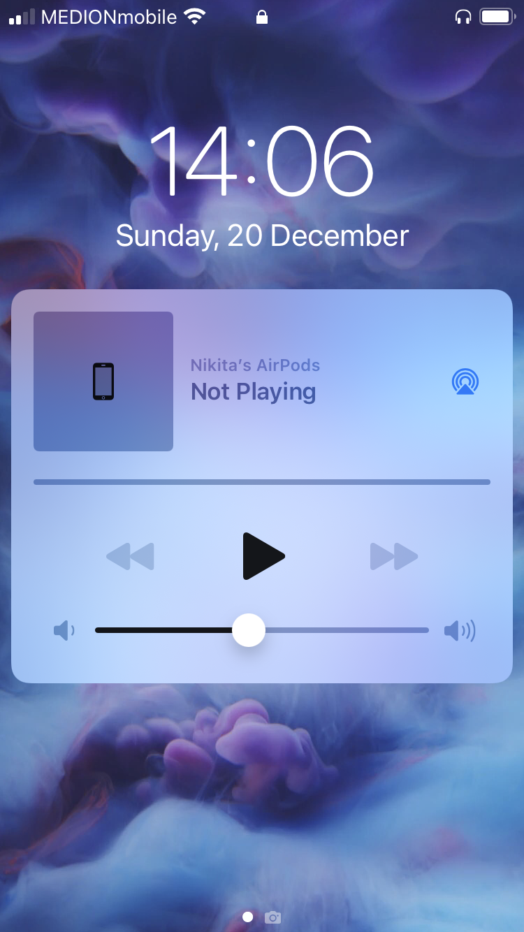
At this point I am pretty sure iOS is just fucking with me. It KNOWS I was listening for something. It just decided not to show what, neither let me continue. But cover half of my screen with this useless widget nevertheless.
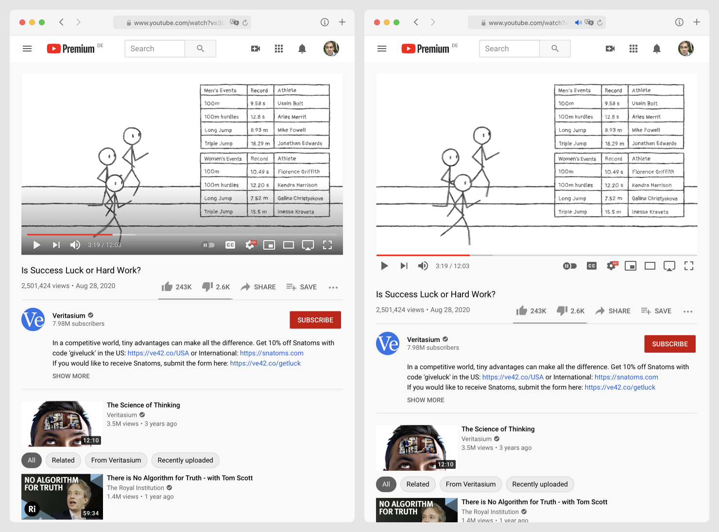
Hot take: UI displayed over content (left) is bad. Remember: user came for the content, not for the UI. Don’t hide it. Don’t cover it with gradient.
Another hot take: controls that appear on hover are TERRIBLE. Nothing worse than shaking your mouse for a few seconds waiting for buttons to appear, only to START moving in the desired direction.
Always-visible controls (right) solve both problems easily.
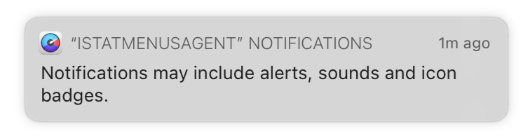
Thanks Apple for reminding me what notifications might include. Thanks also for showing me a notification about it.
I wonder how soon people will realize that notification are bad, bad, bad. That they destroy working flow. That there’s never a good time to show a notification. That it’s ok to let user discover events at their own pace. That most of the notifications we see today are really stupid and meaningless and not worth the attention they require.

All of your icons are white on black? Add gray on gray to stand out!
(Not. This is not an advice. DO NOT do this)

Remember when iPhone was introduced and it came without file system? And Apple was like: you won’t need files, you have apps now, apps will cover all your needs. Files are a geek concept, normal people don’t need them.
13 years later, I am trying to make by desktop Books.app sync with my mobile Books.app. Both made by Apple. No luck. No idea what’s wrong. It just won’t go. An HOUR spent trying this and that.
Then I just download an app from the Store that accepts files, drop the book via AirDrop, and voilà! All took five seconds.
I had the same experience with music, photos, comic books, tv shows. People are having problems with screenshots sharing from XBox/PS. It all went to shit because every app has its own magical way of getting content and its own cloud and there are myriad of edge cases and million limitations and no freedom to do your own thing.
It makes me really sad, remembering, how SIMPLE files were. Reliable, too. Download, transfer, open. All steps easy to understand and predictable. Ancient technology from a more advanced civilization.
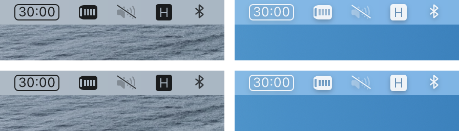
macOS built-in VPN icon (second from the left, looks like a battery). Can you tell which one is on and which one is off?