
The definition of “needy software”.
Thanks @grishka for the picture
The definition of “needy software”.
Thanks @grishka for the picture
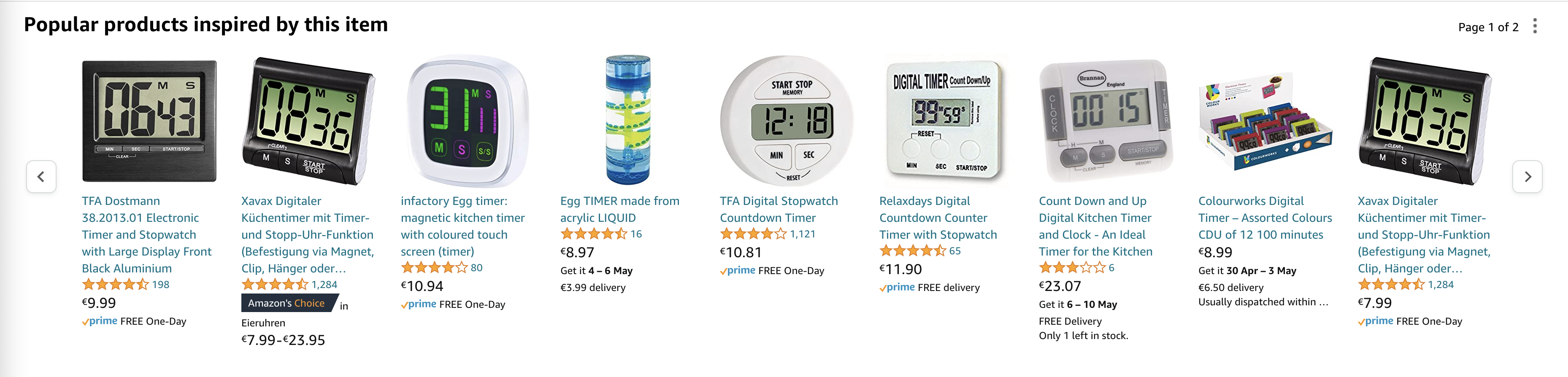
I don’t understand why most kitchen timers have only +1 hour, +1 minute and +1 second buttons.
First, 1 second is too fine a detail. 10 sec? 30 sec? Maybe. But one? Don’t make me laugh. Who needs that?
Second, 1 minute is great but often not enough. What about 10 minutes? 20? 30? All these time intervals are pretty common in cooking, but clicking a +1 min button 30 times is absurd.
Third, +1 hour is almost always useless. I am prepared to click +10 minutes 6 times once a year I actually need this long.
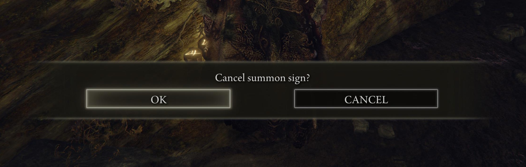
Press Ok to cancel, Cancel to cancel cancel.
I don’t understand why people are so afraid of putting words on buttons instead of context-dependent Ok/Cancel.
Cancel summon sign?
[ Cancel ] [ Don’t cancel ]
Why is it such a radical idea?
A control that shows another window and does not reflect the actual state of the feature? It should’ve been a button, not a checkbox
How do you like our header?
Thanks @Strannii for the video
Help! I can’t reach controls because of your help button!
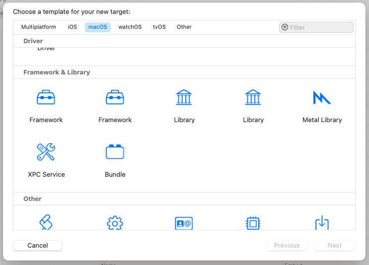
Framework, Framework, Library or Library?
Thanks @marmphco for the picture
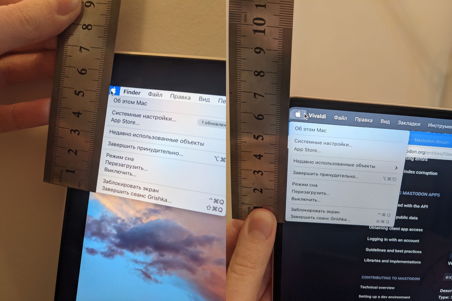
System dropdown menu on macOS 10.15 (left) takes less vertical space compared to macOS 12 (right), despite right Macbook having higher pixel density (254 vs 225 dpi)
Thanks @grishka for the pictures
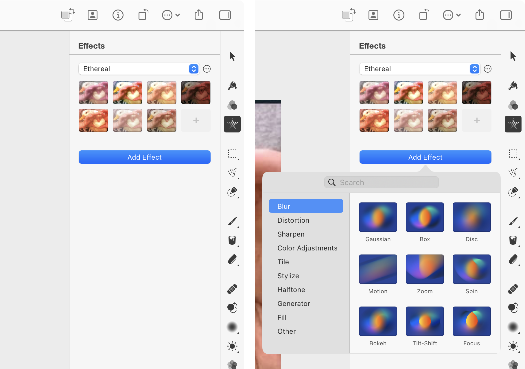
This UI always gets me. “Add Effect” feels like a button that adds effects listed above it.
When in fact a button (!) is a drop-down (!!) with a second set of effects (???)
WHY?
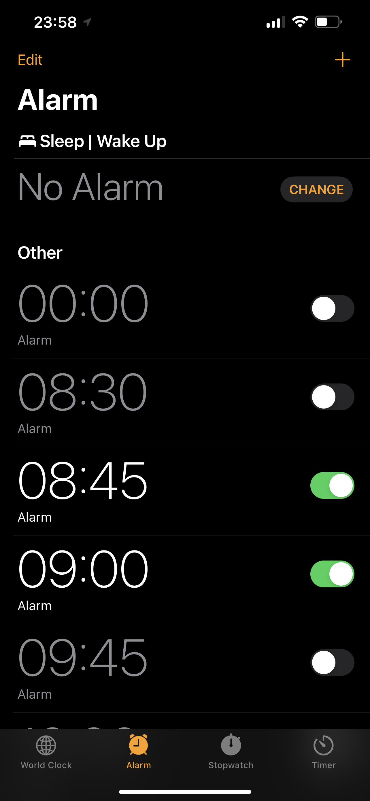
What do you mean “No Alarm” when there are clearly two alarms right there (and one more down below)?