
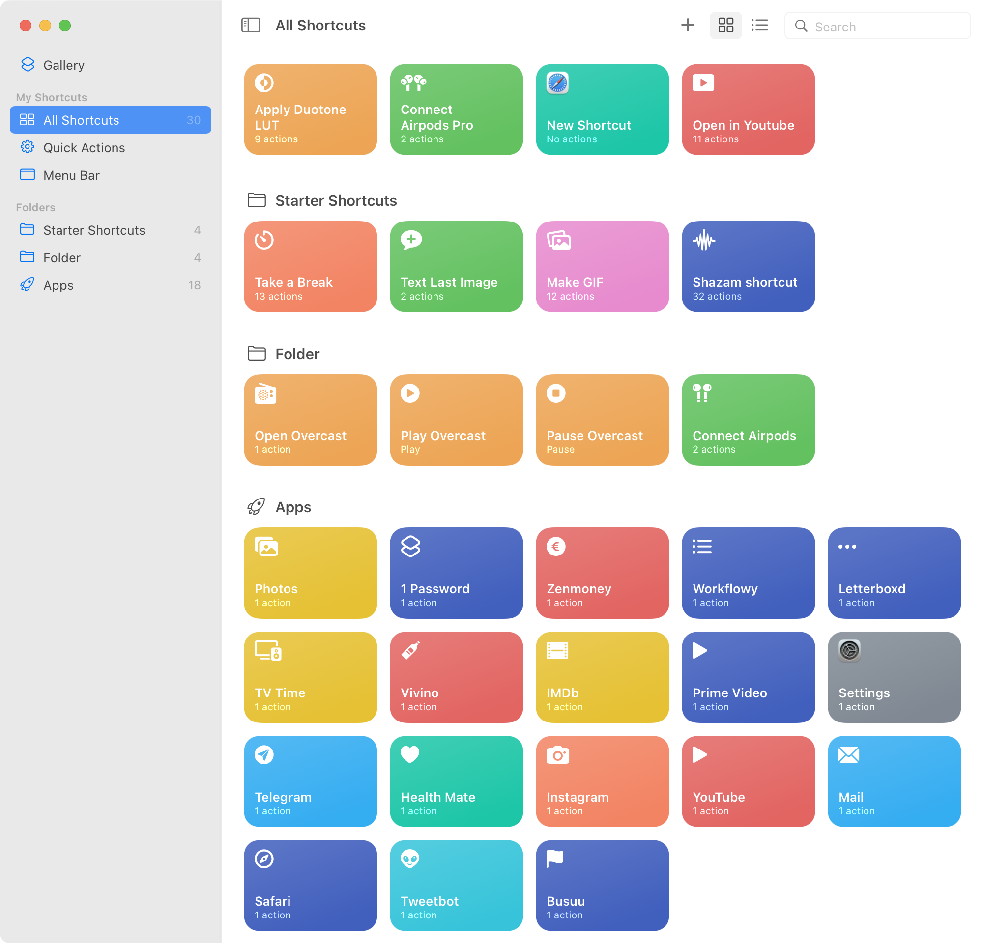
For unknown reason, desktop macOS has imported all my mobile shortcuts. None of them work, of course. Why, Apple, why?
For unknown reason, desktop macOS has imported all my mobile shortcuts. None of them work, of course. Why, Apple, why?
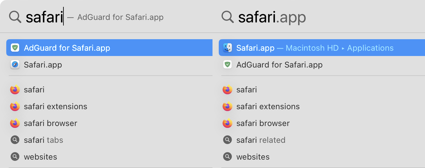
First attempt: full match is ignored, I got extension instead. Why would I want an extension as a separate app? That’s another question.
Second attempt: results are different (!). Safari icon is now a Finder icon (!!).
How does anything in computers still works? I have no clue
If header does not change its height, why resize labels at all?

Red checkmark feels... weird

Apparently new iMacs are upside-down in their box, relative to the box art.
Just... Why?
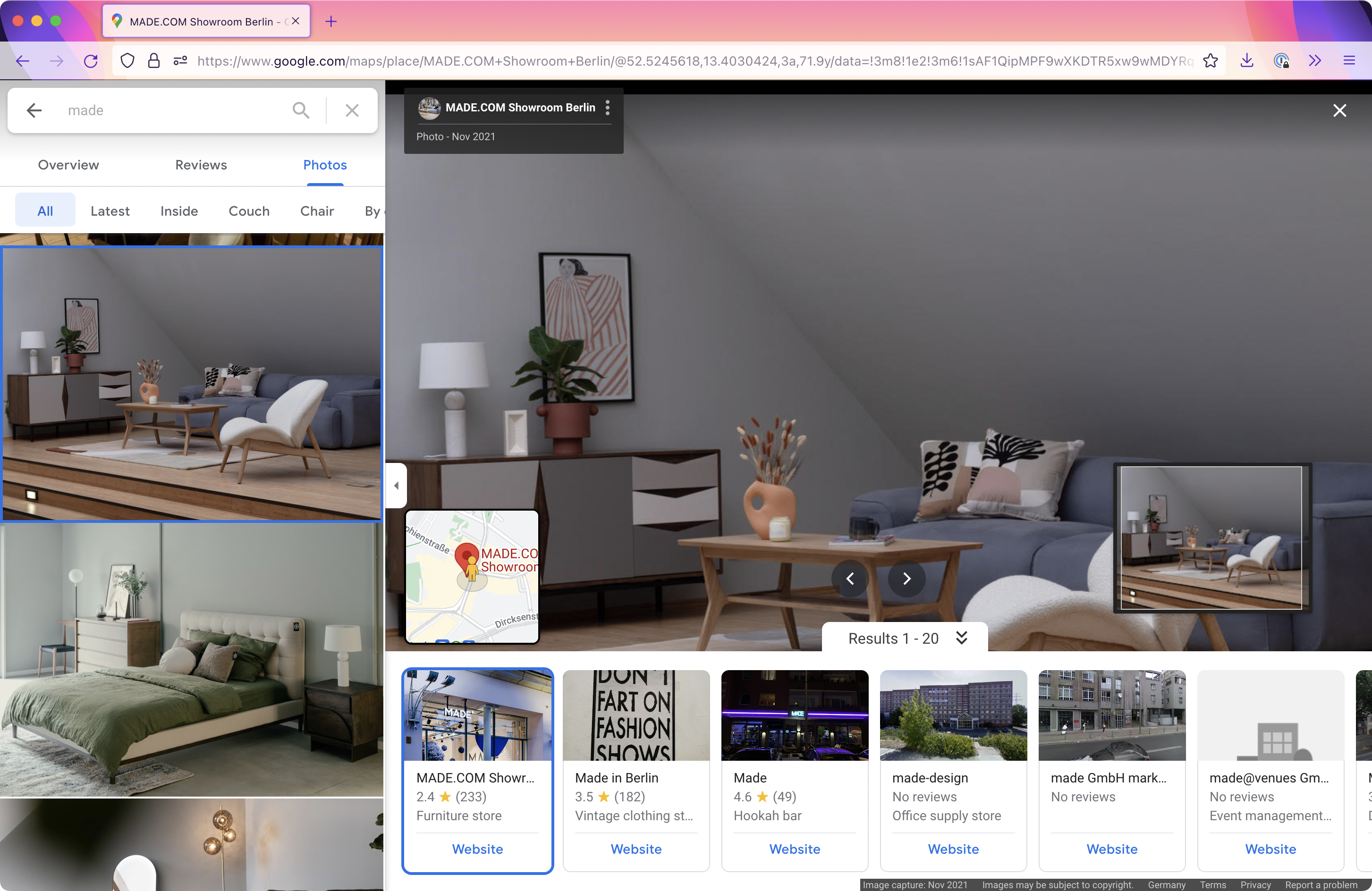
Stills from @mkbhd channel
Weird interface where you see more on the preview than in the main operating area
Good practice is to make hover zone bigger than small visible boundary.
Ok practice is to make hover zone equal to visible boundary.
And then there’s Safari. Hover zone is SMALLER than button boundaries!
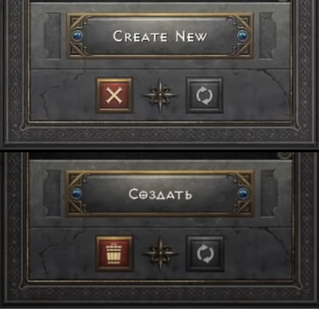
Top: Delete character button uses X icon. Bad, because X means close. Being red also doesn’t help here, because Close window in Windows is also red.
Bottom: Delete button replaced with trash icon after a storm of complaints.
Bonus: a video of a user deleting his character by mistake (in Russian) youtube.com/watch?v=YUXXwQXzBbk

Bing Wallpaper is a tiny tool that updates my wallpaper every day. And now it suggests that I change settings of my non-default browser.
What is going on here?
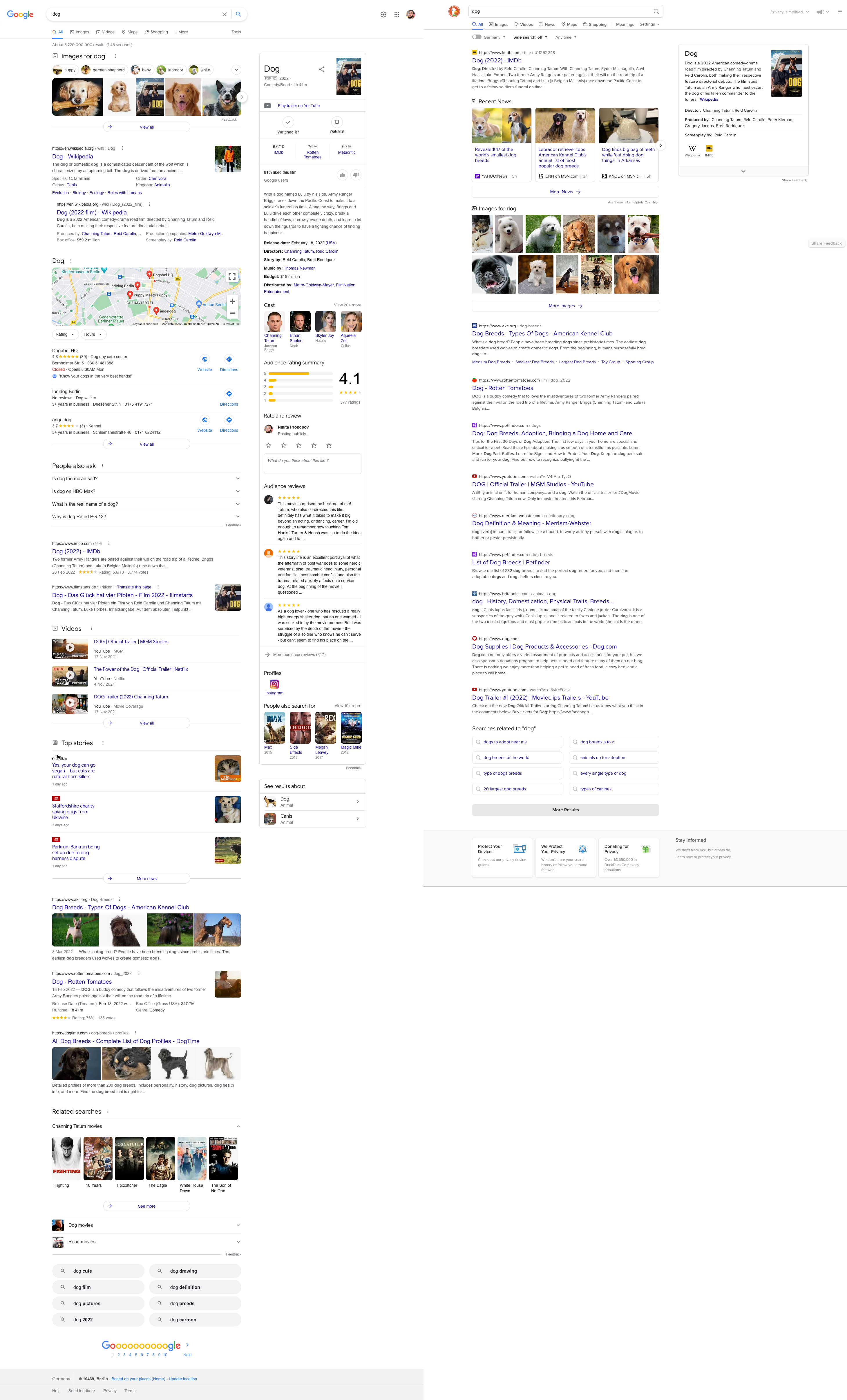
Left: Google search page for the query “Dog”
Here’s what’s in it, top to bottom:
- 5 search suggestions
- 5 images
- 1 search result
- 1 search subresult (?)
- A map
- 3 organizations
- 4 more search suggestions
- Oh wow, two more results! We’re on the third screen by now.
- Three videos
- 1 search result with 4 inline images
- 3 Top stories with 3 images
- 2 more results. This is fifth (!!!) screen by now, and we’ve only seen 6 results.
- 6 images
- 2 horizontal related searches
- 8 related searches organized in two columns
That’s 6 search results for 6 screens, interrupted by an impossible amount of distractions, all of which have different design and layout for some reason. Many of “result types” repeat multiple times (e.g. related searches and images”, leading to even more confusion
Right: DuckDuckGo for the same “dog” query.
- Three screens. 10 results. That’s 4 times the information density.
- Distractions (e.g. images) grouped into a small compact block, grouped into 1 place, presenting twice the amount of images.
- All consistently designed.