
Click targets should be as big as possible. Just text itself it too small.
Also, if you draw a checkmark, least you can do is allowing clicking where it goes
Click targets should be as big as possible. Just text itself it too small.
Also, if you draw a checkmark, least you can do is allowing clicking where it goes
Does this text field feels like “reply to this comment”? Well, it’s not. It starts an entirely new branch. Very confusing
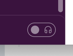
As a rule of thumb, toggles should not start any action. Especially calling someone. Use buttons for that
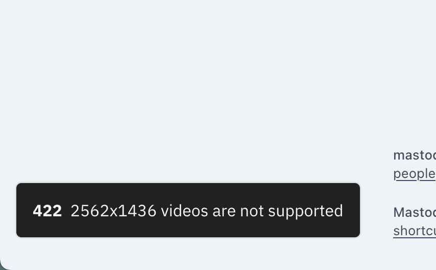
When reporting error, don’t just tell what’s wrong. Tell why. What’s wrong with 2562×1436 specifically? Is it too wide? Too tall? Too big overall? I’m happy to re-encode, but I’d prefer to know what I need to change
Checkbox labels should be clickable. Come on, Apple, you are better than this!
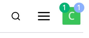
When one badge is not enough
Thanks @chuhlomin for the picture
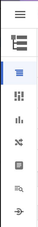
Today’s guessing game: guess the meaning of these icons
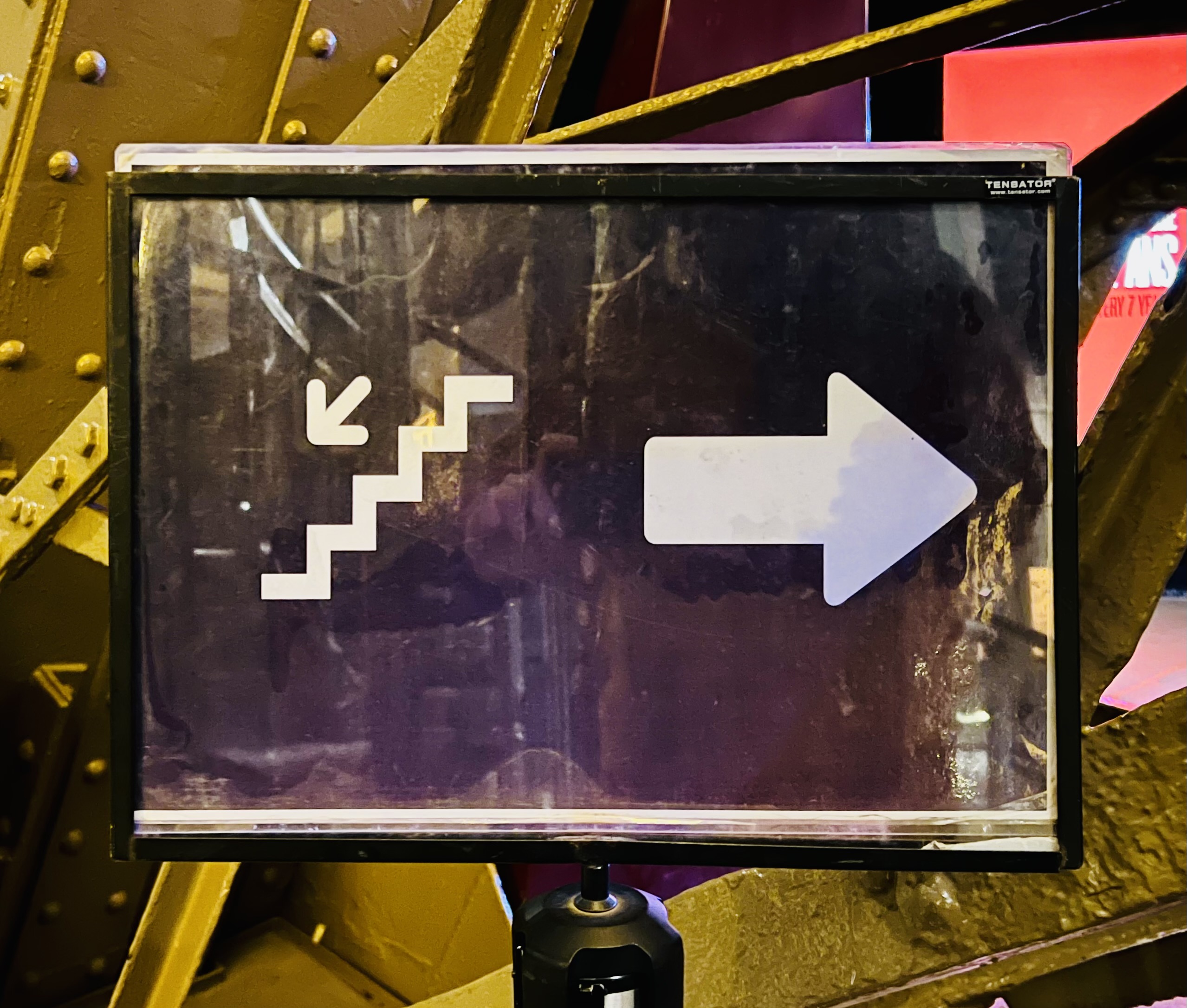
If possible, don’t use arrows in your icons. People might confuse “abstract” arrows with actual directions
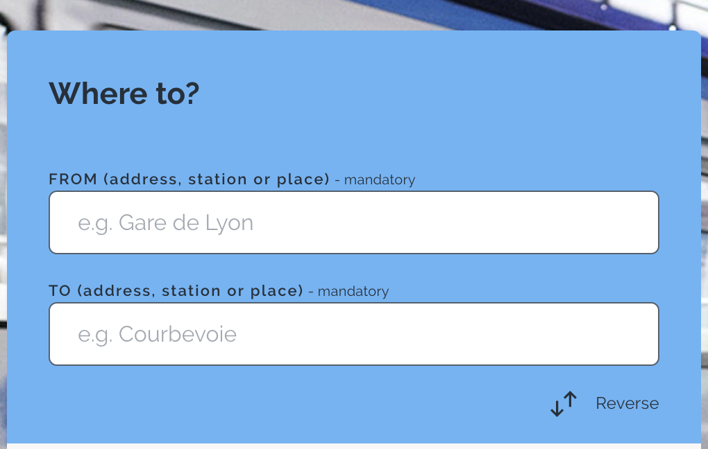
It’s a bit confusing when huge label says “Where to?” but tiny label says “Where from?”