
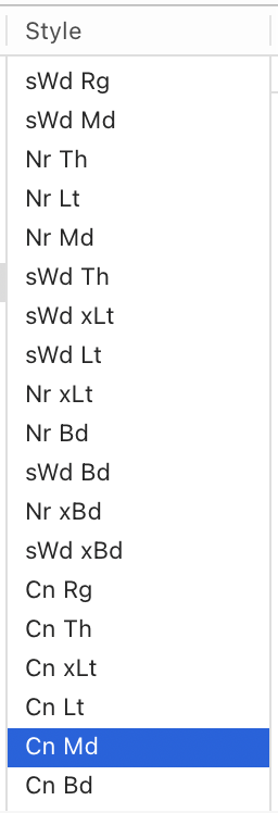
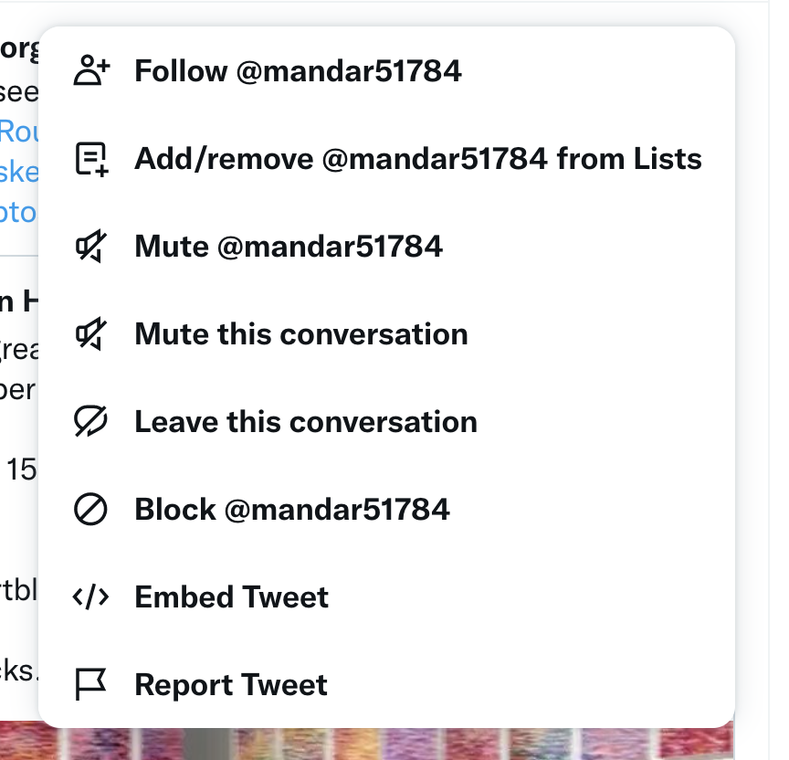
Developers! Sort your lists. Thank you
Developers! Sort your lists. Thank you
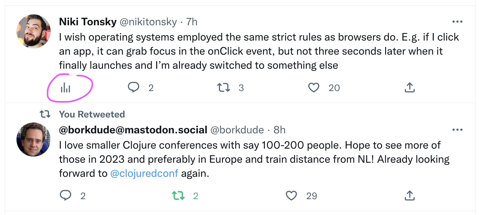
Same controls in the same place, please. For 10+ years I’ve been clicking on the leftmost icon to get to replies, to the second left for retweet etc.
Now, because new “analytics” icon is now added first, but only to some tweets (your own), it breaks the pattern. What’s worse, it creates inconsistency across the same interface, on the same page
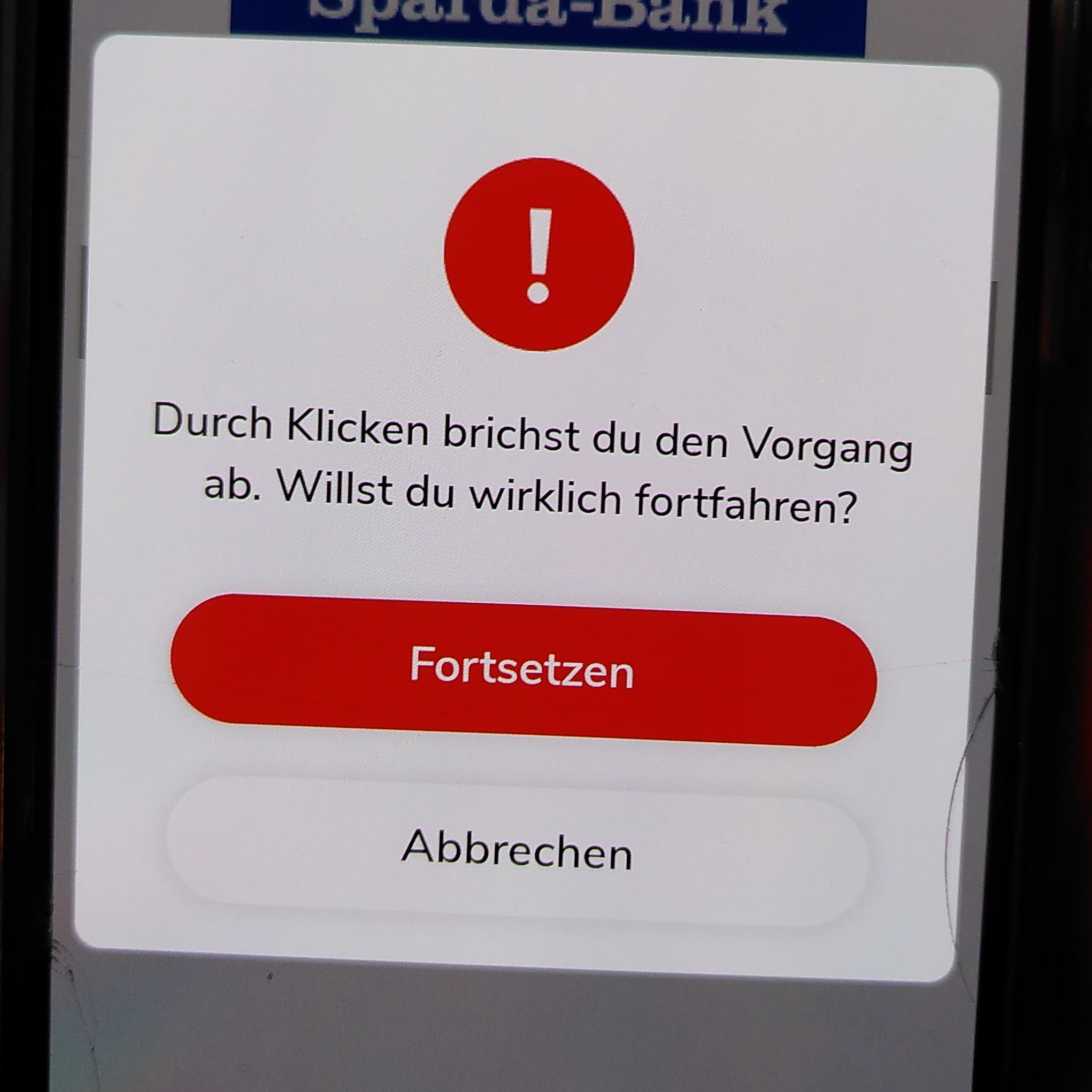
By clicking you will abort the process. Do you want to continue?
[Continue]
[Abort]
Well, guess what? Clicking on [Continue] aborts the process while clicking on [Abort] makes you continue within the process. Classic :)
Thanks @FKohlgrueber for the picture
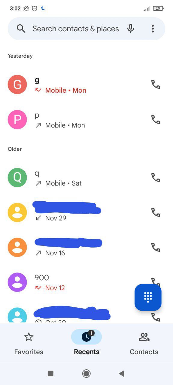
A call log that doesn’t show call time? You had one job!
Thanks @slavamfsu for the picture
See the button? Do you think you can press it? Think again!
Thanks @CyrilChristin for the video
Helpful tool tips. Show up instantaneously, too
Bold font is for highlighting. If you have _many_ of something, like body text or a list, don’t make it bold. For highlighting to work, some things must not be highlighted
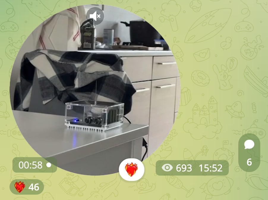
Numbers... Numbers everywhere...
Thanks @antoon334 for the picture
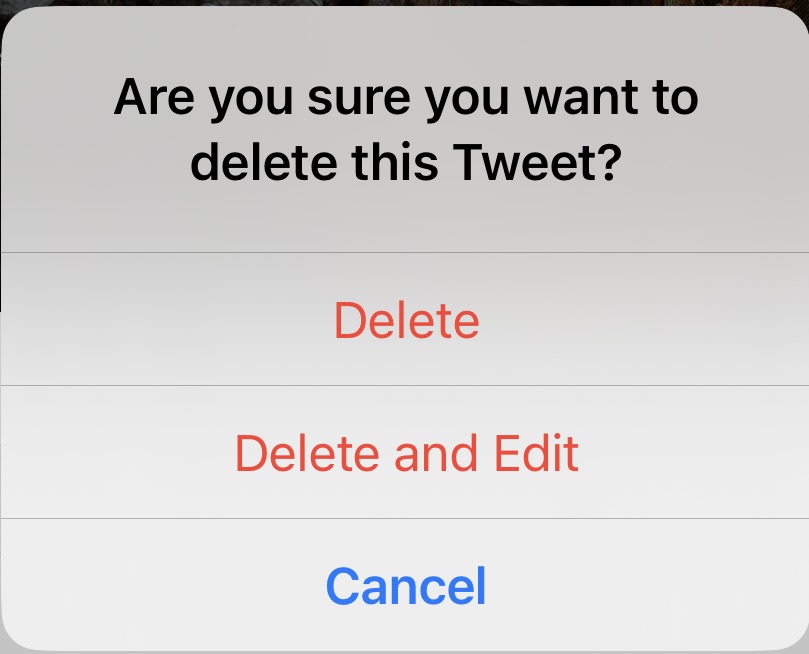
On Twitter, you can edit deleted things
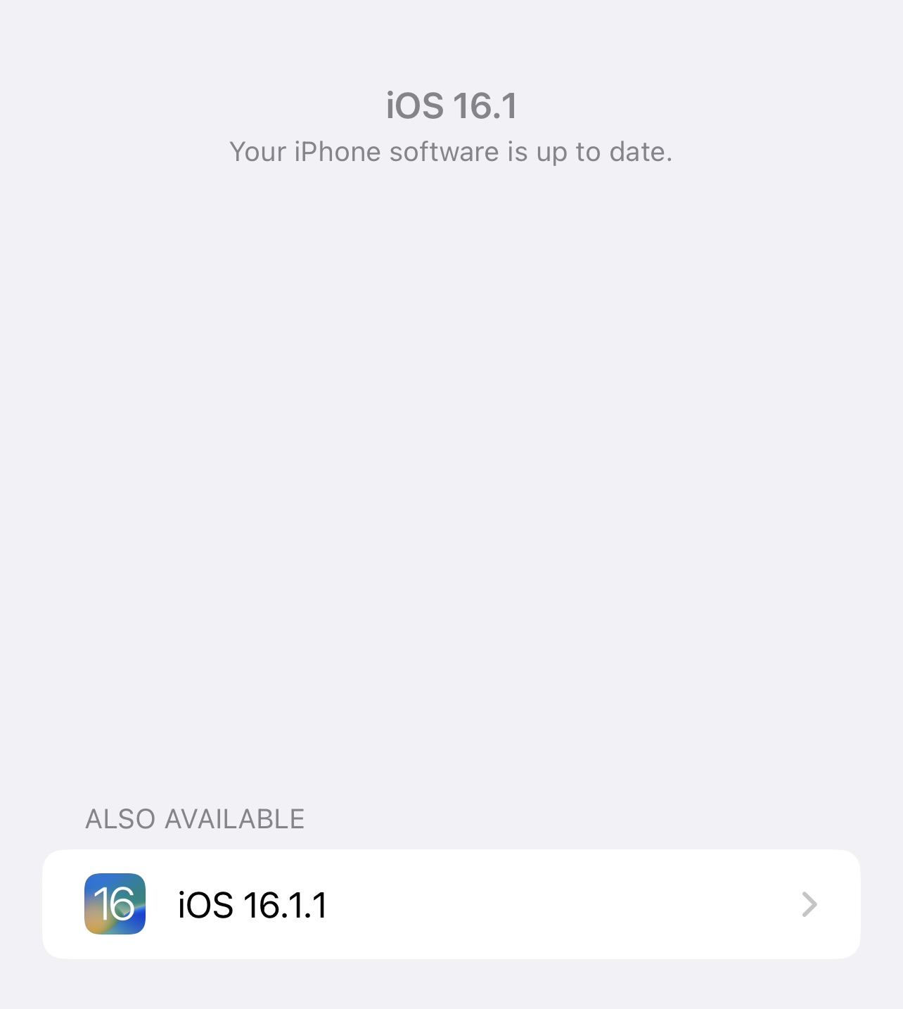
There’s no update.
Also, there’s an update