

Controls should come _before_ apply button. That is, on top or on the left. Not on the right!
Controls should come _before_ apply button. That is, on top or on the left. Not on the right!
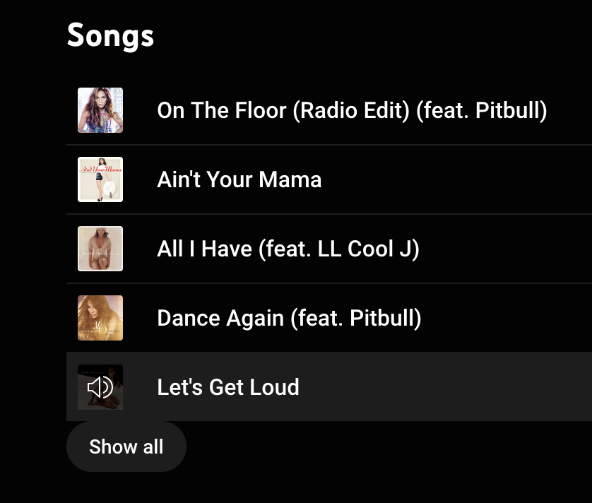
Everything is a slider if you’re brave enough
Thanks @toby3d for the video
Touching shapes in UI, not good
Hey Apple! Some of us still move mouse cursor up and down from time to time, you know? Not everything is touch yet. On-hover menus are very bad idea
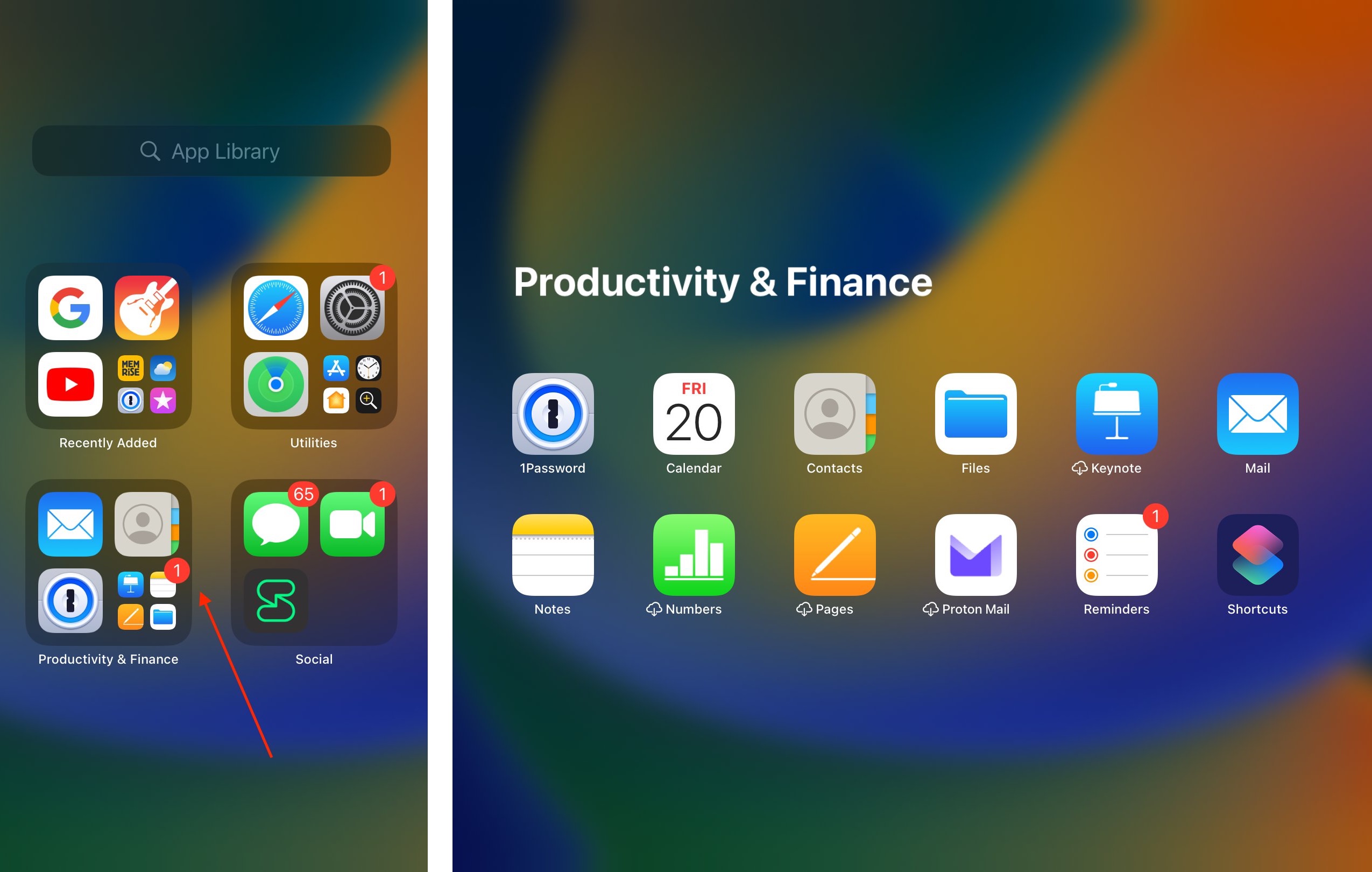
Badge that is actually on Reminders looks like it’s on Notes instead because of the grouping
Thanks @fuckadey for the picture
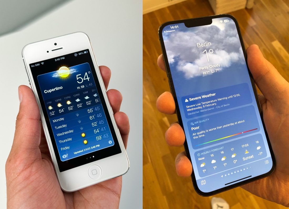
Screen: twice as big. Information: 1/4 of original. Is this progress?
Pro tip: things inside circle look best when centered
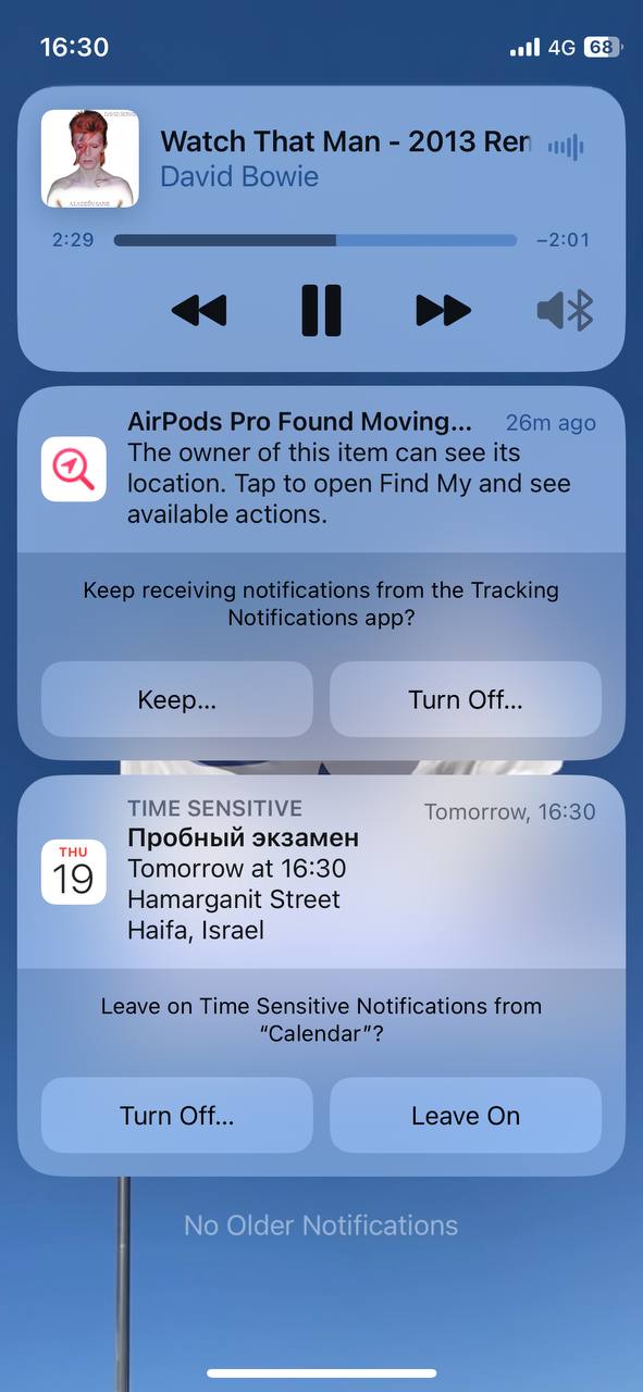
It’s better if the same function (Turn Off...) is always on the same side
Thanks @gershik for the picture
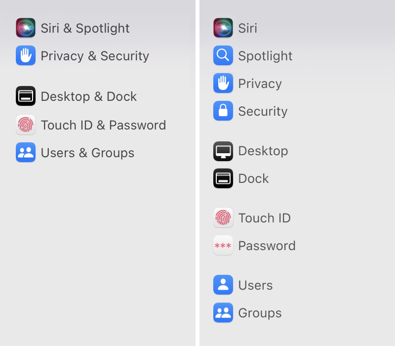
I wonder why Apple feels the urge to group many settings into exactly two things. Especially now, when the whole list is scrollable and space isn’t the problem. Understanding & finding single word is much easier than group of two
Ultimately, it all comes down do a simple question: are you writing for your readers, or are your readers here to fulfill your marketing needs? What comes first?