
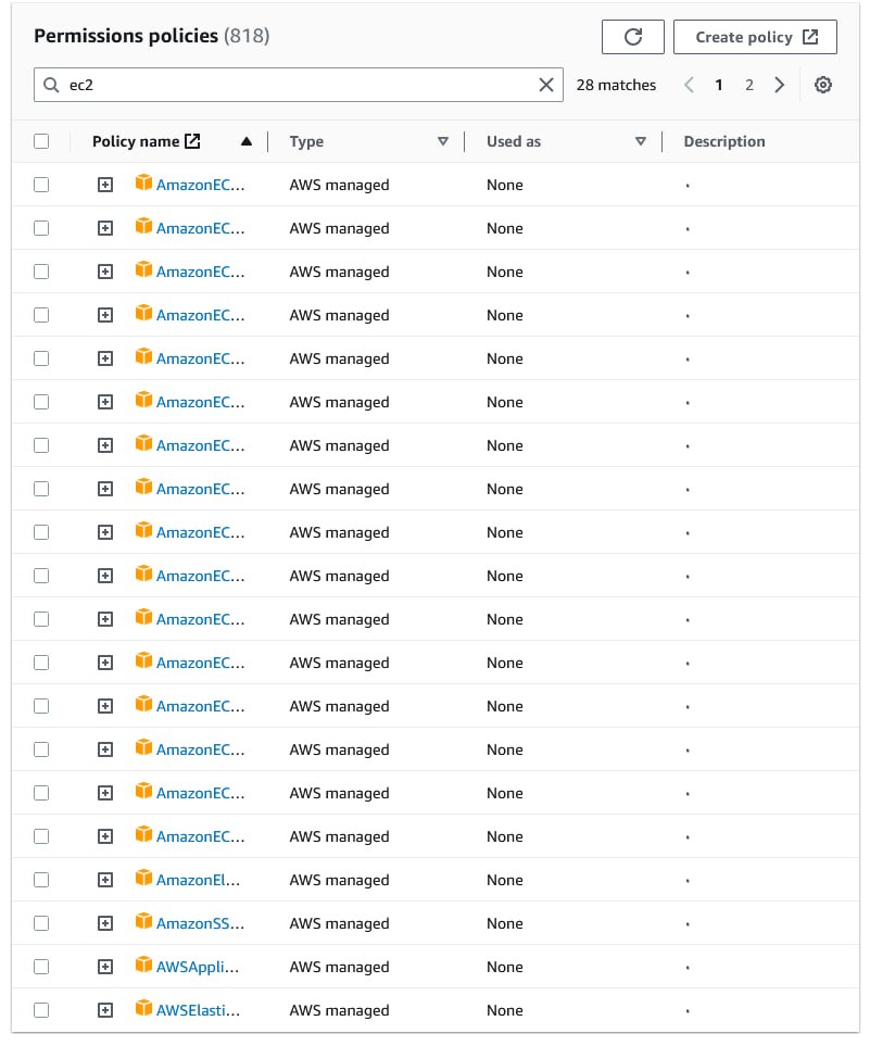
Three problems with table at the top:
1. Data is too far away from its labels
2. Data is right-aligned
3. Too much visual noise created by delimiters
All solved trivially in the bottom one.
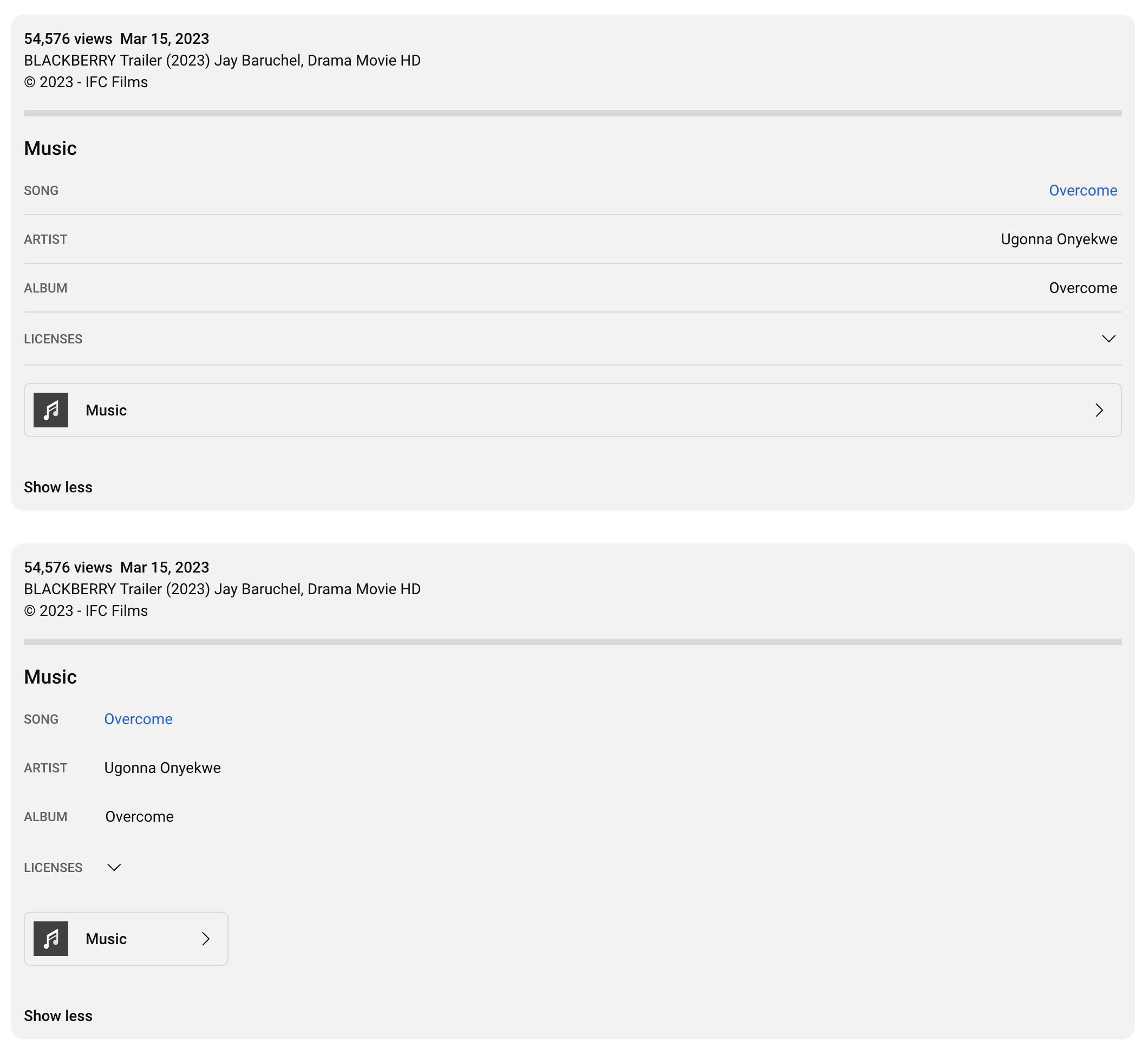
Three problems with table at the top:
1. Data is too far away from its labels
2. Data is right-aligned
3. Too much visual noise created by delimiters
All solved trivially in the bottom one.
Modern idea to put controls on top of content when the space on screen is essentially free and infinite is... not good
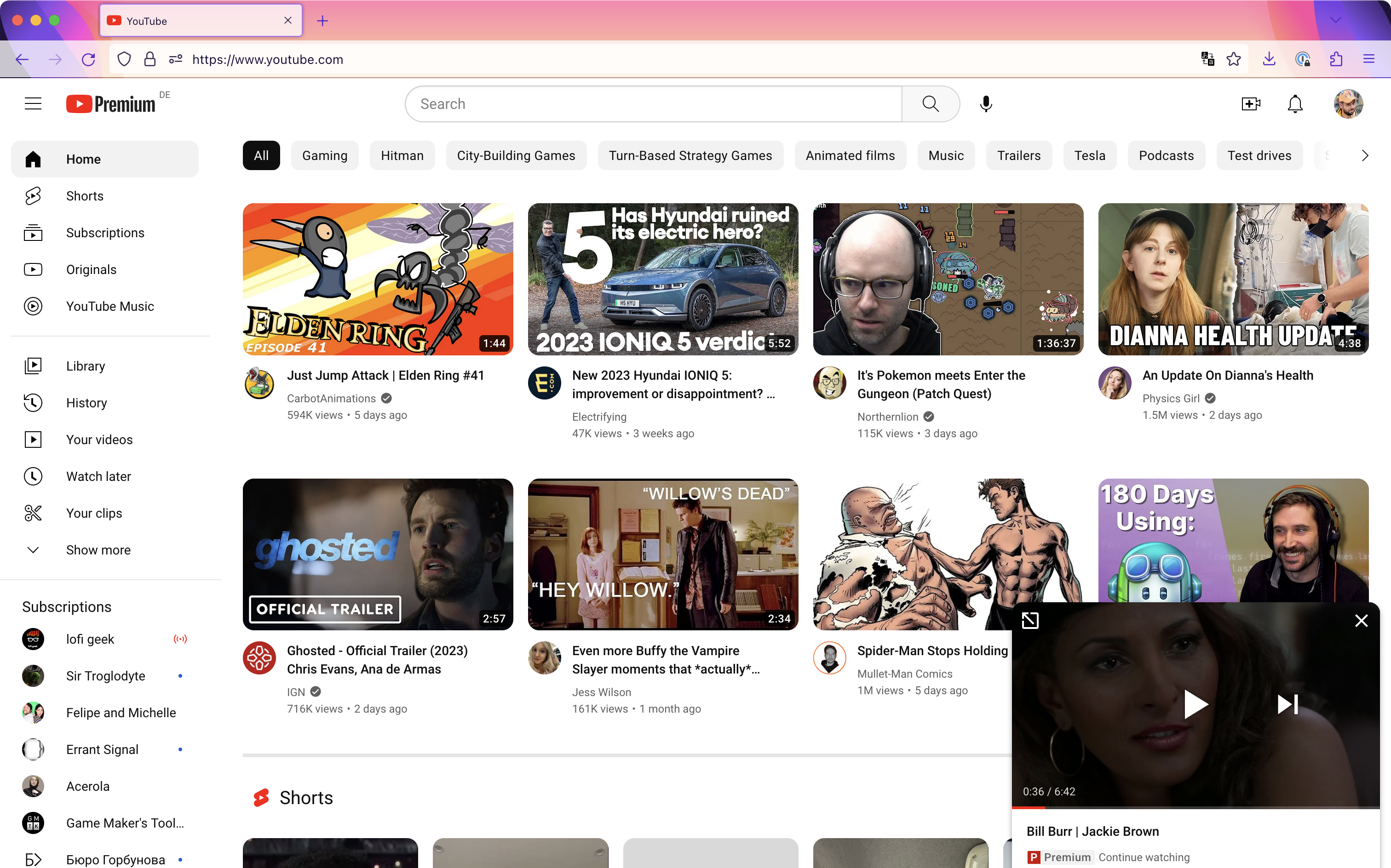
Why does some of your content hovers over some other content? Can’t decide what’s more important? You control _everything_ on this website. Find a place for “continue watching” that’s not as annoying as current implementation. Probably a case of two departments fighting for user’s attention, but still, no excuse
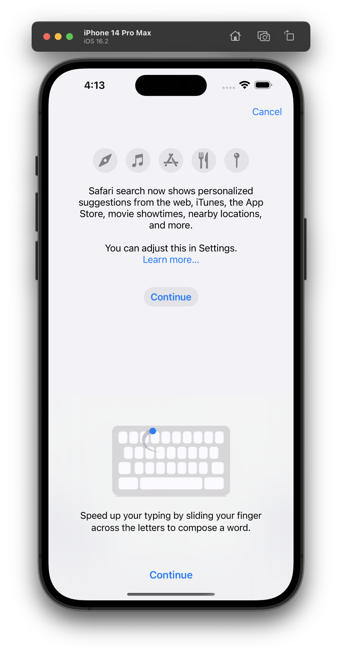
Two “Continue” buttons on one screen. As a rule of thumb, one clearly distinguished “call to action” primary button is preferred
As a rule of thumb, don’t change the size of your graphs when editing irrelevant settings. It looks like files are getting smaller, when in fact they are not!
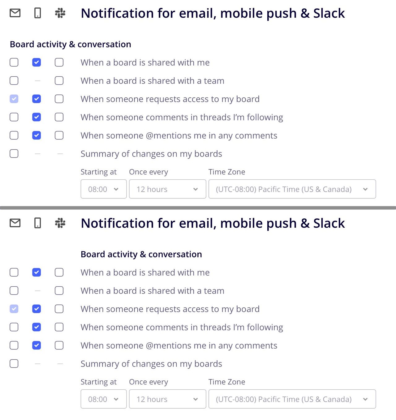
Try not to separate table header and table columns
Thanks @semeromance for reporting this
Put important information first.
Thanks @SomeKirill for the picture
There’s no reason to give disabled buttons different styles
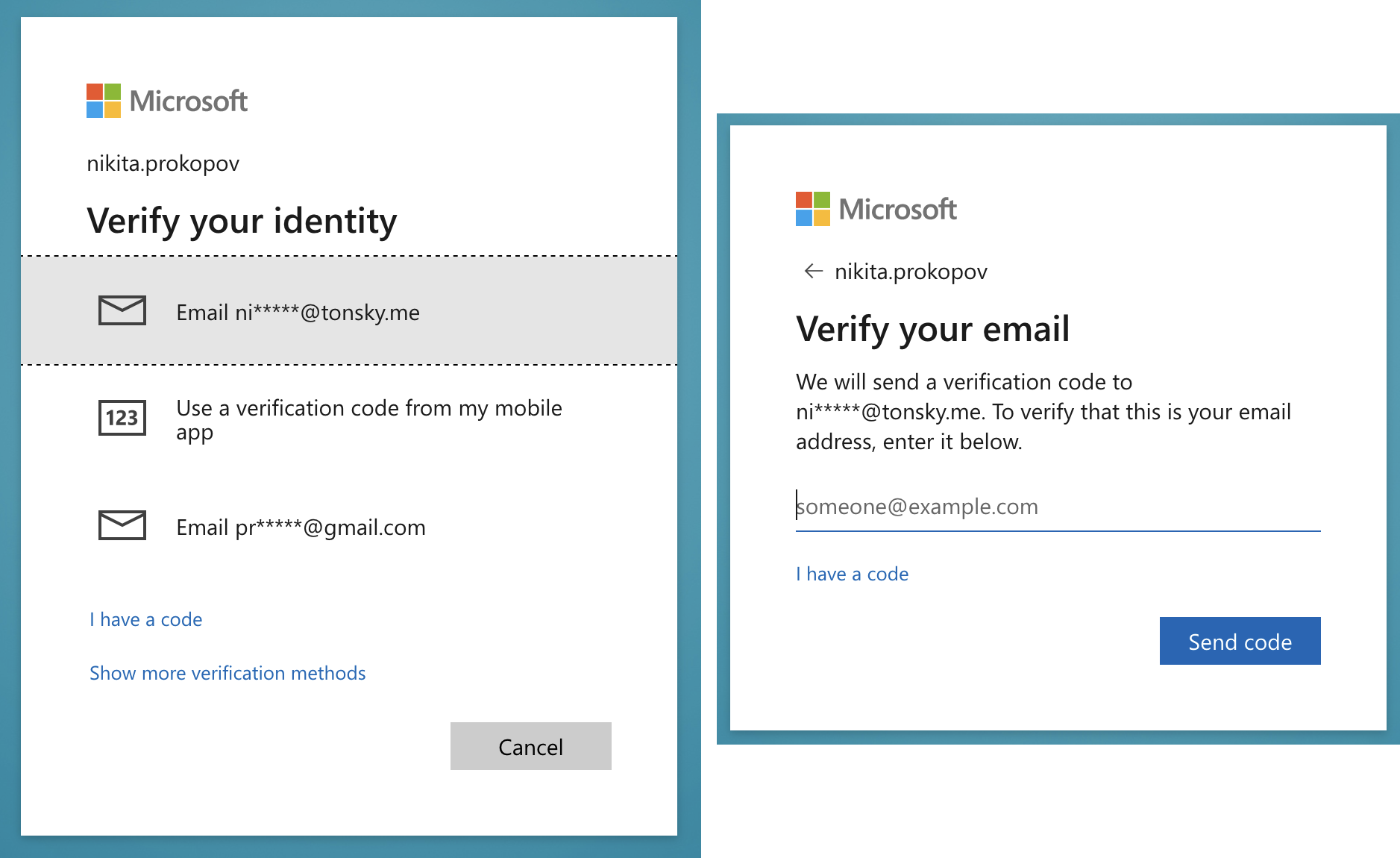
How do you want to verify your identity? I choose email. And start monitoring my inbox for the code.
When, unlike any other 2FA system, Microsoft has one extra step to _type in email_ that looks exactly like “enter 2FA code” screen would look like.
Very confusing.
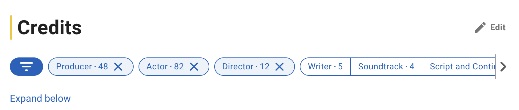
This tag UI is optimized for wrong thing: excluding instead of including.
I want to know, in which movies this person was as an actor. Instead, what I can do is see in which movies this person _wasn’t_ an actor. Nobody wants that.