
If you extend source code with line numbers, make sure those aren’t selectable
If you extend source code with line numbers, make sure those aren’t selectable

Yeah, I think you got my attention
Thanks @The2lb3oz4dr10grOfHedgehogs for the picture
I wonder who invented this Instagram behaviour: right after opening the app, show you some _new_ content, spark user’s curiosity, but then immediately and unconditionally replace it with another content.
Like, what was they thinking? Show skeleton screen or a spinner!
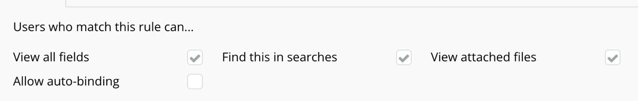
Rule of proximity: things that are close together are considered to be the part of the same group.
In this case that rule is broken: checkboxes are closer to labels they have nothing to do with.
Thanks @apust for the picture
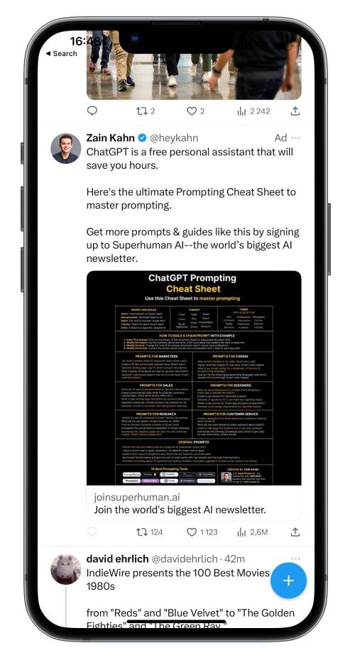
Twitter removes entirety of its UI except for the plus button. Not a good move.
Rule of thumb: users use UI controls more often if they can see them
Hiding more places behind the scroll? What?
Rule of thumb: show all your data or indicate clearly when not everything is shown.
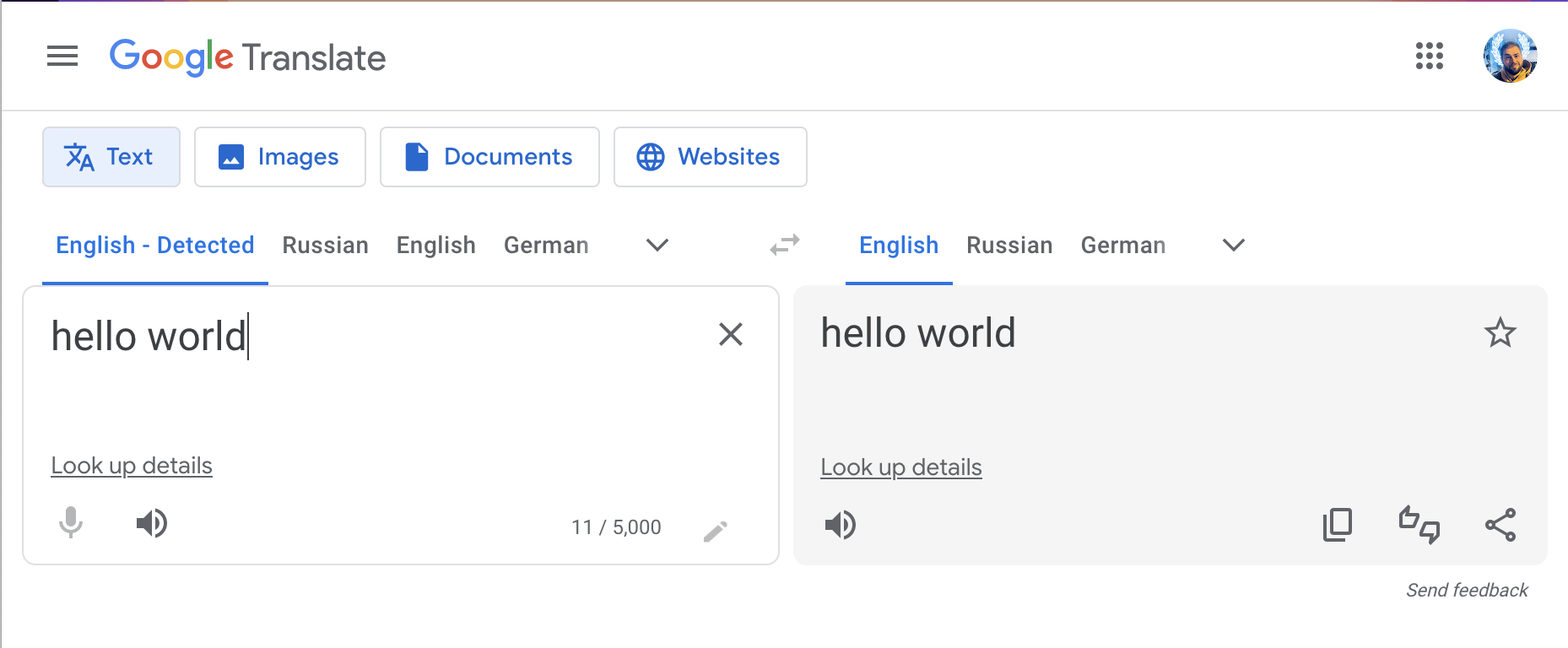
Sorry Google, but it’s pretty unlikely I will ever need to translate English to English. _Any_ other guess would work better
As a general rule, hover could be used for navigation, but not for entering data.
You have an infinitely scrollable timeline. There’s literally no limit for vertical space. Why crop and then implement a undiscoverable feature to deal with problems caused by crop when you can just not crop at all???
STOP. CROPPING. IMAGES!
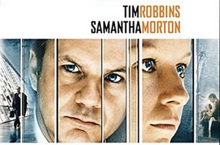
Different ways to show relationship between objects:
- Distance. Tim Samantha is closer to guy’s face, so we naturally assume that’s his name
- Color. Tim Samantha is one color, so we naturally assume it reads together