
Sounds obvious, but... maybe don’t move the button away when user tries to reach for it?
Thanks Marcus for the video
Sounds obvious, but... maybe don’t move the button away when user tries to reach for it?
Thanks Marcus for the video
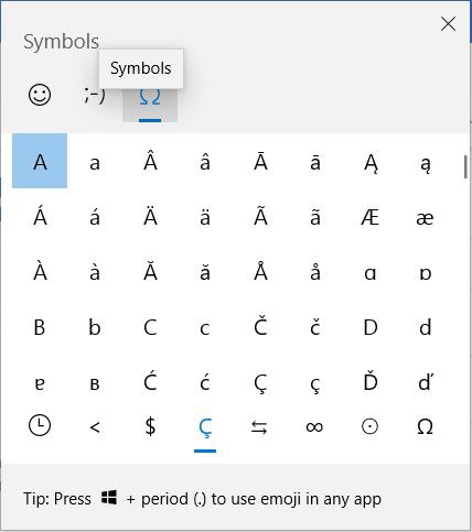
Bottom row of characters is actually a tab list!
Thanks @Saaska for the picture

Well of course Date is under Number, where else should it go?

I wish programs could check for common causes like “You are offline” or “No internet” instead of “Error 11556”. Seems like a common case
Applications should match OS look and feel, unless there’s a good reason not to.
Browsers, specifically, should draw as little attention to themselves as possible. It’s about web pages, nobody cares about the browser.
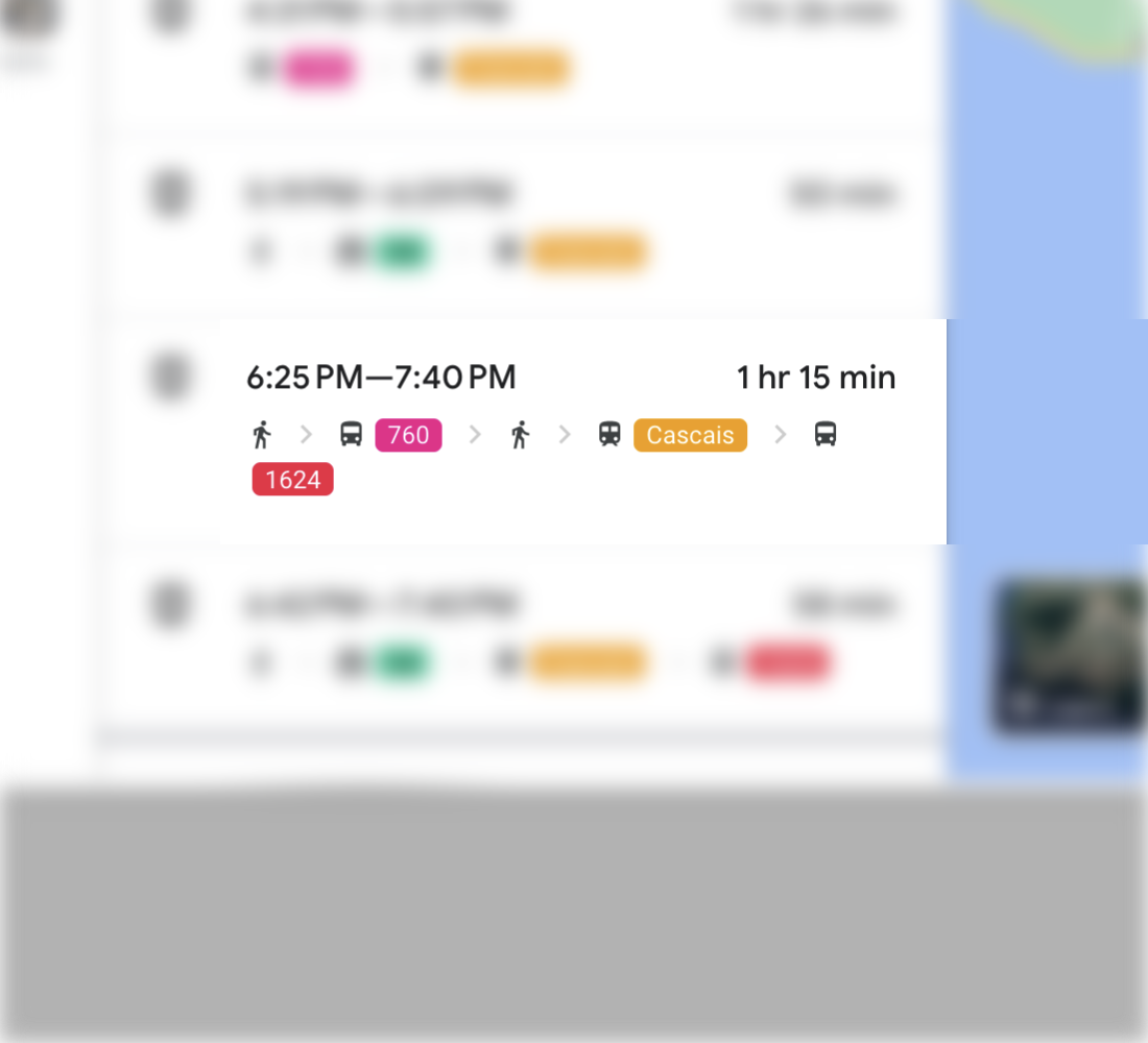
The idea of icons is to be easily distinguishable. If the only difference is 30° rotation of two pixels, at this size... it won’t work
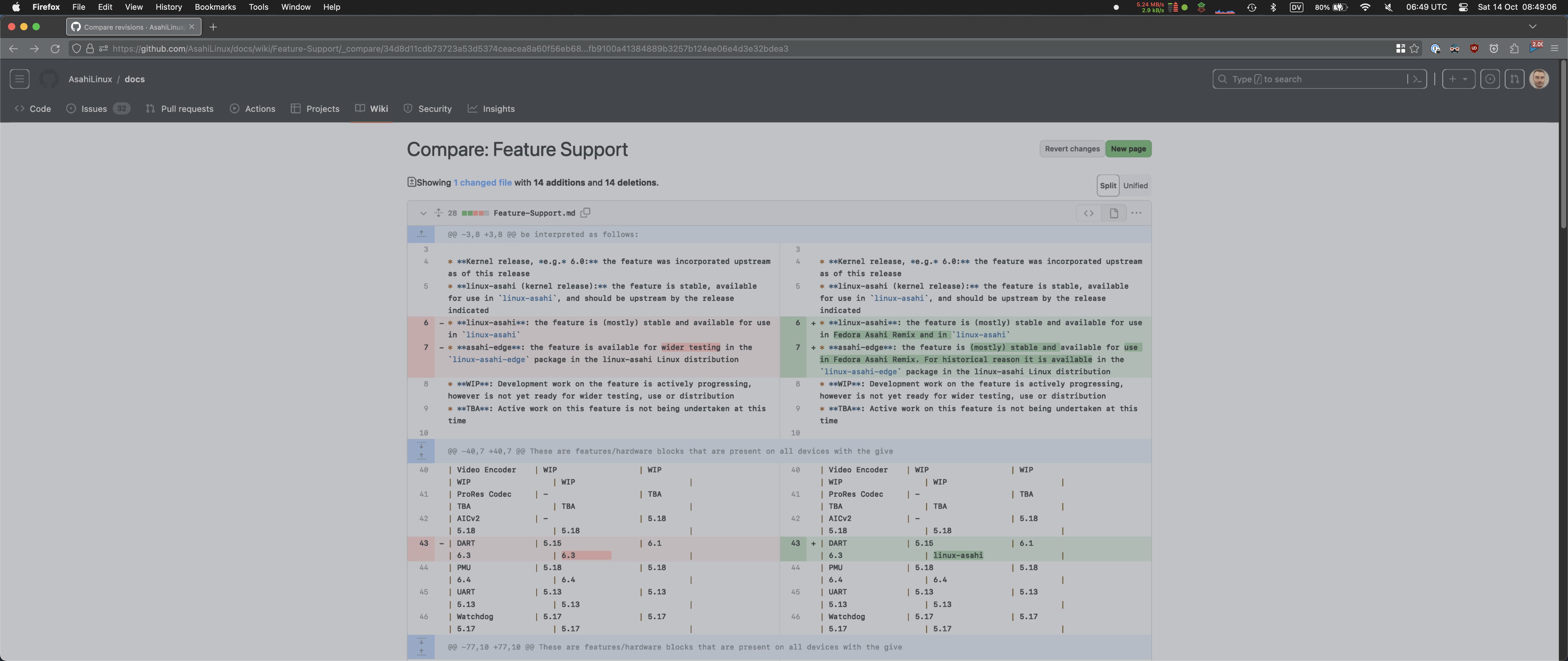
An idea: double your page width for side-by-side diffs
Thanks @dottedmag for the picture
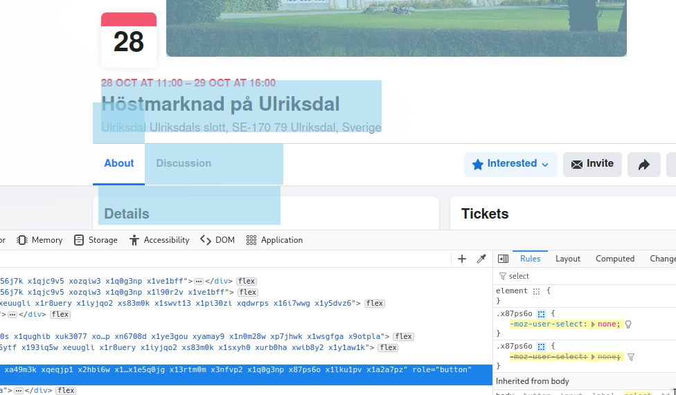
The right to select text is a basic right of every user. Don’t take it away!
Thanks @verglasz for the picture
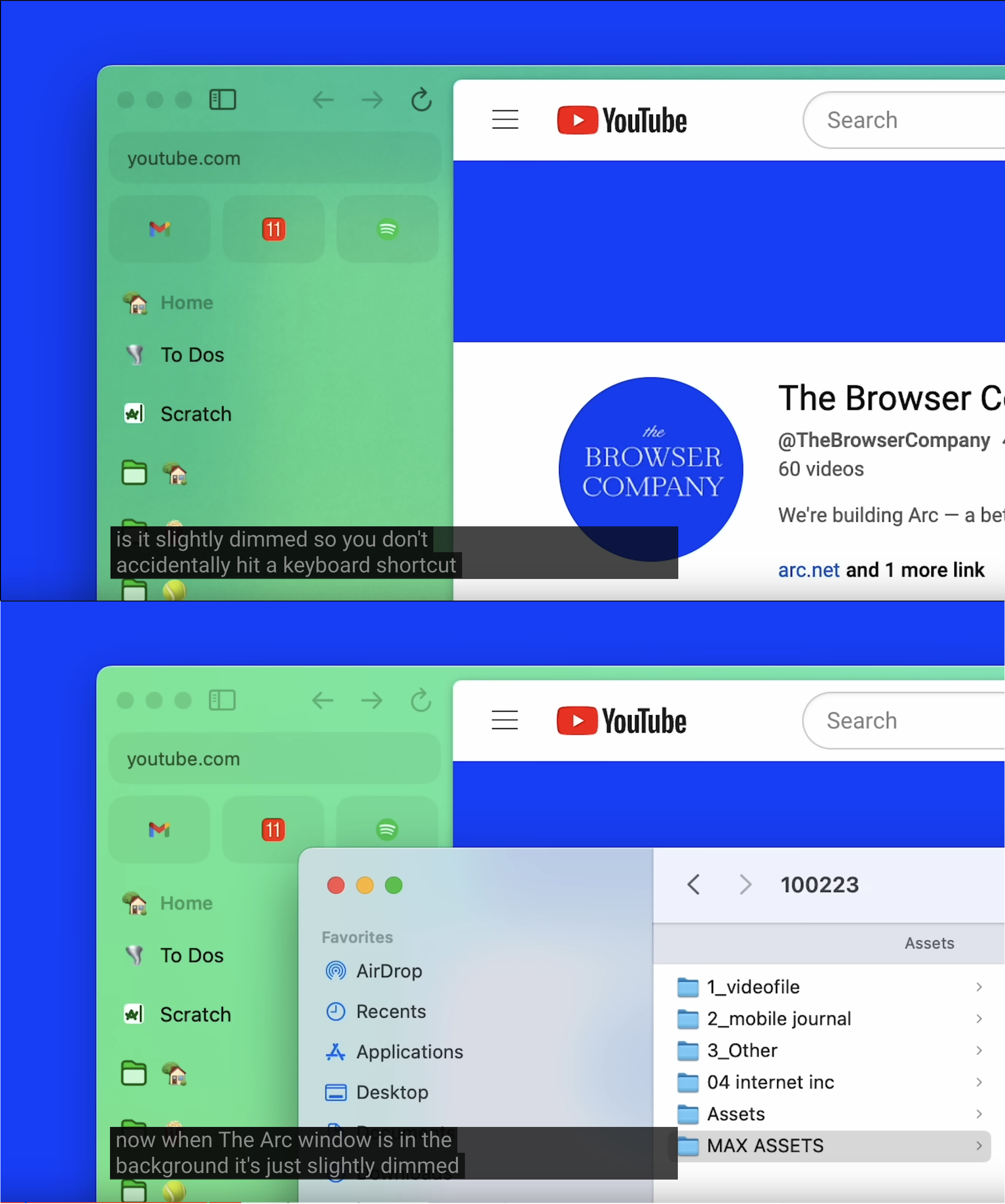
Pro tip: background windows should indeed be dimmer, as in, have less contrast than foreground ones. Not the case in this picture

Pro tip: Article titles are usually more informative than associated images. The latter are very often logos or meaningless stock photos.