Grumpy Website


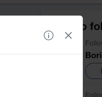
and then there’s problem with designers who don’t understand conventions or meaning of icons. No, Twitter, (i) is now your go-to place to put dialog options (or any controls for that matter). It’s INFORMATION. It’s something you _read_ (or rather don’t read, as I’m sure most people do). Report/block/delete conversation buttons are NOT information

One of the stupidiest things you can do with text is to reveal it on scroll. What is it? A designer thinks plain text is boring? This article desperately needs animations, but there’s nothing to animate but text? Text in a book isn’t animated, and last time I checked, books are doing just fine.

Web sites are already suffering from loading delay that varies from 0.5 to tens of seconds. Such delays make things much less usable than they could’ve been. You can scroll through the whole book in a couple of seconds looking for a picture you need. It’s not a big deal. Imagine going through 500 web pages. How much time would it take? How soon will you abandon that idea? Very few people are patient enough to check even second page of Google.

Make things instant where they can be. Instant response goes a long way, always.

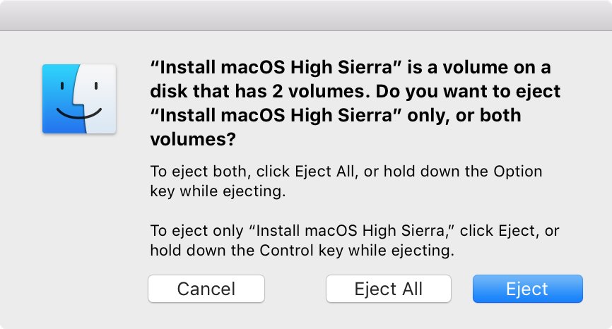
I guess I’ve found the most confusing dialog in macOS. If you use a thumbdrive with two or more volumes, this is what you get if you try to unmount it. After all, “ejecting disk properly” _is_ a rocket science

Ladies and gentlemen, let me present to you: hidden double-hover menu. A menu that you don’t even know exists until you hover over a perfectly blank white area.

Thx @lrrr for the gif

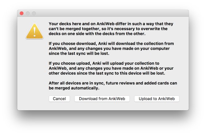
The picture basically says: you fucked up and now have two versions of a document with conflicting changes.

How developers see this dialog: we give you an option to choose which one to keep.

How users see it: we are about to destroy half of your work, but you get to choose which one.

Kinda sadistic, isn’t it?

Thx @razum2um for the picture

Default mode for GMail action panel is icons. Icons are great: they take little space, don’t need to be translated. Only one caveat: more often than not there’s no good, well-understood icon for your action.

In this GMail toolbar, the only one that more or less works is Trash (delete). Everything else is at best confusing:

- A box with downward arrow? What’s that? Put box down? Which box?

- Stop sign with exclamation mark — do not enter?

- Two envelopes in a stack. Who would’ve thought they mean Mark as Read? In the old version they gave up and put text label even in icon mode.

- Ok, clock now. This is universally undestood sign that could mean literally _anything_. What time is it?

- A folder with arrow pointing to the another arrow on the right? This means move, but even since Windows 95 days it was clear nobody is going to come up with a good metaphor for move. Nobody did.

- Right-pointing rectangle? This looks most like road sign pointing to some place, but actually means TAG. Huh?

- Finally, a Google invention, dropdown menu icon that’s three vertical dots. I never really understood what was wrong with a downward-pointing triangle or at least three horizontal dots? Why weren’t they working for them? Just for the sake of being different?

Luckily, this menu can be switched to text labels in Settings.

When signing up for another service, I always look for a Google button. I don't want to spend my time on creating yet another login/password pair in my password storage, then validate my account by email, etc. Too long! Ideally, signing with Google provides the fastest pipeline to create a new account.

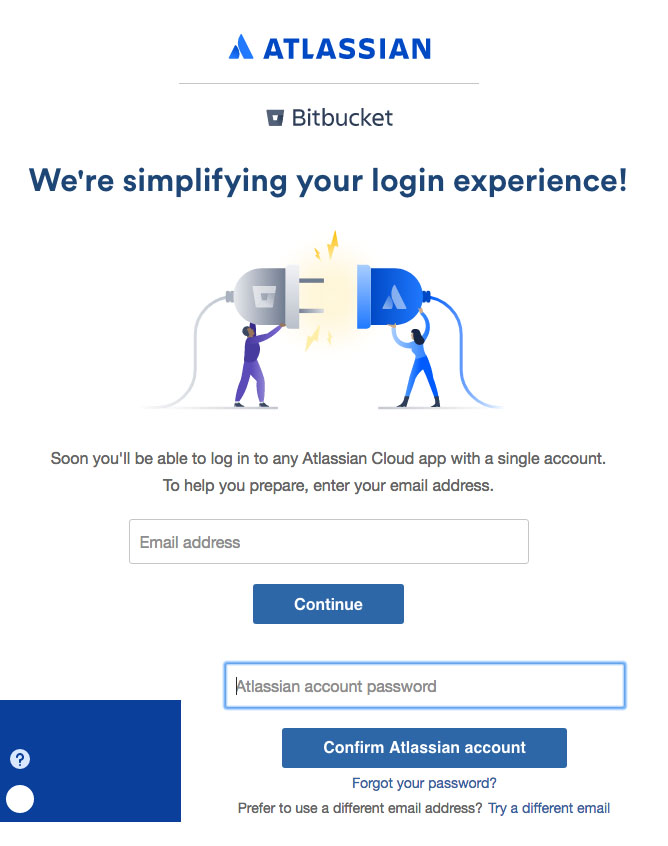
Under the hood, the Google servers return all the required information the service needs. These are full name, nick-name, email, locale, gender, country and even avatar URL. Everything we need to know about a user and even more! That's why, it's more than strange to see such a lame auth pipeline that Bitbucket has, for example.

Even if you signed up for a Google account, they will ask you for email. What? You've already got it in JSON response, haven't you? I cannot imagine a scenario when a Google user "ivan@gmail.com" signed up but then specified a completely different address, say "foo@test.net".

Then, they'll ask you for a password. I repeat, the main feature of a third-party authentication is you do not need to care about a password. So this benefit is completely ruined.

You also need to validate your email by clicking on a link from an email message. Although the very pipeline by itself ensures that yes, this guy is really a Google user Ivan and no one else.

Finally, in the left bottom corner, do you see a white circle? Believe me or not, this is me. Google returns a URL that points to a nice high-res user's avatar. Was it so difficult to just put that URL into an tag? Or at least your programmers could fetch that image from Google to Bitbucket servers and assign as my default avatar?

After all of that said above, was it really worth to add Google authentication?

Last in the list of GMail redesign sins is button shape.

The old buttons (top row) were bulkier, but they were clear: buttons looked like buttons, they had clearly defined boundaries. After a quick glance you knew immediately what’s going on and what to do. Don’t make me think™.

After the redesign, buttons are now text labels, and whole row is just one big sentence with no indication where one starts or ends. Sure, there’re _subtle_ signals, but they are so subtle you actually have to keep in mind that those are actually buttons that look like text. The interface does not speak to you, you just remembed what it used to be and had to remind yourself “these labels are supposed to be buttons” constantly.

Previous parts:

Terrible layout grumpy.website/post/0PtjXmFEK

Nauseating animations grumpy.website/post/0PuSXQmsl

Annoying on-hover buttons grumpy.website/post/0PugAwZf_

GMail mistake #3: buttons that reveal themselves on hover.

The most common problem with that is that you don’t see the button in advance, meaning you can’t move your mouse directly to it. Instead, you have first to move your mouse to reveal controls, and then decide/correct after they appear. Two moves instead of one, big deal when it comes to the interfaces you use every day. Notion, as one example, has the same problem grumpy.website/post/0PhAYfy0b

But GMail made things even worse (being grumpy, I wouldn’t expect anything less from them). They put on-hover controls in a dense and _active_ area of an email card. To open any email you _need_ to click anywhere in that small rectangle. This is the _primary_ interaction, this is the one and only way to open emails and switch between them. But—surprise-surprise!—when you try to do so, accidental hover control might appear right under your mouse out of nowhere. Those hover buttons even overlap the text!

The worst part? Those controls are not even that important in the first place. You can do the same action after you’ve opened an email, or select it and do it from the top menu. In that case, GMail team tried to save you a click where you didn’t even asked for.

Second bad feature of new GMail redesign: hover states.

First, they are animated which makes you nauseated pretty fast.

If you can sustain that, second problem kicks in: the reaction is not instanteneous. Instead of immediately filling background they start an animation that will fill it in 100ms. As the result, the whole UI feels slow and unresponsive even though there’s more than enough resources for it to operate.

I bet it looks cool in animation editor where you don’t get to actually use it. After the 100th time you’ve seen it, though, it doesn’t feel like a great idea anymore

Pages:
160...3130292827262524...