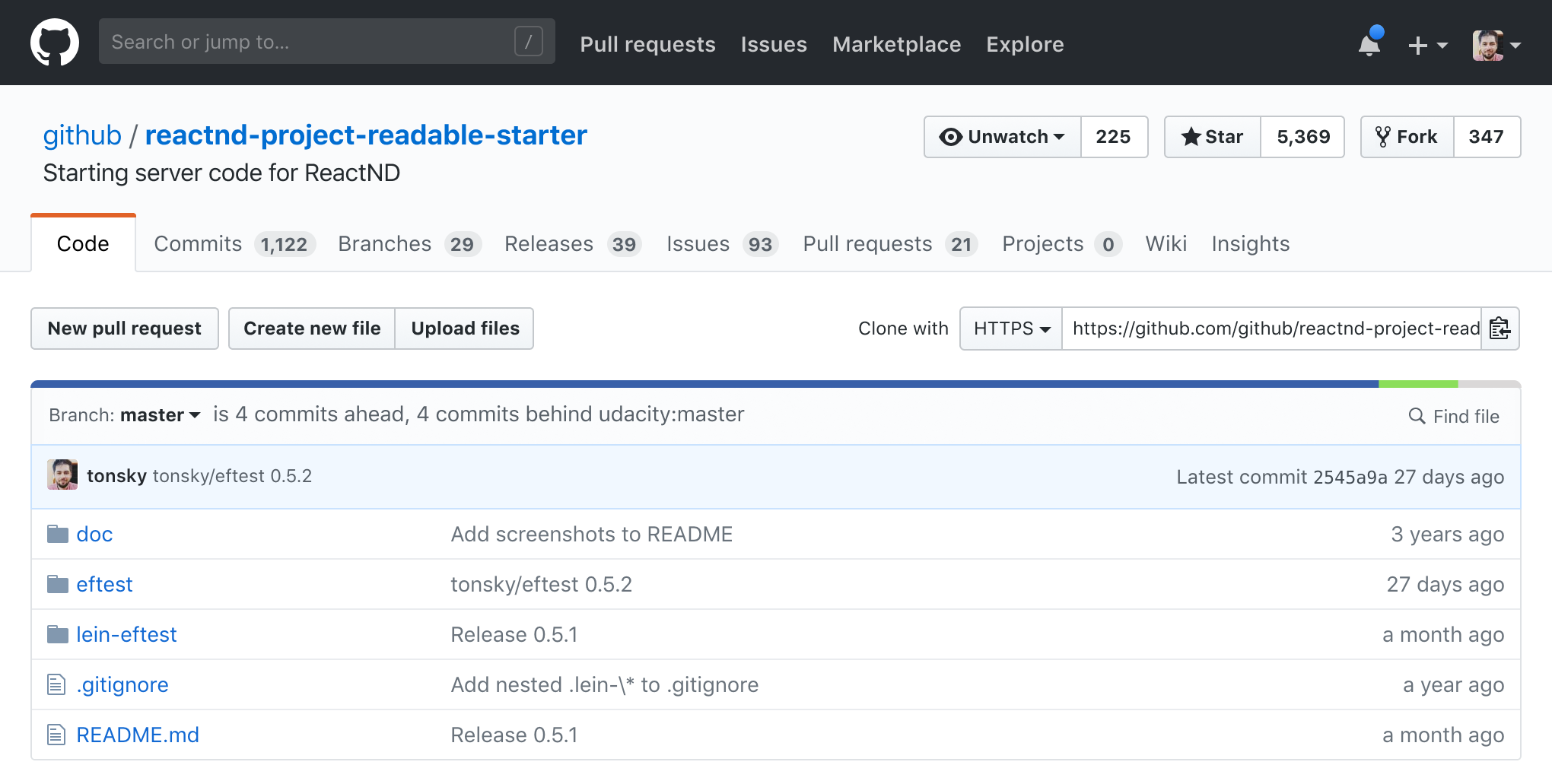
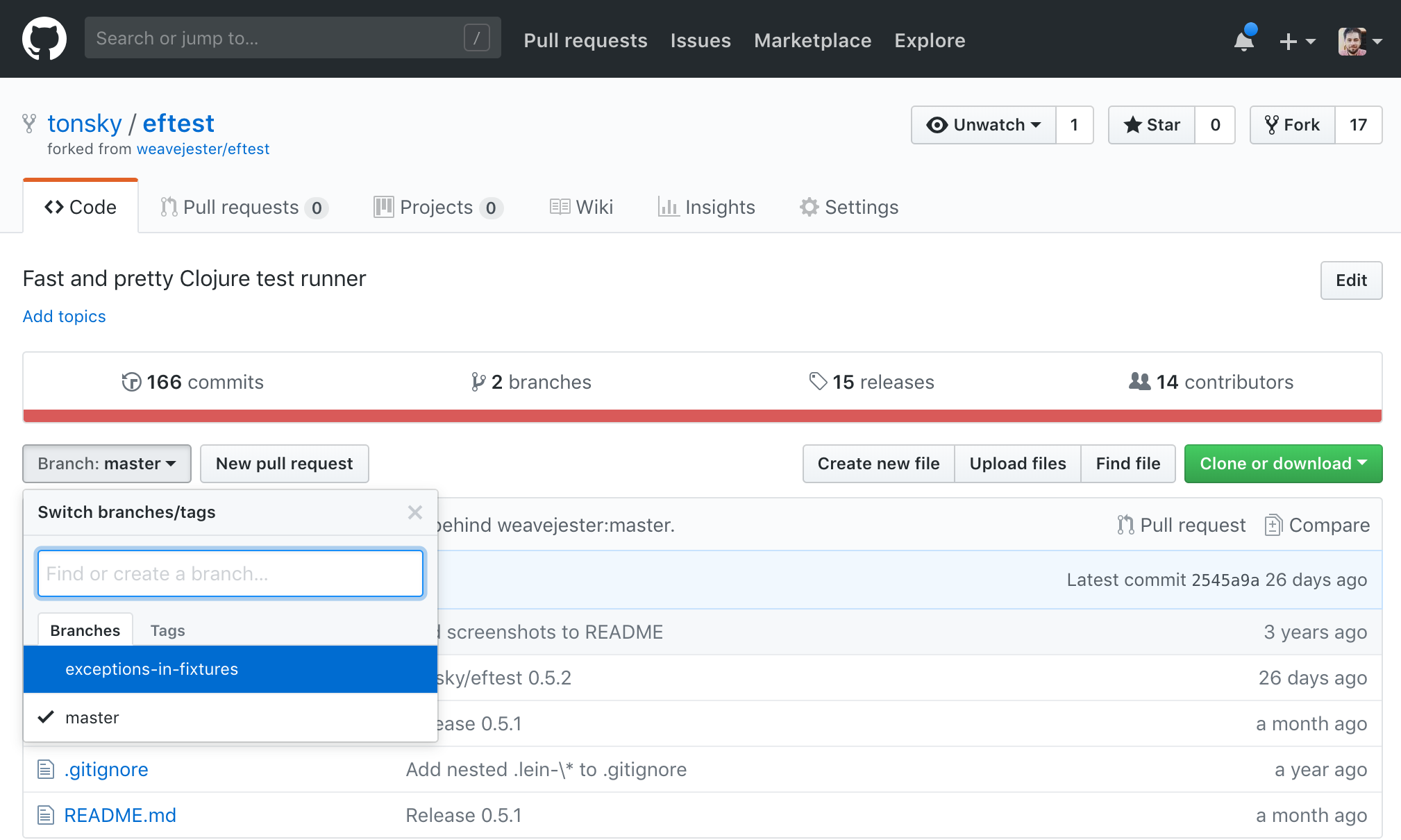
Grumpy Website


I was in the middle of buying a book when this message occurred. Well, I cannot even find appropriate words to share my mix of wonder and irritation caused by the text in a red bar. For security and shipping reasons they cannot sell me a book, what a weird sentence. In simple words, they just cannot ship it in my country. So why did they put it into the "Select your country" widget then? And this note saying I may want to divide an order. Absolute rubbish! I've got a single book in my cart, how can I divide it?

Please don't make me pass through many steps filling a lot of fields if you cannot ship it. I do believe it can be handled before I start ordering something I cannot achieve.

it’s funny how some pages still reference user’s “computer”. People don’t use computers anymore. They use phones, and while technically they are computers, nobody in their right mind would call them that.

Same for “browser”. People don’t use browsers, they just open web pages. Browser is an invisible part of infrastructure that you don’t even think about (neither are you supposed to). When I click on a link in Twitter app on a phone and a web page pops up in a webview and says something about my browser running on my computer, I’m like “what the hell are you even talking about?” I used no browser. I was reading twitter on a phone.

One morning I woke up at 7:05 wondering why didn't I hear any alarms… I remember setting the alarm for 7, and the phone was well charged and alive. But it didn't wake me up! It didn't make any noise. It just ignored the alarm completely.

I opened the clock app and yeah, here it is — enabled, green, 7:00 and says "Alarm".

It took me quite a while to understand what had happened: it was set to repeat never. Even though this is my bad (I guess?), the whole UX is terrible. Here I have an alarm that is enabled but will never really go off. So, it's actually disabled. That is the definition of the disabled thing: it doesn't do stuff.

The problem this UI is trying to solve is the problem the developers and designers have, not the end user. They want to consistently divide "alarm status" and "alarm settings". And in the underlying database it makes perfect sense, there are separate fields for those.

A stupid analogy I came up with: you see a store entrance with an "OPEN" sign, so you walk in, but the cashier says "sorry, we're closed", and you say "wait, but the sign said open", and the cashier goes "yeah, right, that's just the door, the door is open, but the store is actually closed".

And no, I'm not suggesting it should magically disable the alarm when you make it "repeat never", this would be worse in some cases.

Maybe, when all options lead to confusing outcomes, the problem should not be solved, the problem should be eliminated. There is something fundamentally wrong in these alarms.

You might’ve seen this picture. This is how Slack decides whether to send you a notification or not. Usually it’s posted with a comment like “if you’re a programmer thinking you could build Slack clone over the weekend, there’s more to it than it seems”.

Yet when I see it I see what Slack is famous for: complexity, no clear principles or vision, hard to understand UI. Workspace system, terrible threads, unclear right panel, inconvenient shortcuts, miriad ways to catch up with no clear/preferred one. And yes, notifications that bother you even if you didn’t expect it (@here, for example).

I mean, yes, to build great product requieres great amount of work that’s easy to underestmate. Ten times true for polishing the interactions. But if all you can provide is great amount of work you’ll end up with an overgrown Frankenstein monster creepning with features. It’ll consist of many little decisions and interaction which would almost make sense on their own, but altogether it’ll be a mess.

What you also need is an ability to simplify, clarify, communicate, reorganize in a better ways, throw away. Integrate. Connect. Reuse and rely. Not just add. Even this diagram could’ve probably been simpler. So could Slack.

apparently Google’s second is about a minute or two of our time

No, I get it. For people who “organize stuff” and love everything put into folders, and maybe folders inside folders, or people with multiple accounts who work on multiple jobs. It all makes sense for them. I guess.

But there’re also people who have only one account and only one folder. I guess I can’t call myself Password Management Guru, but still, I’d love to use it just for myself. I don’t need folders. I don’t need accounts. I already get enough out of it. Please just add simple 1-person mode with no UI at all. There’s too much UI where there should be no UI at all.

Also, I’m perfectly aware what my name is and what my avatar looks like. Maybe no need to show it to me four times in an app that only one person on Earth can unlock anyway: myself.

When implementing spinners made of discrete elements (points, dots, rectangles, what have you), do not rotate the whole thing. It looks ugly and begs the question: if it’s made of multiple elements, why is it rotating as a whole? Instead, scale/light up each element in succession to create an illusion of motion while keeping the individual element still.

Following up on my previous post on Github navigation problems grumpy.website/post/0Q0xKAK_f I redesigned the UI to get rid of most glaring problems (click on a picture to open it in full resolution):

0. Page has clear hierarchy now. There’re tabs, then a row of code actions, then the code itself. Easy to understand & remember on a top level, more details when you dig deeper.

1. There’s only one level of tabs instead of two nested ones. That makes it easier to navigate from anywhere in the repo to exactly the page you need in just one click.

2. Contextuality was fixed. Repo description, link and topics were moved above the tabs because those are repo-related, not code-related.

3. File-related actions (Switch branch & Find file) were moved to file browser panel for the same reason.

4. Languages statistics bar is not a separate bar anymore, it was moved to the code panel as well. Because it’s about the code, you see? It also used to visually split the page in two halves, that was fixed too.

5. Buttons are grouped into two clusters (code one and repo one) instead of four. No need to scan all over the page looking for a button you need.

6. Buttons are used only for actions. E.g. find file is now just a search field, not a button.

7. Clone URL is back! I hated it when they hid it away. Now it’s available immediately, with a combo to switch to different options.

8. New navigation is 1.5 times smaller than the old one (200px vs 300px). It means you can actually see code above the fold.

9. The only thing that didn’t fit here is the number of collaborators. That’s still avaliable in Insights/Collaborators, as before.

10. What about icons? Yeah, Github loves icons, even when they don’t bring much value. I removed icons from tabs because they were mere decoration there. Everybody was looking at the tab text anyways (note how icons were muted in comparison to the text). So basically I just removed noise and made everything cleaner.

A version with full details (owner controls, popups, fork, topics) here s.tonsky.me/grumpy/github_redesigned_full@2x.png

Github navigation. I mean, I remember there were at least two major redesigns, so they are trying, but always somehow mess it up.

The rule is simple: don’t put tabs inside tabs. It might seem logical for a programmer who’s writing it but in real life people don’t like hierarchies and don’t want to understand nestedness of your stuff. Especially when it’s not supported by visual cues. Which it isn’t here. But even if it was, it would not make it natural or pleasant to use.

What do we see? Top black bar is fine, it’s like separate sections of a website altogether. You either go there or you don’t. And has black background, which makes it easy to ignore. So this part is good.

Next we see our first level of tabs. It’s related to current repo. Ok, fine. If only it was the only level. The buttons Unwatch/Start/Fork also make sense here.

Then we get repo description. Why here? Why in a code tab? Shouldn’t it be on repo level? Edit button on the right is supposed to be contextual, but it’s really hard to find, given all the space that separates it from the content it’s supposed to be editing.

Ok, second level of tabs. Commits/branches/releases/contributors. You might argue that this placement is correct, after all, those make sense only in the context of code, not in PR or Wiki or Settings. True, but imagine you’re in another tab and want to take a look at commit list. It’s not natural to think “ok, commits are code so I should first go to code and then select commits here”. No. You’ll be just looking for Commits tab on a screen.

This is a problem similar to grumpy.website/post/0PKt_NN8B. When you group stuff, grouping makes sense. When you’re looking for stuff, you don’t think in groups, you’re looking for something directly.

What’s worse, even the grouping here isn’t consistent. E.g. branches are on this level and in a button one level below. Contributors are also in Insights.

Also I can’t not mention that big red line that separates tabs from the content that’s supposed to be “inside” those tabs. This is a language statistics, and you might wonder: why is it here? Well, because.

(Actually, what you see as tabs here and is funtionally a tab switcher has couple more peculiarities: current tab is not shown (you’re in “default”, unnamed view now), switching to any of them removes tab switcher altogether)

And then we have a confusing level of buttons (Branch/New PR/Create files/Clone) which are, well, not always buttons.

First of all, Branch/tag switcher is another tab switcher that hides in a button (each Branch is like a tab for your code). That would be a third layer, yes. Even more, the switcher itself contains tabs!

New PR/Create file/Upload are actions, that part is fine.

Then we have Find file which is, again, just another tab (or section) hiding under a button.

And Clone/Download is just a piece of info, not even a link, and certainly not an action (buttons are supposed to be actions). I suppose they painted it green because it was very popular but made it a button because didn’t found a better place for it.

It’s time to sum it up but look! There’re two more links (Pull request and Compare) just down below. Yes, PR link is actually an action (and is supposed to be a button), and Compare. Well, it’s enough to say those two links lead to exactly the same place :))

Ok, what’s the net result? Buttons, tabs and links are all over the place. There’re multiple “groups” or “clusters” of controls (~seven, depending on how you count).

Good news: lots of controls are top-level, not hidden under dropdowns and easy to access when you know where to look.

Bad news: grouping doesn’t make sense. It’s arbitrary, badly organized, illogical. Visual cues are not applied consistently (links that look like tabs or buttons, tabs that look like buttons or links, buttons that look like links).

As a result, I never know where to look for stuff that I need, even though I use Github every day in my work. Even just one big dumb linear list of “everything we have” would be better because at least you would know where to look for the things you need.

There are many bad things to say about Slack, being slow is a popular one. But even slow apps can behave decently if they really want to. Not Slack.

You see, because it takes so much time to start up, I usually start it in background while I’m busy with something else. But as I’m focused on my work, Slack Spinned #1 shows up, on top of everything I was doing at the moment. Loading spinners are usually a good thing, but the idea of them is that they are shown immediately to inform user her request is being processed. Not in Slack. In Slack, even loading spinned takes significant time to show up, usually multiple seconds. By that time you’ve completely forgot you started it and are already switched to something else. And here it is, interruption you and stealing your focus.

Ok, one mistake wouldn’t be so bad, but Slack team didn’t stopped here. As you’ve switched away from that spinner (there’s no point watching it spin for another ten seconds, is there?) and busy with your life again, time passes and Slack is finally ready to render a window. Of course, that window overlays everything you were doing AGAIN, and of course it has nothing to show to you but another spinner. It’s not ready, but it’s interrupted you twice already. I wouldn’t expect less from Slack.

So you switch away, again, and this time it will silently finish loading in the background and there’s no way to know when it’s ready for you. Just when you might (arguably) finally want it.

Pages:
155...3231302928272625...