Grumpy Website


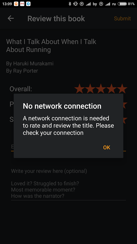
I often listen to audibooks, while travelling and without an internet connection (as I presume many people do). I expect the app to save reviews on the device and sync them with the cloud, once it is possible. Instead, Audible forces you to remember to send the review, as soon as you have wi-fi.

macOS Mojave announced that you’ll be able to switch all apps to dark mode (as soon as they support them, of course). But is it better? Trick is, it depends. Dark mode is definitely beneficial for media content (Photos, Illustrator, Movies) but sucks for anything else where text is involved. Nobody wants to look at white text on black background.

So, instead of switching all apps at once, it would be better if media apps would always launch in dark mode and everything else stayed the same (light).

In an attempt to save menu space, Google Docs moved Table menu under Format. Is it an obvious place to look for Insert new row? Given that rest of the menu is, well, about formatting: colors, styles, align?

At least now they have enough space to spell “All changes saved in Drive” which is no doubt the shortest form of the message there can be

Google Drive File Stream is a brand new software project, yet it fails to comprehend the oldest thing in UX: tell users the things that make sense in the user's world, not in software's world.

Here I have trouble updating some items. So, it was deleted and a copy has been recreated.

I have NO idea what this might even mean…

one common mistake when implementing infinite scroll on a web site is an unreacheable footer. People needing important info about site authors cannot reach it. Each time they scroll more unwanted content is shown in their place. It feels like a dog chasing its own tail. Don’t do that — put footer in a fixed, visible place that’s unaffected by scrolling

Adobe is known for their annoying update popups. Well Microsoft just overdid them. Since I don’t spend that much time in Windows these days, they sent me _an email_ that I need to update my Skype. Nice try, but no

I don’t know what it is with macOS but it deliberately doesn’t let me know which updates it is going to install. Even if I click for Details. That usually ends rather badly, because if I don’t see the point I would almost always postpone. Sometimes you should burden your users with unnecessary details

Ah, email. Best platform for conversations. Please never change

There’s nothing new... Wait, here it is, right on the same screen!

I'm still on the book theme: here is how Amazon prompts me to subscribe to Kindle Unlimited plan. The dialogue pops up continuously when I surf Amazon for something. Well, ok I'd like to subscribe. But the next screen shows a red text saying no you cannot do that since the service doesn't work in my country. Unlimited stands for having no limits as I know. But not in case of Amazon: something unlimited is still limited. The funny fact is the dialogue is still there even after I've been on the page that rejected my request. We don't care you cannot buy a service, buy it anyway.

Pages:
155...3332313029282726...