Grumpy Website


What Google is very consistent at delivering is UI inconsistencies.

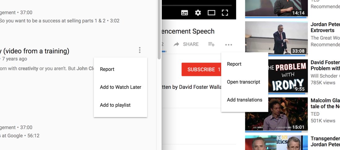
On the left are the search results on YouTube. Each video has the-three-dots menu (visible only on hover, by the way, which is another ridiculous detail). On the right is the video page. The-three-dots menu is horizontal this time, but has three items as well. The first item is the same in both menus. The last item looks the same, because it's "add something", but it's an illusion.

If you're wondering how to add the video to a playlist or "watch later" from the video page: you have to click the plus button to the left of the dots.

Come on!

Hey, do you remember that universal UI thing: if your menu item opens another thing, like a new window, then the item has '…' in the end? Like, "Save as…".

"Add to playlist" should be "Add to playlist…", because it opens, you guessed it, the list of playlists.
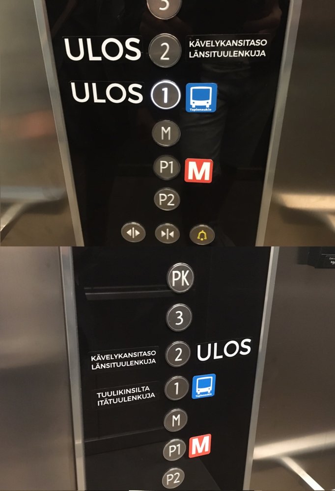
Helsinki metro expanded west recently and several shopping centres in the neighbouring city of Espoo became metro stations. Additional navigation was added everywhere, including elevators. Orange square with letter 'M' is the symbol for metro.

But buildings often had an M floor long before the metro! And they are usually located between the underground parking and the ground level.

So, now there are confusing elevators all over Espoo: M button is not for metro, P1 is.

this app sells movie tickets. But they were so eager to put two advertising headers on top that they completely obscured good half of the movie poster, including the lead’s face. No problem, they though—we’ll just put another, smaller version of the same poster inside the big one so you can see it anyways

Web developers often obsessively optimise for small screens, do "mobile first", but for some reason ignore the desktop, where most of the professional work is done.

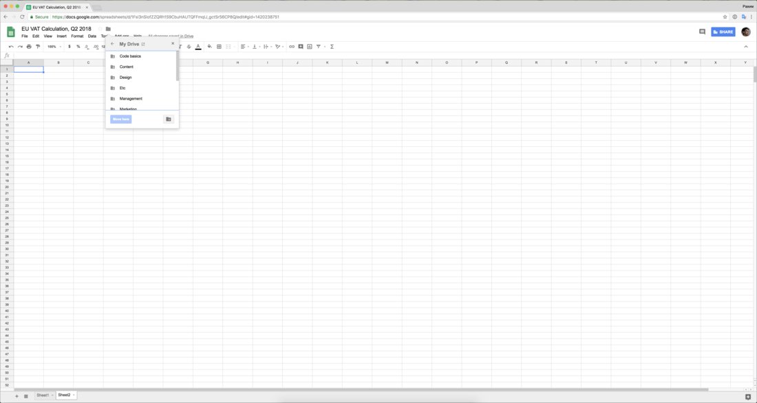
Google Spreadsheets is literally for spreadsheets, one of the most boring (and exciting, if you ask me) things computers can do. It's often used for accounting, reporting and other work of similar nature. The kind of work that is done on large screens due to the amount of visual data.

And every time I need to change the location of a document, I'm presented with a tiny dropdown menu with 5½ folders visible. It's not responsive or adaptive in any way.

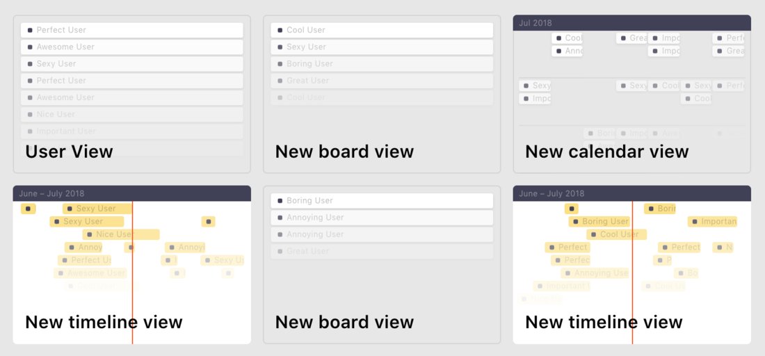
miniatures can’t have abstract details. Calendar icon can’t have just some date. Shell terminal miniature can’t have abstract text in it. It’s either real thing or something so generic and vague you can’t possibly read it. Otherwise people will start wondering if those details should be taken seriously or not, and that’s the question that you shouldn’t leave for interpretation

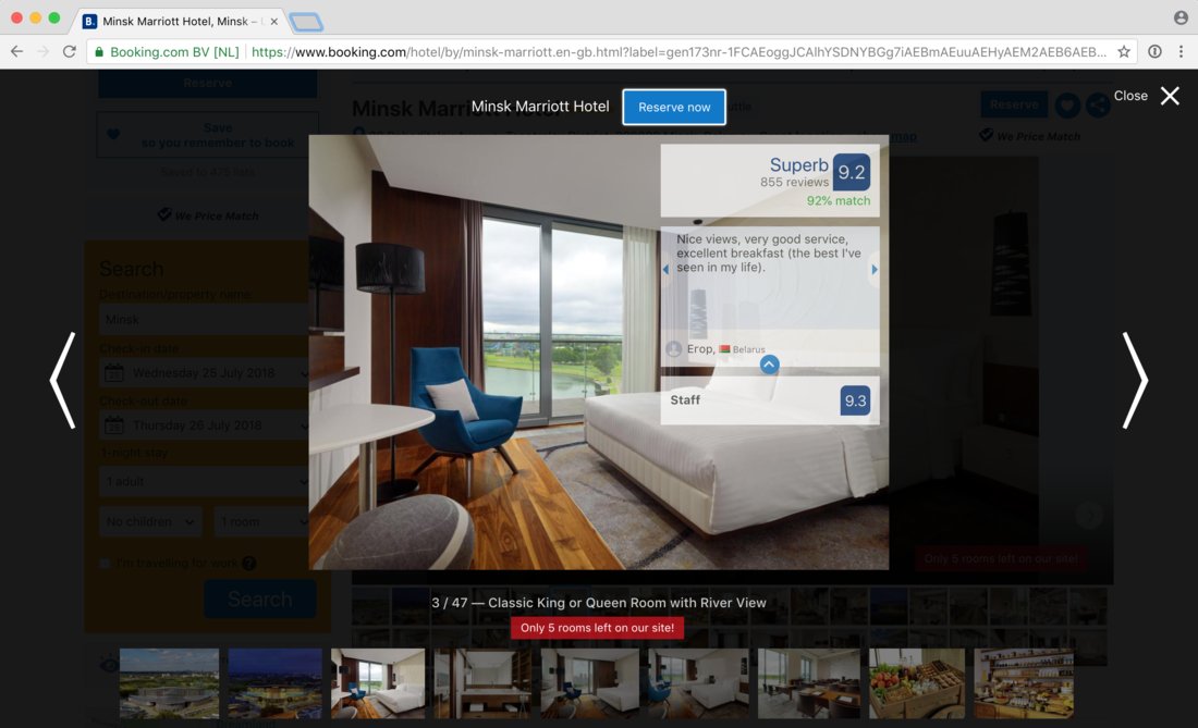
The badness of booking.com UI is usually explained by their greed. This one, though, I can’t find any explanation for. Hotel photos are supposed to sell the hotel—yet Booking covers good half (!) of each (!!) photo with almost opaque irrelevant rectangles. No, you can’t close or hide them. Yes, they are animated. Of course they are.

Given that it is most certainly not about fitting as much info as possible on a page (look at how much empty space is there around each photo!), the only explanation I can come up with is: average hotel photos are so bad that obscuring them with “Superb” reviews actually increases conversion. Good job Booking!

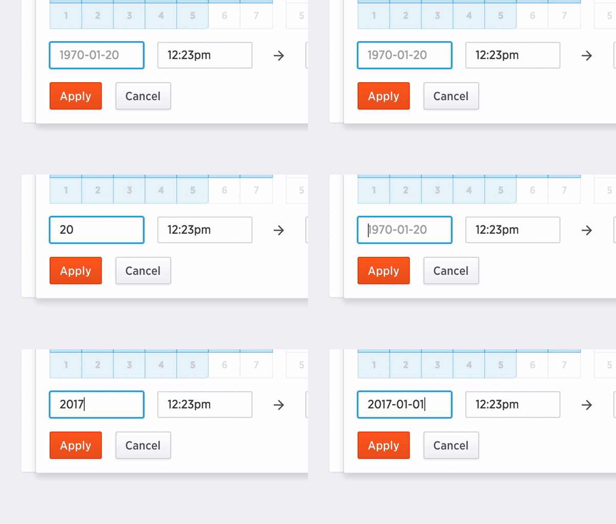
HTML input fields have native placeholders. They are often used to show the correct format for the field, like in the example above.

I see the placeholder, kinda get it, then start typing and boom, the placeholder is gone, and I don't remember what it was. Was it year-dash-month…? Or slash? Or period? I have to delete my input to see the placeholder again.

We don't remember something explicitly until we know we must. And I only know I must remember when I start typing and see the placeholder gone.

A nicer way to handle this would be showing the relevant portion of the placeholder even as I type.

Or just accept ALL sensible formats and don't make the user think.

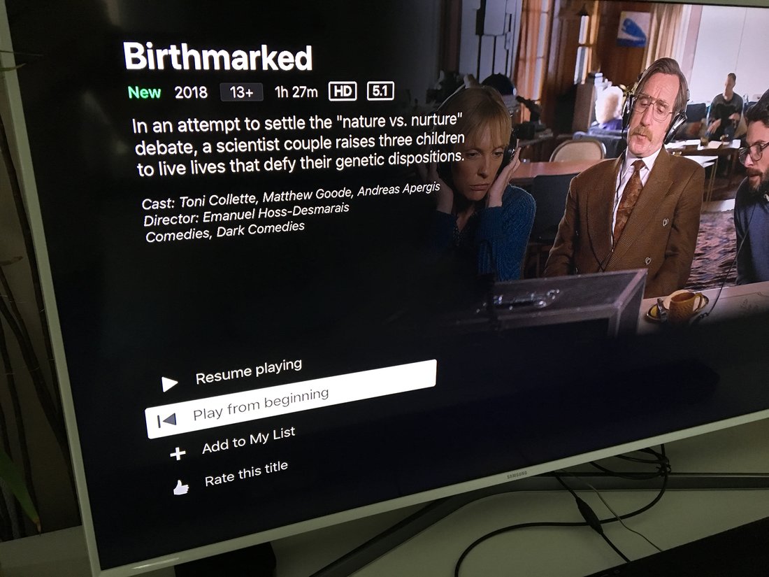
Netflix Apple TV app. If you pause a movie and then put Apple TV to sleep, next time you wake it up you get this: a movie screen with the second button selected by default.

Why is "Play from beginning" default, and not "Resume"?!

Lots of times I just clicked it without looking, well, because we expect the default choice to be the one that makes the most sense. If I haven't finished the movie, the choice that makes most sense is that I want to continue, not start over.

I'm sure this isn't a weird design decision on Netflix' part. It's probably a bug or something.

The thing I want you to consider is this: why does it always seem like some obvious use cases are not tested? I'm talking about multi-million or multi-billion dollar private and public companies with hundreds of engineers. Funny thing is — the smaller the company is, the higher probability all those obvious use cases will be tested and cared for.

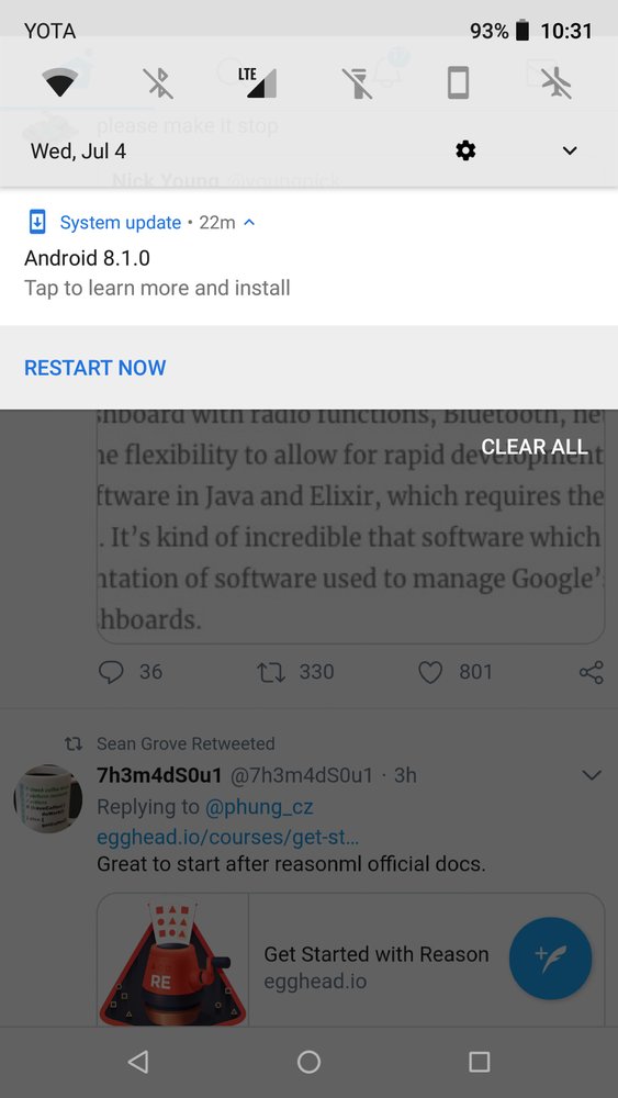
It’s about fourth or fifth time I’m installing 8.1.0 on my phone. It’s most certainly different updates—different download sizes etc. Not that I mind, but bump the version number every now and then maybe?

One downside of everything being computer today is that everything takes forever to boot. Monitor needs 5-10 seconds to start, Smart TVs need minutes, headphones boot in couple of seconds! Cars go from completely off to completely on and ready to ride faster than a simple 24" DELL display! I miss simpler times when everything started working at the moment you plug the cable in.

Pages:
155...3433323130292827...