
Highly detailed information about a user of mine in MS Excel.
Highly detailed information about a user of mine in MS Excel.

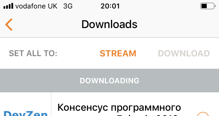
Guess which option is selected here, Stream or Download? I mean, after you figure out those are radio buttons and Set All To is a label, not another option. Yep, it’s Download ¯\_(ツ)_/¯
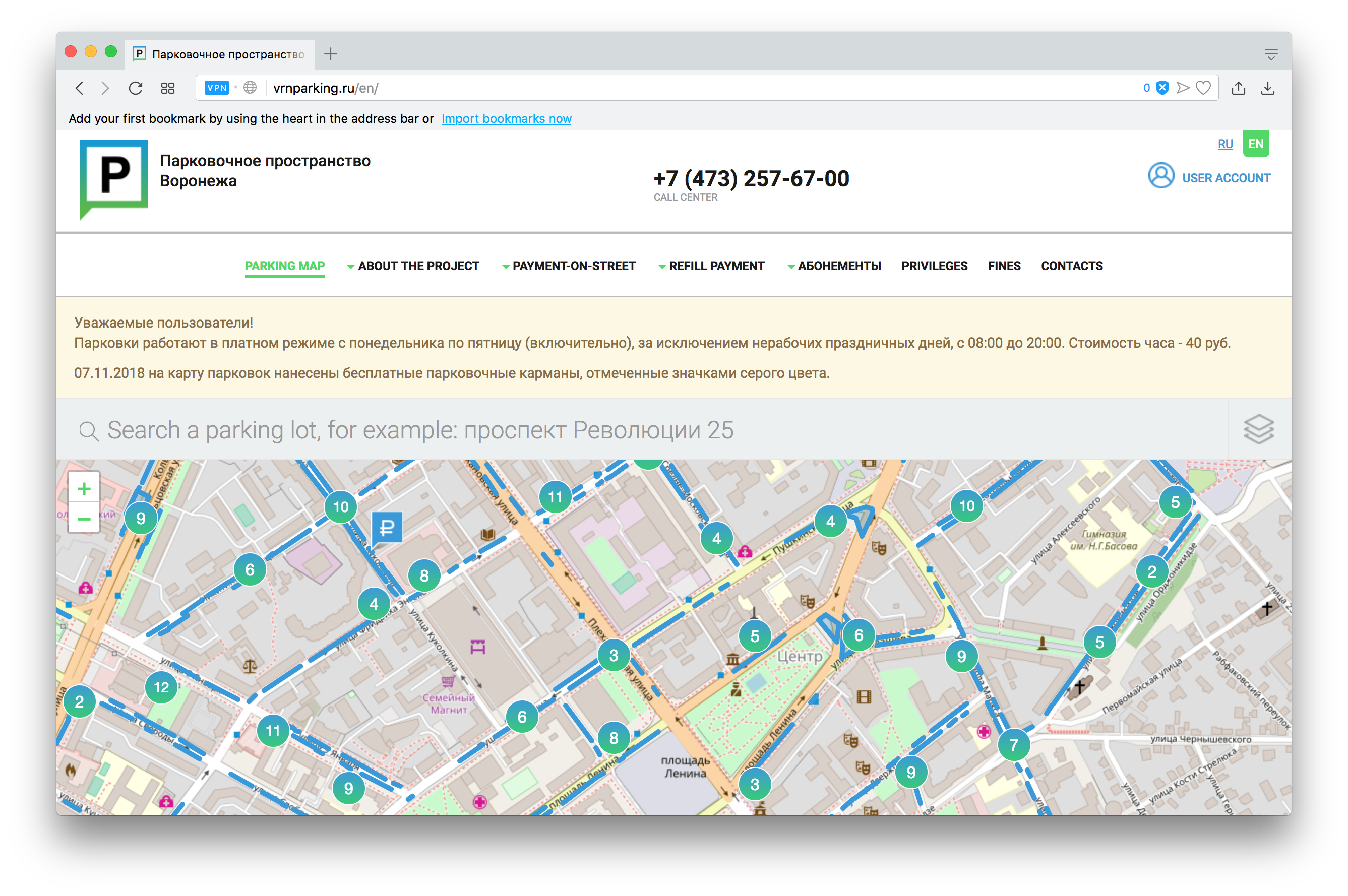
This is how a geo-oriented project shows a map on their site. Isn't it a shame, is it? You've got only a half of the map, not the whole one. No scroll, no any expanding buttons. This is your fault of cause since your display is not as wide as the designer's one. You just have to open that site on an external monitor, and that's it.
TIL that some sites replace your page ON SCROLL. Meaning you can’t scroll back to the article you’ve just been reading. Thx @suhinini for the heads up
All things Medium in a single post medium.com/@nikitonsky/medium-is-a-poor-choice-for-blogging-bb0048d19133
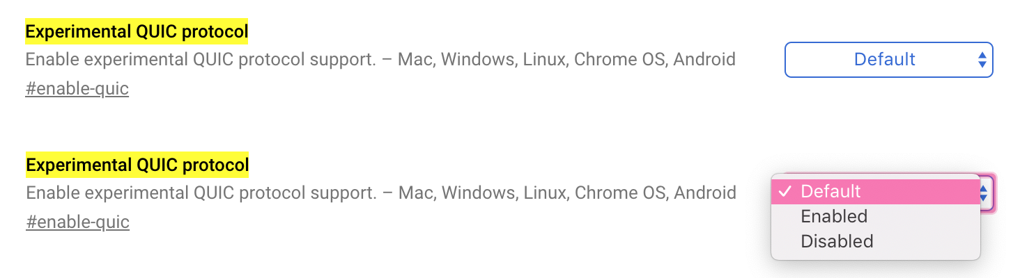
If you have defaults in your system, show what value it has. E.g. if QUIC is enabled by default here I would be happy to leave it at Default.

App switching on iPad iOS 12 doesn't make sense...
Four finger swipe switches between open apps, in a linear fashion, just like you would expect. Imagine having a row of open apps and just sliding between them (similar to virtual desktops on macOS).
BUT that only works until you interact with an app. Do anything, just a single touch inside an app, and BOOM, the row is lost, this app becomes the last one in the row regardless of its previous position.
If you had some app on the left, it's no longer there. This is extremely confusing and doesn't make sense to me. The only useful use-case here is that you can switch between two apps quickly this way, BUT only if you interact with each app after switching.
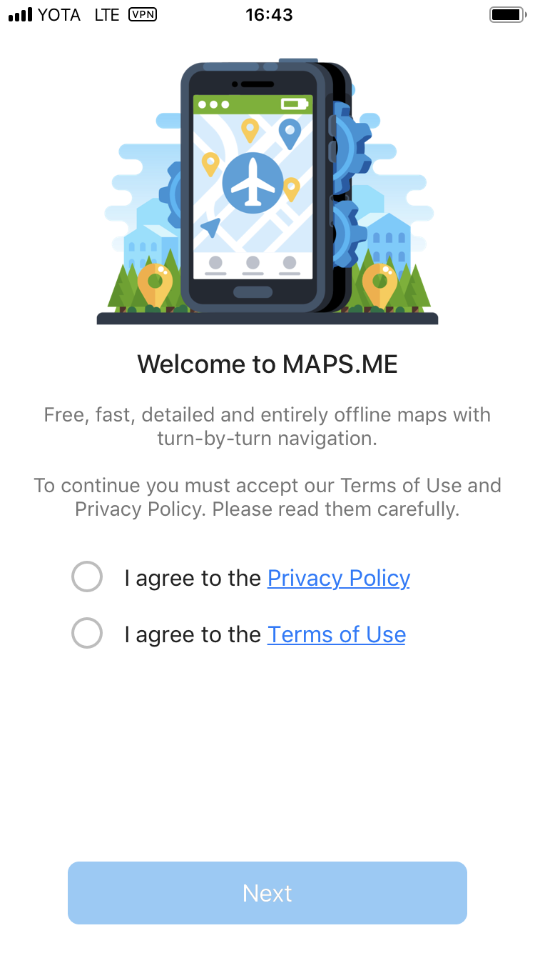
Do you agree to Privacy Policy OR Terms of Use?
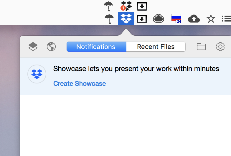
Dear Dropbox,
bright red notification means "something important". Your repeated attempts to upsell a feature I said NO to every month is not "something important".
You are a cloud file storage. Please, stop with this nonsense.
Yours truly,
paying customer for years.
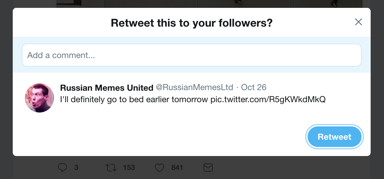
So Twitter has two modes of retweeting: with or without comment. They decided to implement this with an additional popup dialog. It sort of works, but adds unnecessary step which makes the process harder that it should be for both cases.
What they could’ve done instead is making two separate buttons, quick retweet and retweet with comment. This way quick retweet would be, well, quick, and retweet with comment would ask for a comment. Instead of asking for directions later, just make two quick shortcuts and everybody would be happy.