Grumpy Website


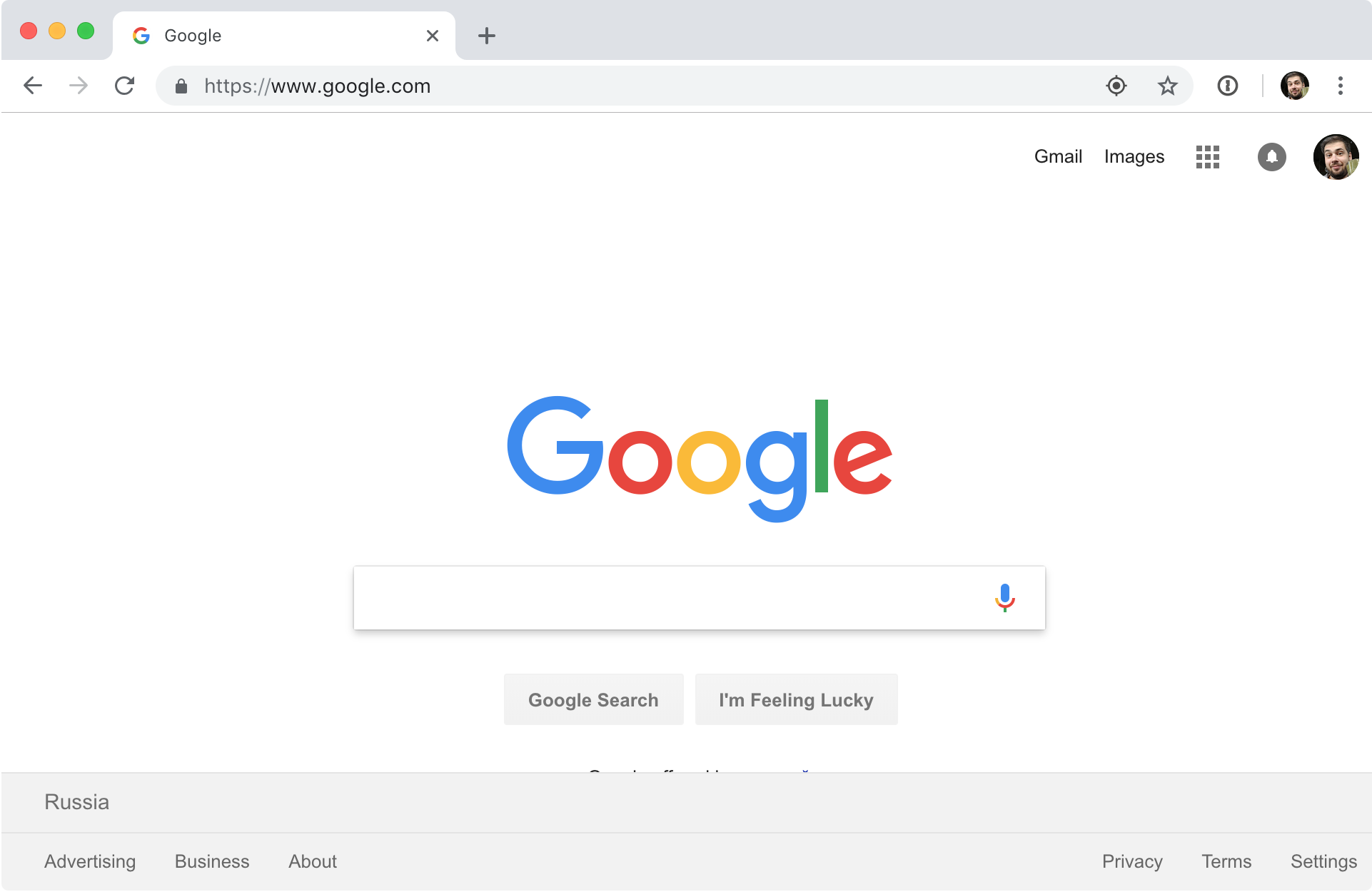
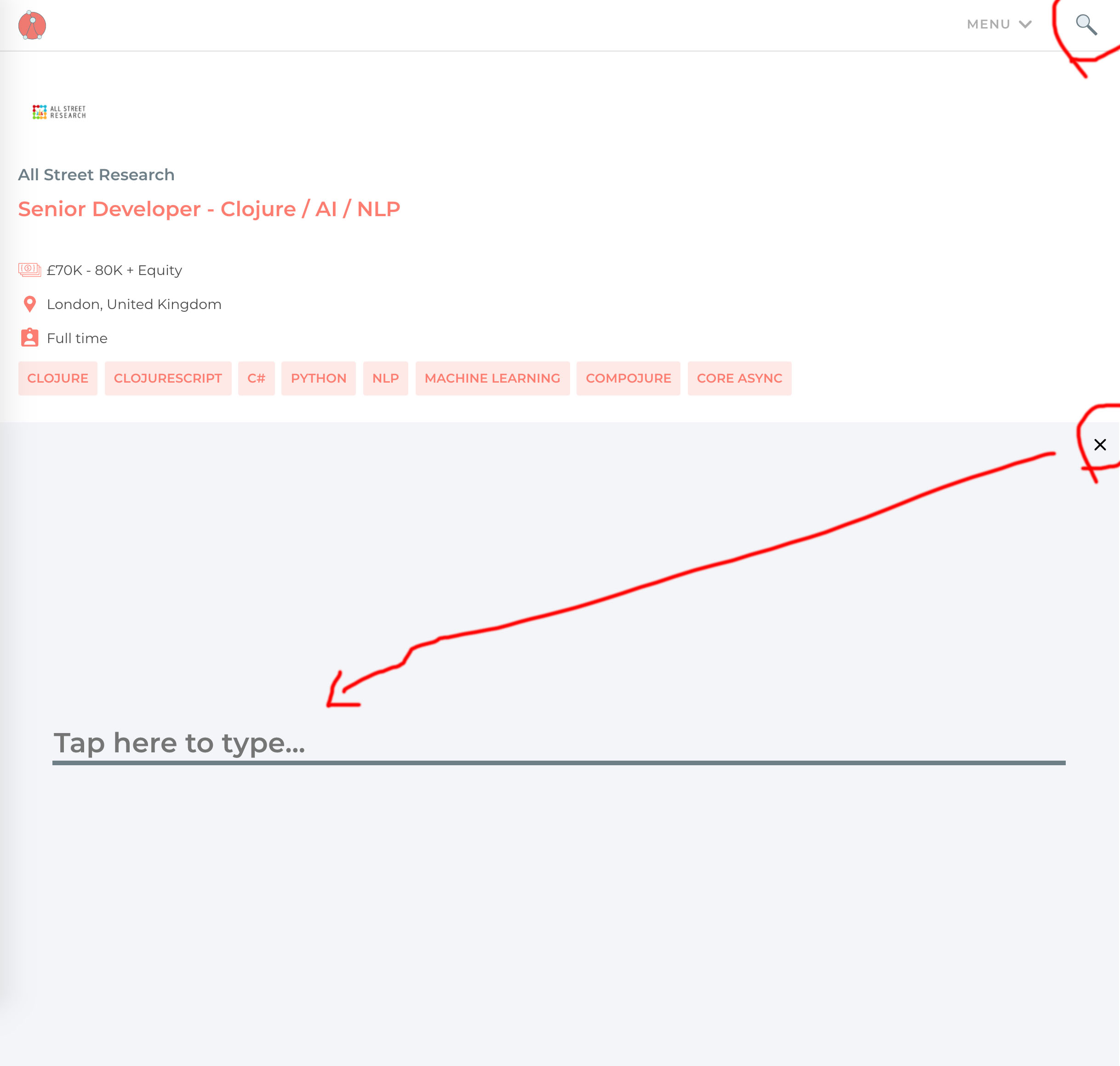
It's Functional Works again. Well, in 2018, how do UI developers make a search? A simple text input would be too primitive, of course. Let it be just a loupe button. By clicking on it, a huge popup appears obscuring literally everything on that page.

Just a reminder: this is all to prompt me for a query term which is one word in my case. One input = one screen on 1920x1080 monitor, great.

Now that you see that HUGE popup with a single input, you still cannot type anything because it is not focused! Yeah, you need to tap on it first or your text will go nowhere otherwise.

Remember, my mouse pointer left on the top right corner the last time I clicked on a loupe button. Now I need to cross the whole screen to reach the search input.

This is really insane.

One of the most annoying things across the internet is "Show more" or "Read more" buttons. It seems like every single service tries to lurk as much information as possible.

I regret to say, GitHub got into it too. Recently, they started to shrink everything: issue content, comments, etc. Literally, everything that is longer than a couple of sentences.

That is especially annoying when I know for sure that just one line or a couple of words were stolen. Who was that programmer who wrote such an ugly logic? Hide the last sentence of my text, that's madness!

For what reason, I wonder? Why cannot the system detect that if I click constantly on "show more", maybe it would be better to remove that feature? Or at least track my choice in cookies.

The thing is, scrolling the content is much easier than clicking on a small target. A scroll is cheaper in terms of efforts, especially today when we've got wide monitors and great touchpads. Hiding everything under a tiny element and forcing me to click on it is really a mockery.

Ok, Google, are you sure there are no other, more discrete colors than these almost similar shades of blue?

Chrome 69 brought new animation for favorite sites icons. They now fade in. Why? I don’t know.

There are animations and there are animations. New tab, for example, communicates clearly what’s going on: old ones shink, new one appears on the right. It’s quick, enjoyable and justified.

Site icons though are confusing. Why was the page empty in the first place? Where do icons come from? Why do we need it at all? Why is it so slow? Why do I need to be reminded of it every time I open a new tab?

It feels more like someone thought “animations are cool, so I’ll pick one at random and just add it, and everything will look cooler with it”. Well, it doesn’t work like that.

I don't know why but in Functional Works, they think even 1260 pixels is not enough to fit cards. Once I shrank my browser a bit, they re-render the whole layout leaving a huge amount of white space. Everything might have kept as-is without any changes. And of course, my scroll position was lost.

Hello, this is Java. We’ll put an update window that floats on top of everything else and that you can’t hide while we _download_ the update. BTW download might take a while (and it does take a while even on a 100 Mbps connection)

So Google is worried that Chrome isn’t personal enough. I get that. But as a user, I don’t want to see my own face on every page I browse. I’m well aware of how I look, thank you.

I mean, it’s just a browser. It’s supposed to be as transparent as possible. Stop making product out of it. I don’t want to engage with you. I don’t want features. I don’t want to “setup”, “personalize” or “use” it. I want Internet. I don’t want Google-branded internet. I don’t care what I use to browse it as long as it stays out of my way. Google. Please.

P.S. You might wonder why am I logged into search here? I wonder the same thing. Search is supposed to be simple—I ask question, you give me the answer. At no point my personal account comes into play. I don’t want to search using different accounts. I don’t want to “manage my searches”. I just want answers.

Now, Chrome, are you sure there’s definitely no space to make navigating this 2hr mp3 any more precise? Like make progress indicator any longer?

No, Disqus, YOU reload the page if this is required. Oh wait, you're not sure? I MAY need to do it?

Well, don't YOU know what happened? Are you a computer or what?!

First you create a horizontally scrollable galleries. Then you decide to add swipe navigation. As a result, when I swipe, one of two things might happen: I either scroll to the next photo or switch to another screen. There’s about 50% chance on _every_ interaction to get not what you wanted. Pretty bad.

Another downside of scroll navigation is that if you’re scrolling not perfectly vertical or your finger accidentally moved during the _vertical_ scroll, you might get punished for that with unwanted screen switch.

Pages:
155...3736353433323130...