
My favourite thing is when enlarge button actually shrinks an image. Thanks for the help!
My favourite thing is when enlarge button actually shrinks an image. Thanks for the help!
The idea of icons is to anticipate what will happen. This is called affordance. If you draw an arrow pointing downward, people expect popup to appear below. If you really want the popup to appear from the right, maybe don’t draw anything? Just leave a link

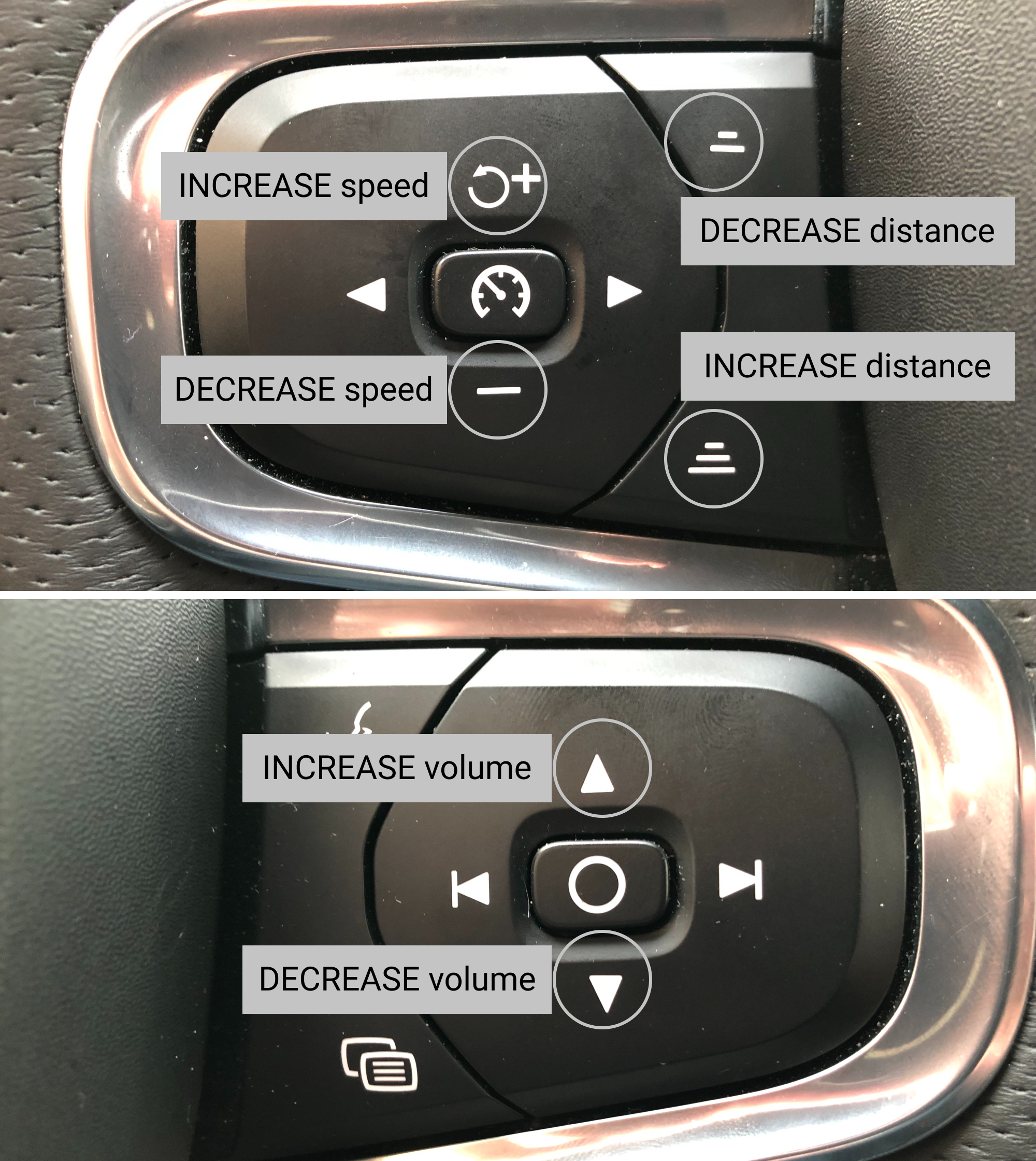
While we are on the subject of cars. These are the buttons on the steering wheel in a Volvo car.
The symbols in the middle are for a so called IntelliSafe Assist: it assists the driver to keep a certain distance from and speed of the vehicle ahead.
The other buttons which you use very often work in a simple fashion: up means increase, down means decrease. You use them often enough that this becomes second nature. Up == increase. Down == decrease.
Except for the IntelliSafe buttons. Up means decrease, and down means increase. I understand the thinking behind such a decision. Down is also associated with "back", so when you press down, your car "moves back" and the distance increases. You press up, the car "moves forward" and the distance decreases.
However, since every single element on the steering wheel (and elsewhere in the car) uses "up" for "increase", and "down" for "decrease" this particular element is baffling and its behaviour is confusing.
We don't often talk about the design of things in real life. And we should. Especially when it comes to cars.
Most modern in-car systems are clearly designed by people who have never been inside a car. For the longest time ever Volvo cars have been an exception, but even they succumbed to the Curse of the Touch Screen.
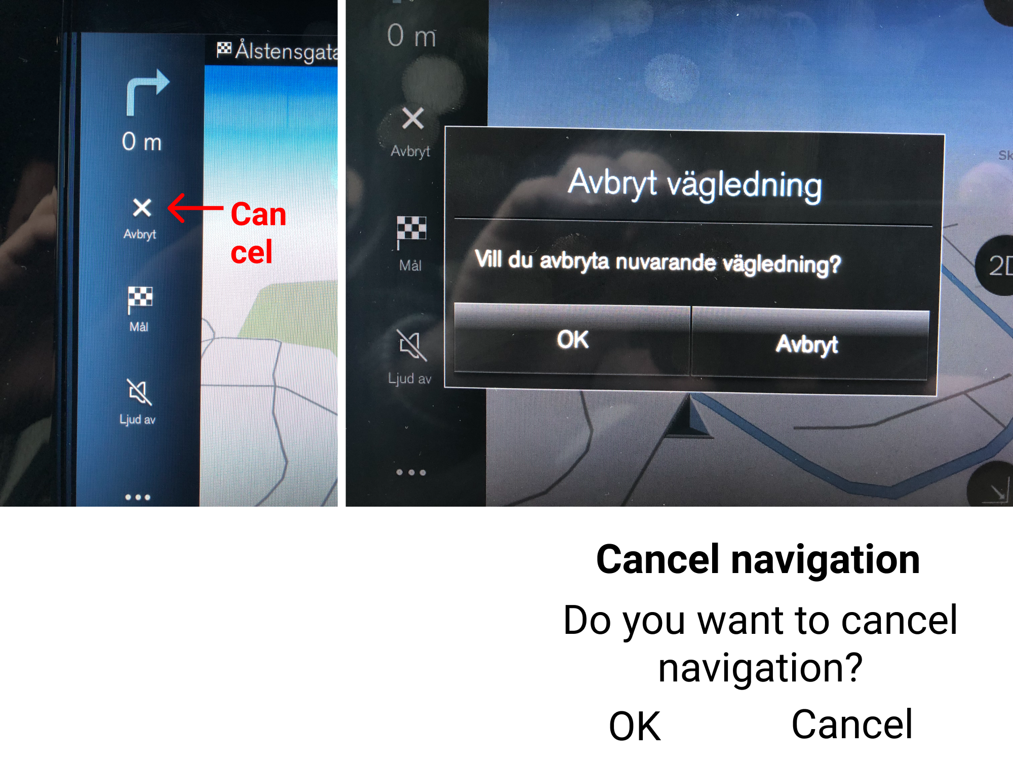
Quite often as you're near your destination you no longer need navigation assistance and you turn it off. This is what happens in a modern Volvo car. Note that none of the click/touch targets are large enough to safely operate with a finger in a moving car. Neither are texts.
- You click "Cancel"
- A confirmation dialog pops up which displays the following: "Cancel navigation. Do you want to cancel navigation? OK / Cancel".
Count how many times the word "cancel" appears in all these interactions. Even your own *intent* is to *cancel navigation*. Naturally, since you can't take the eyes of the road for too long, you click cancel. The dialog is dismissed, and the navigation is *not* canceled.
You have to read the text and/or realise that you have to click OK instead.
A simple solution? Two big buttons labeled: "Cancel navigation" / "No, continue navigation".
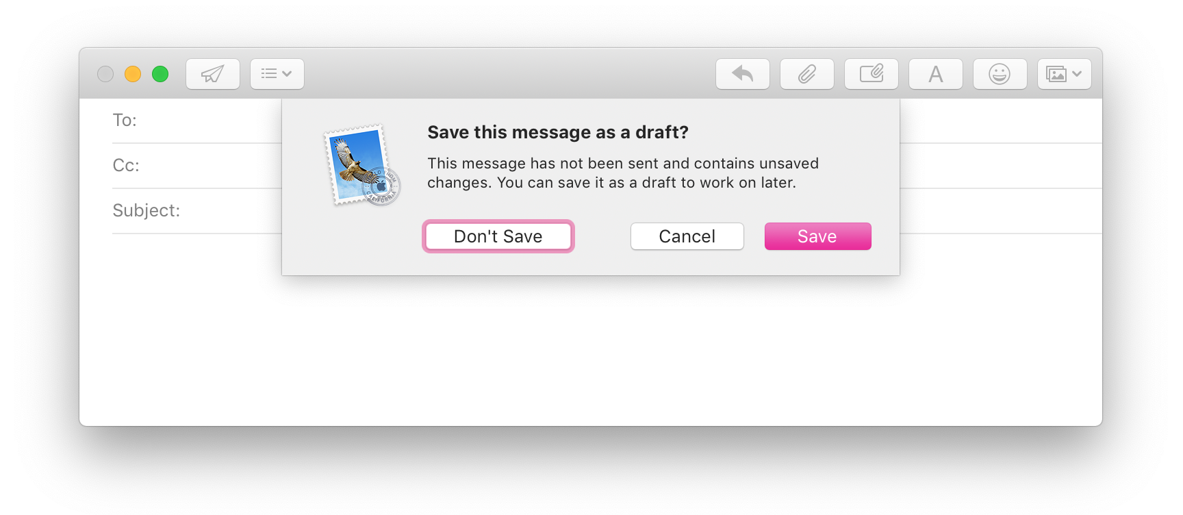
Always consider context of your actions. _Technically_ you can save an empty draft, but why would you want to?
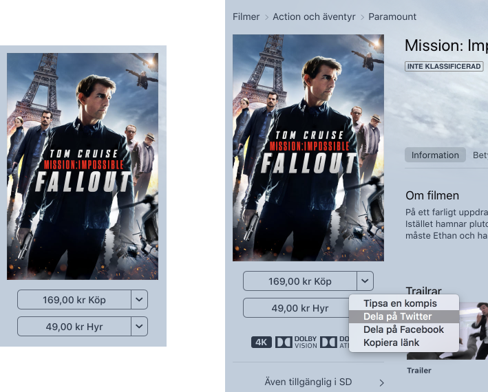
Let's talk about Apple's famous attention to details in UI/UX design.
This is an iTunes page with what is clearly two dropdowns: "169 kr Buy" and "49 kr Rent". Over 30 years of GUIs have taught us to recognize this as a dropdown.
Think different!
The texts are buttons. They will respectively buy or rent a movie.
The drop-down arrow opens a menu which has zero connection to the price, or the buy/rent actions. It contains the following: Recommend to a friend, Share on Twitter, Share on Facebook, Copy Link.
It takes courage to do the unexpected or something...
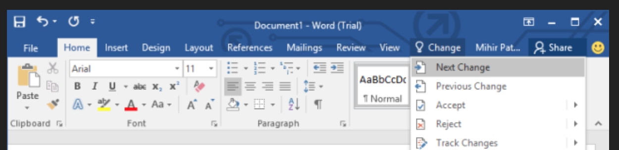
Modern Word has a couple of buttons in the left corner of window titlebar (save, undo, redo?). On one hand, it’s a great place for a couple of actions: empty space, always accessible. On the other, though, it’s almost like they cement the helplessness of the Ribbon: they dedicated huge portion of the screen to the myriad of icons but can’t find a place for three more.
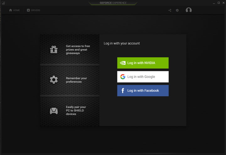
still can’t believe you have to login to your own video driver
If you’re making Read more/Show more link, make sure the link itself takes less space (i.e. saves you some space) than the content you’re hiding.
Thx @apust for the image
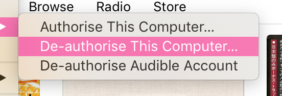
so... If I can both authorize and de-authorize this computer, which state is it in right now? Quantum superposition?