
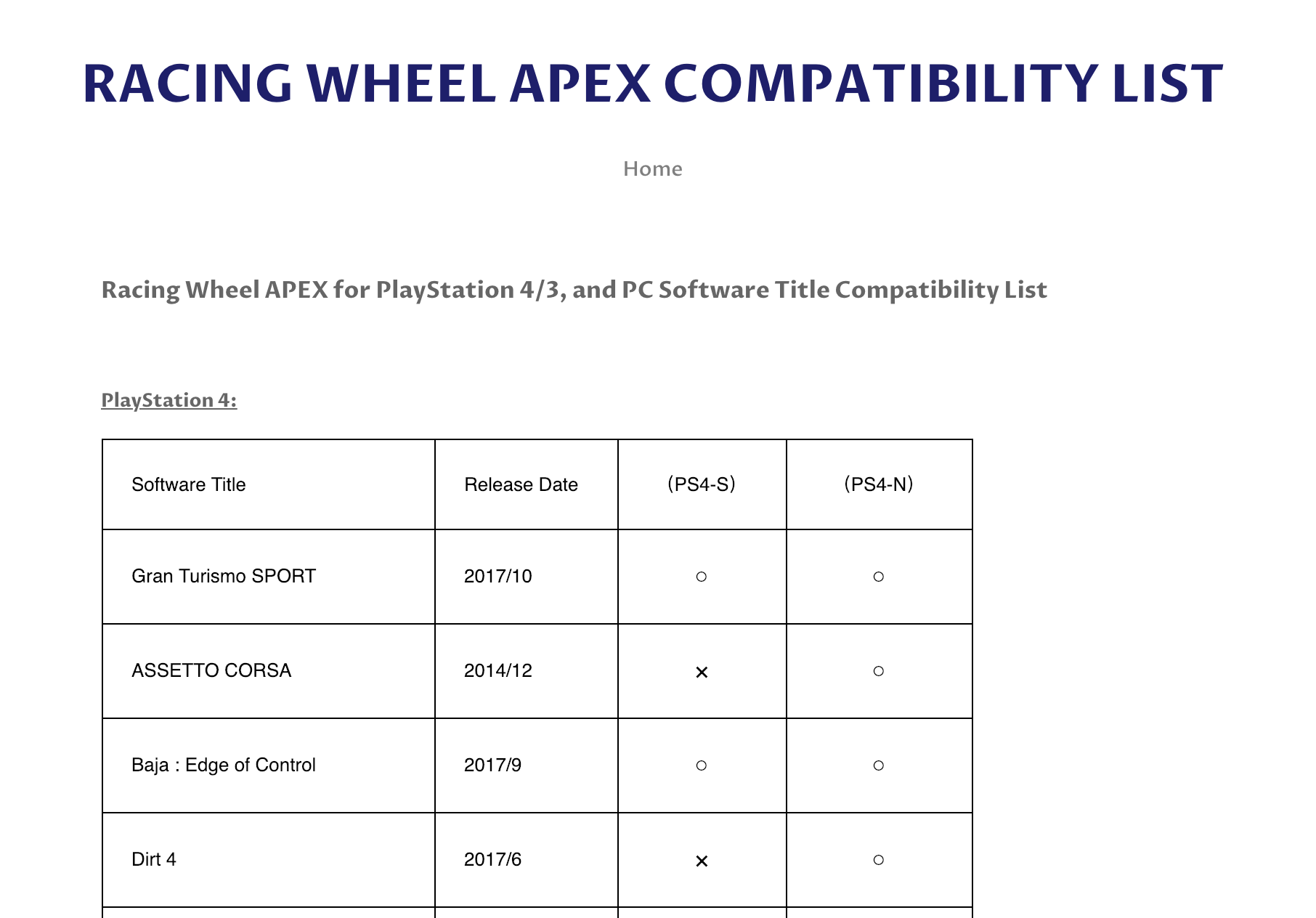
The creator of this table had one job. Maybe it's just me, but I have no idea what these icons mean. Does x mean "no"? Oh, wait, empty circle is kind of like zero, so it must be "no"... Or?..
The creator of this table had one job. Maybe it's just me, but I have no idea what these icons mean. Does x mean "no"? Oh, wait, empty circle is kind of like zero, so it must be "no"... Or?..

Netflix Apple TV app is getting worse and worse. The current version loads for a solid 30 seconds and then shows an ad on the user selection screen.
This screen is bad in itself: I MUST click on my name even though it's the only name. How often do I need to "Add profile", really? Why do I see this every single day?
Now we have ads here. Who's watching Netflix? Rakhim? Or Roma?
The worst part is that I have no idea what this is. Is it a new movie? A show? I can't go to this title neither from this screen nor from any other. If gods of random ab-testing shine on me today, then I'll see this new title on the homepage, but reload the app and it's lost, since they scramble everything like shady illegal street gamblers.
God, do I hate this app. I can safely say Netlix is one of the worst user experiences I ever had.

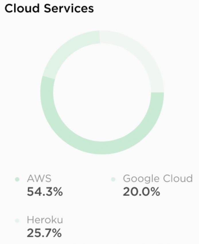
Using similar colors for on a diagram is not a good idea. Using SAME color is even worse one.
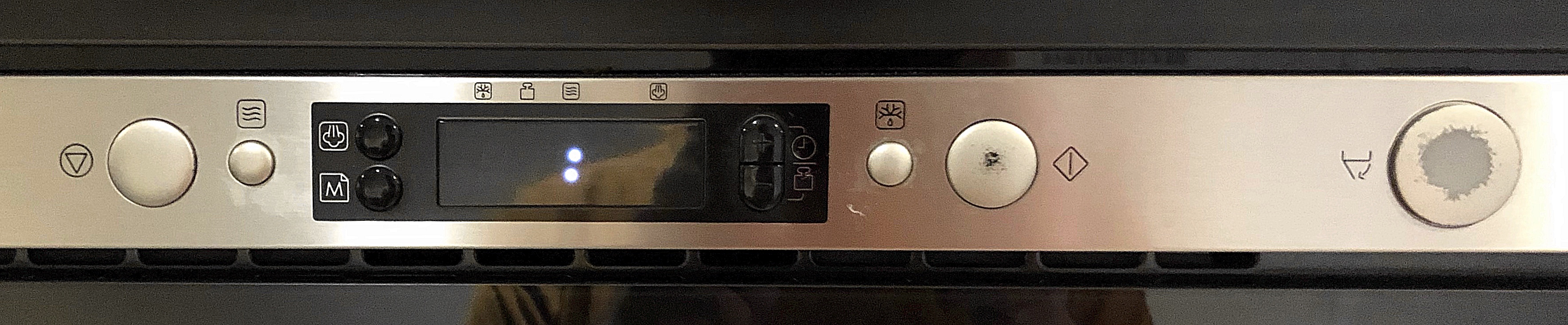
Let’s play a game. This is a control panel of a microwave oven. Can you guess which icons do what?
From left to right:
- Bottom-up triangle in a circle?
- Waves? Wind? In a box.
- Steam? Jellyfish?
- M in a document. Is it for Markdown?
- Clock. I guess it’s for setting time.
- Scales weight. Can it measure my weight?
- Deer antlers with a drop of water beneath them. I have no idea at this point.
- Rhombus with a vertical line?
- Something with a bottom falling out. Is it for auto-disposing badly cooked food? Apparently it’s also a most often used button.
Click on an image to open it full-size.
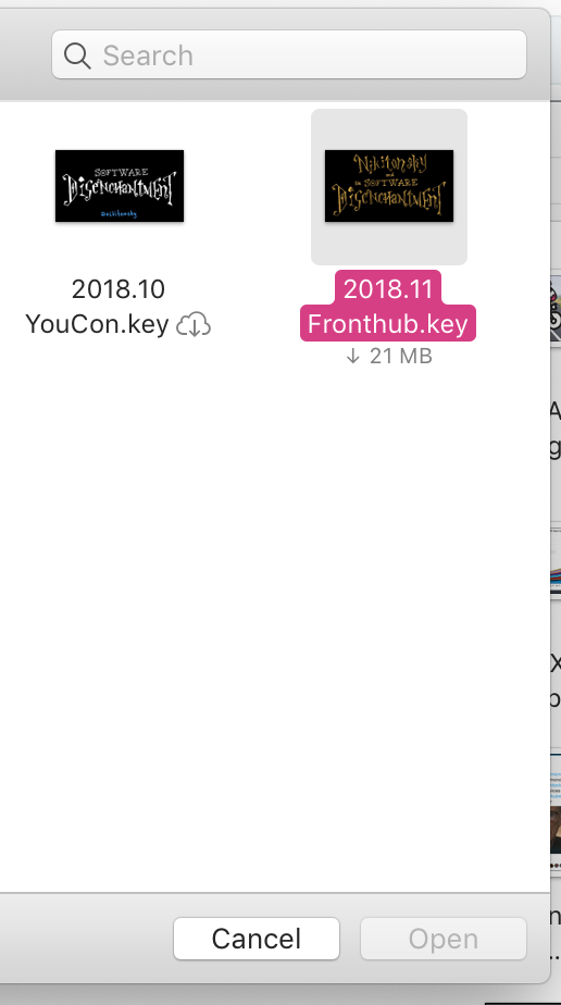
“Open” button is disabled while the file is “in the cloud”. What am I supposed to do then? Apparently I have to double-click the file and it starts doing something (I suspect downloading) and some time after it’ll enable Open button for you. With no clear indication of what’s going on or how to get there. Come on, Apple, even Download file in Safari is integrated into Finder better
This youtube popup. You click on a value and then have to go all the way to the right and down to click save. Why? Why not apply and close on change? Smart people invented an idiom exactly for this task: dropdown.

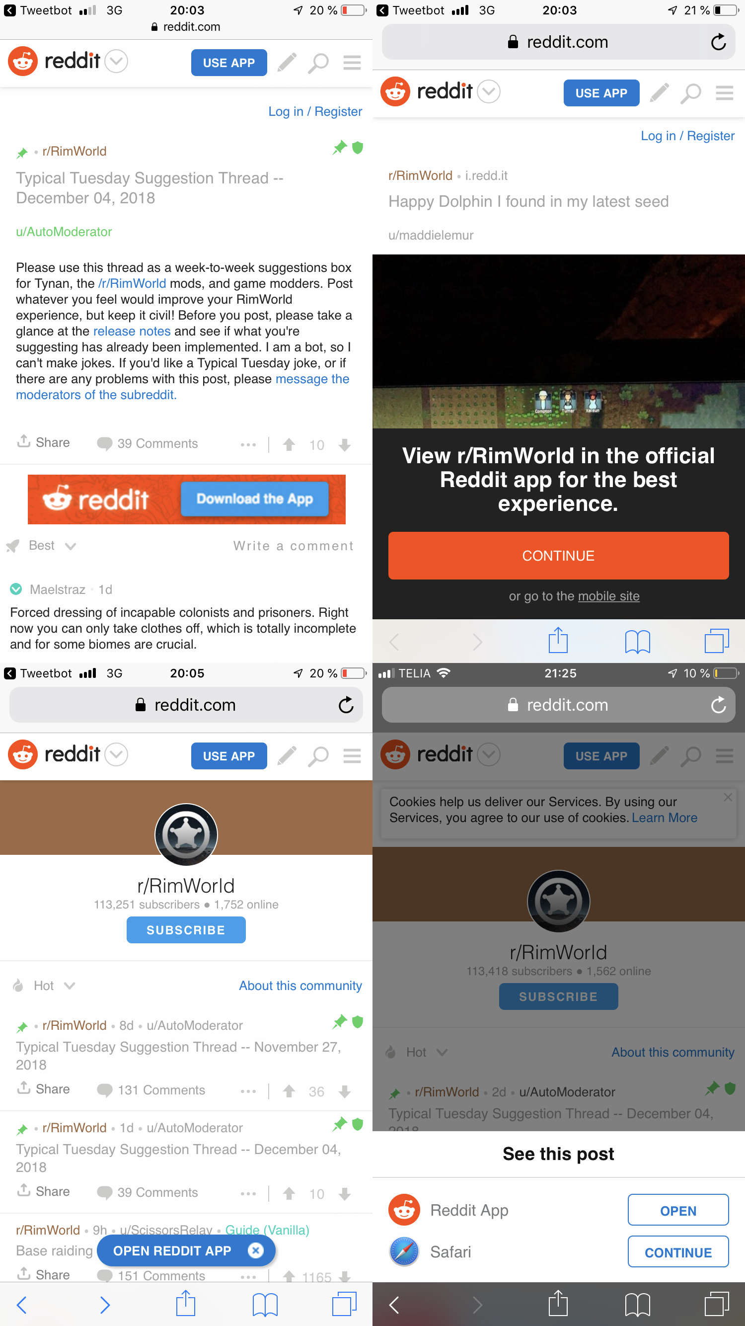
We get it, *download our app* Reddit. We really *try the app* truly do get it *open in our app* that you *open app* want us *app* to *mobile app* use *official app* your mobile app.
If only you used that cookie consent to save the preference that no, I don't want your mobile app, and that I've already said no to the thousand or so banners.
*Open app*

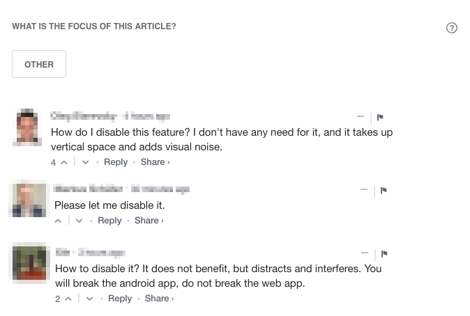
Feedly has just shipped a new feature which asks me what was the focus of that article. Well, that's a mess. That damn widget now hangs below each post. Surely, there is no "leave me alone" button. Go to the deepness of settings and find it by yourself.
Next, Feedly clearly says, the feature works for English only. What's the point to show it for non-English feeds then? It's plain to check whether the language is English or not.
The only available tag "other" looks like a mockery. OK so I press "other", are you happy now? Did it give you more data to analyze?
Finally, I don't feel good about solving that puzzles. Google captcha has been enough. Go train your neural network or text recognition engine, but leave the users alone. We'd like to read text, but not recognize something.
For a minute, check what your users think about it.
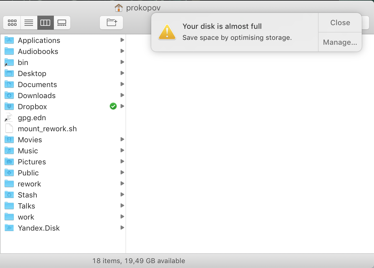
MacOS, let’s not notify me when my disk is almost full. Let’s notify me when it actually runs low on space. 20 Gb free might be less than 10% of its size but it’s still 20 Gb!!! Why should I be worried when there are 20 MORE GBS free??? What are you planning to put there?
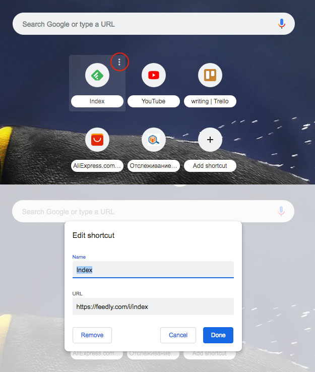
Some sort of inconsistency is here. Usually, those three dots open a popup window, don't they? Instead, there is only a single edit action behind it. Were they put in advance maybe?