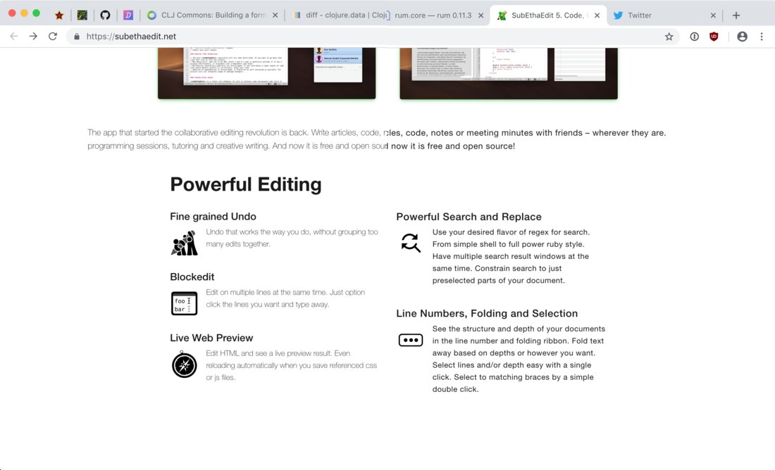
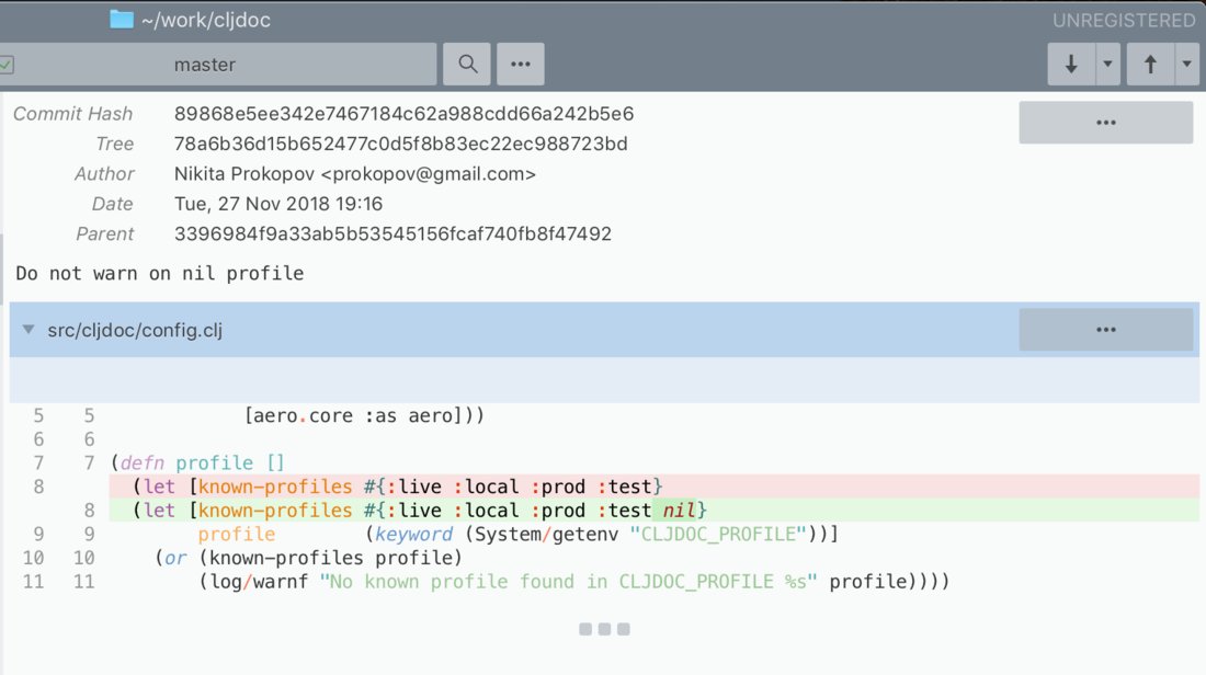
Don’t use font-weight: 300 for body copy. It’s too thin to be read comfortably. Designers like it because it pages look “lighter”, but it hurts those who would like to know what’s actually written there.
font-weight: 400 is default for a reason—it was carefully chosen to be most comfortable to read. Font designer spent, let’s say, 6 month fine-tuning every letter and every letter combination in her font. Don’t make a decision only because you’ve looked at it 30 seconds and feel it looks “cleaner”.
(click on a picture to see it full-size)
Creating a streaming event on YouTube is stressful. Pick your date and time, then make sure it didn't go back to "Today - Now" silently after you change some unrelated setting.
Also, yes, you have to click on a date twice for it to actually change.
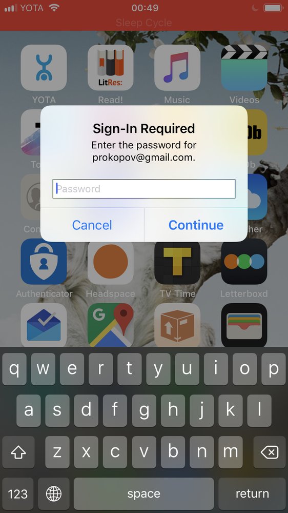
Well this is annoying. Some app has been begging me to enter my password for Google account. In a nameless popup over everything else. With no way to figure out which app it is for. Suspicious as hell.
UPD: seems it was Apple asking for Apple ID (got that by intentionally entering wrong password). How the hell was I supposed to figure that out?
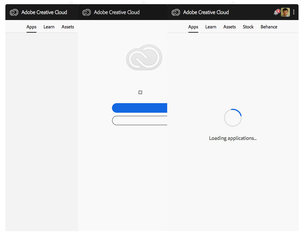
Adobe App Manager is really is a piece of shit, I cannot tolerate it anymore. It's slow, tough and rigid. The first time it starts, it shows just a blank page. The second time, there is something completely broken without any sense. Seems like some CSS files a missing or whatever. An endless spinner hangs for the third time I re-started it. After a number of times the manager has been restarted, I could finally see a list of installed app. Congrats!