Grumpy Website


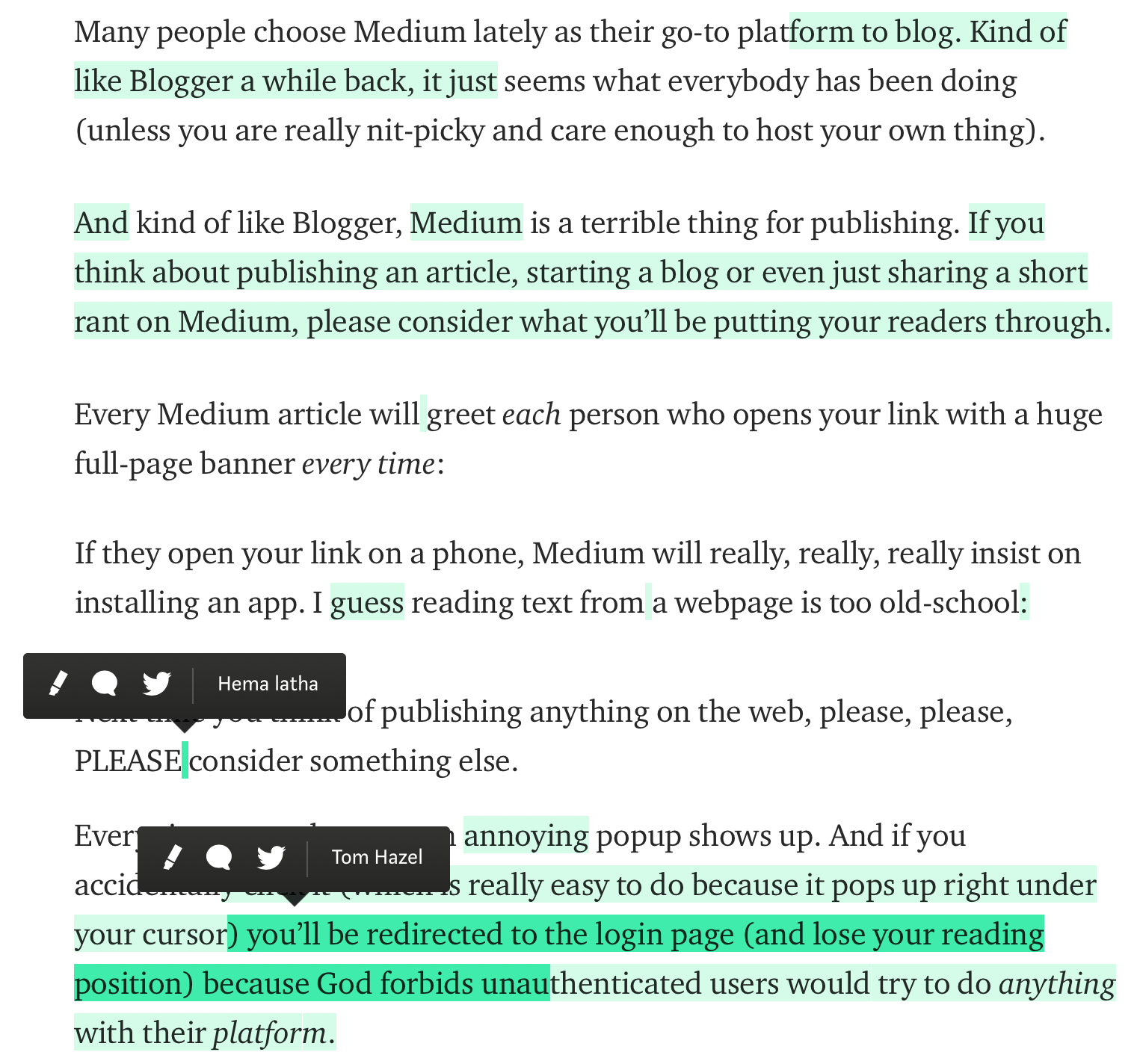
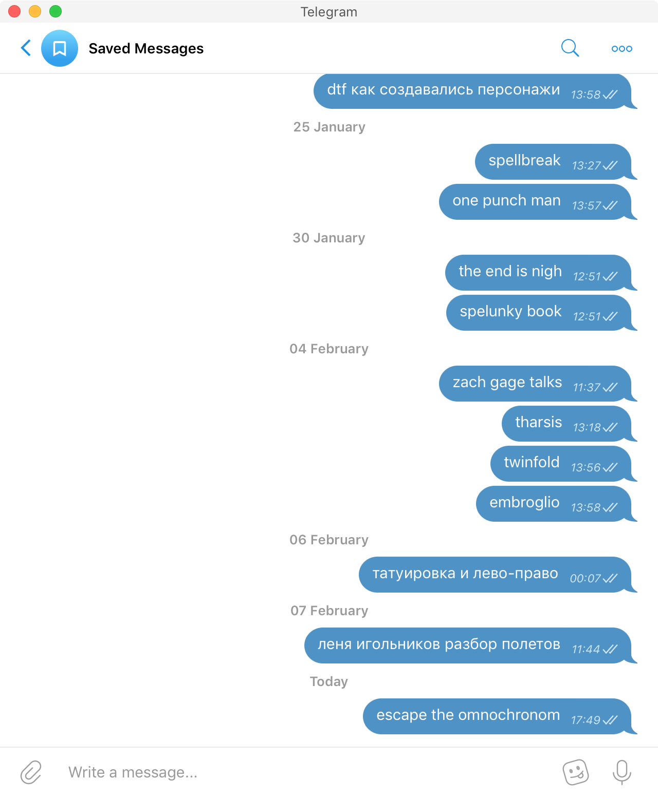
No note-taking application ever stuck with me for extended period of time. Telegram’s Saved messages (just a chat with yourself, really) is the first one I actually use. For two reasons:

1. I really hate having multiple lists. How to organize them properly? How many do I need? Where to look for the information when I need it? I hate making those decisions.

2. You can’t edit the past. In normal notes you have to go over your records periodically and decide what to clean up. But you never know when it’s the right moment to delete a record: delete it too soon and you might need it later, leave it for late and you keep seeing it even though you might never need it.

In Telegram it’s fire-and-forget, you are never bothered with cleaning up. Perfect for stuff you want to look up eventually but not important too much.

Leading Russian design studio, like many other sites before them, just added on-scroll header. And I still don’t get it.

Do they imagine people regularly need to go to the completely different section of the site while being in the middle of the article? How often does it happen?

Then, even if somebody actually need this menu, are you sure people would be aware how to summon it? To scroll up and wait a second for it to appear? With no clear indication that it’s there, with no on-screen control to call it?

Or is it more likely for a visitor to accidentally scroll up or decide to go back a few sentences or take another look at the picture she just saw? And that innocent desire that is much more commonplace (as I imagine) triggers the whole hell of animations and activity nobody has asked for.

How does all this make sense again?

If you consider making a glossary, consider sorting terms by their appearance on the page (left-to-right, top-to-bottom), NOT sorting terms by alphabet. Will make studying the picture much easier.

Even better if you could put terms directly into the picture.

Can I just say that for websites to require gaming-grade videocard just to browse a few pictures is not ok? I guess the reason we see more and more “designer” websites struggling to scroll even on a decent macbook pro is that designers have top-of-the-line workstations and never test it on consumer devices? All those sites are good for are to show them to your fellow designers, but that’s about it

Below, there is a Resident Evil 4 inventory. It's a metal case split on mini-slots. Each item takes its own number of slots depending on its nature. A gun would definitely take five times more room than an aid spray and it's quite realistic. Look how solid and bright is everything. There is no an auto-sort button. I've spent a long time sorting everything manually, for example when an optical sight takes three slots and thus doesn't fit next to items that multiply by two. Yet it's a lovely routine.

In some of the next Resident Evil episodes, the inventory reduced to a dull cell of slots. Now there is a primitive rule "one slot = one item" which is just silly. You've got to choose whether to put an egg or a flamethrower into that slot. What is worse, the icons are small and do not express their items well. You cannot stare and admire your secret gun anymore. Everything is standard and fit one slot. Boring!

All chocolate bars open from the back. But! When you open it, you see the back of the bar itself. Why? If you know it will always be opened (and often eat) from that side, why not turn it over so that you see the front when you open it?

Guess what QR-code you should use to get on the Moscow airport train. Either one? Guess again.

As an author on Medium, I get to see what people highlight. It seems that in roughly 50% the highlighting is accidental: it’s random words, or parts of the sentence starting in the middle of a word, or even whitespace between words. Which means that annoying popup Medium has when you select text doesn’t really work and lead to error in ~50% cases. Is it a good design? I don’t know. I don’t think so.

Each website needs a safe area to scroll. Here, everything is filled with content (which is good, usually) but wherever I place my mouse it will trigger annoying hovers as I scroll. Another lesson here, I guess: hovers are annoying

Hello! We’re Black Ember. Here in California we make pictures so big they won’t fit on your screen. Well, they actually would, but we decided to cover a third of your screen with our logo on a huge white header. Hope you love to scroll. Enjoy!

Pages:
155...4544434241403938...