Grumpy Website


I guess now I have to explain how some basic controls should work. Here we have apple.com-style gallery switcher. Things to know about it:

- It exists to entertain users by changing static content from time to time, basically by showing variations of the same thing. It means don’t hide important info under there. Don’t expect users to read through it all.

- Each dot is supposed to turn the whole page, not advance items one-by-one. If I showed interest, made an effort and clicked to see more, I don’t want to see items I’ve already seen. There’s no point in showing “only one more item”.

- These dots are so small it’s ridiculous to think people will click on them. Dots are more for indication, not for control.

- Which means you need an alternative control to turn the page. It might be autoscroll or huge previous/next arrows on the sides.

Hope this helps!

It's hard to overstate just how incompetent Twitter is at ... everything. If this website ever gets tags, [twitter] will have the most content.

In our show today: opening a single tweet.

When you open a single tweet, you will only see three comments. A small "see more tweets" link, and "More tweets" whose relevance is exactly zero.

Then you click "see more tweets" expecting to see more tweets. Oh, no. The page will reset, and you'll have to scroll past the tweet you've already seen and past the comments you've already seen, too.

Because, in Twitter's mind, that's exactly how people want to consume content.

Why even put a search _field_ on a page if you have to type in a completely different place?

Also, why show it as blank if you keep actual field populated???

Thx @obryant666 for the video

On the web, the whole window MUST scroll. Don’t let anyone tell you any different

Thanks @balcitom for the video

Pictures have size. As a rule of thumb, every part of picture is as important as every other. Otherwise, why would it be there? That’s why cropping pictures leads nowhere. I mean, yes, your page looks tidy and organized now, but what’s the point if I can’t see content? And I came for the content, not for the clean and tidy page, damn it! Besides, it’s not like there’s lack of vertical space in infinite vertical timeline, you know?

P.S. It’s double terrible because crop means you have to click on a picture, and clicking on a picture makes you lose everything! See grumpy.website/post/0TRVXIFch

this fun thing happened

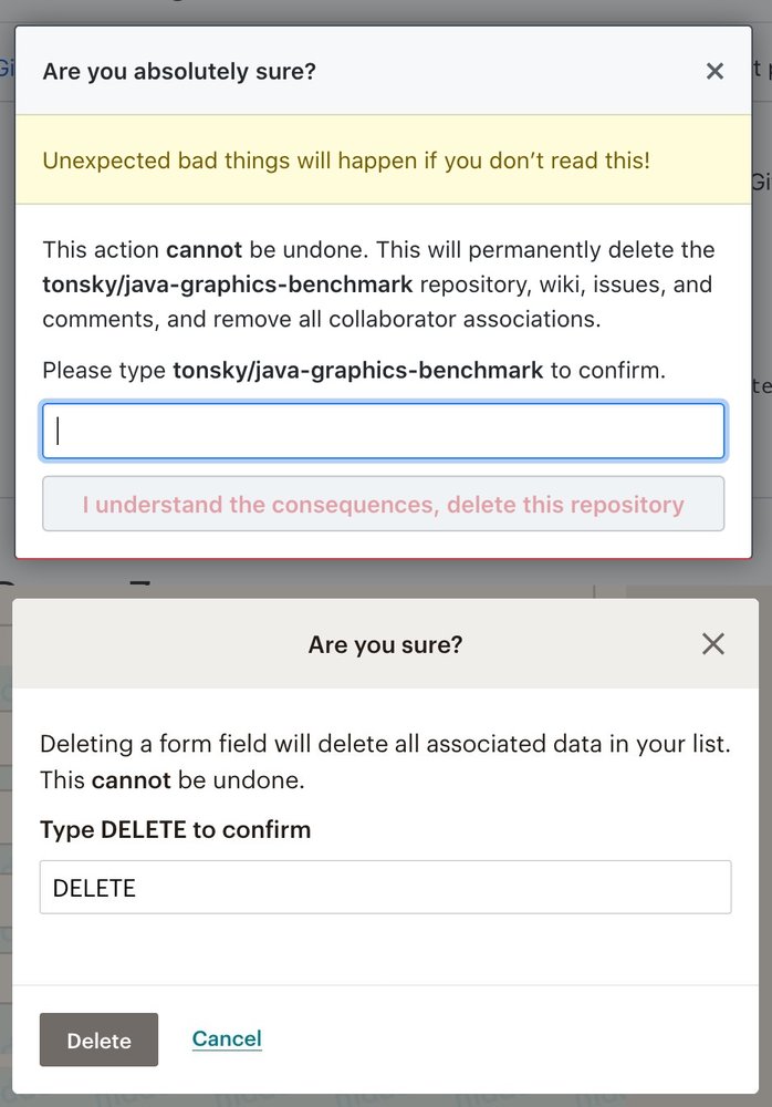
Github asks you to type the name of the repo you want to delete. To make sure you are deleting what you were going to delete, not something else.

Mailchimp copied the idea, but asked you to just type the word “Delete”. So it’s basically a poor way to ask “Are you sure?”, without really making sure you know what you’re doing and e.g. not deleting the wrong field. They don’t even have the name of the field on the screen!

Also notice how Github’s button is big, red and dangerous, but Mailchimp has Cancel button right next to delete, which is slightly dangerous, but in a bad sense.

Be like Github. Don’t be like MailChimp.

Thanks @AdrianSieber for the MailChimp picture.

Photos selection as implemented by Facebook on iOS

That useless animation at the bottom? While it's animating, you can't scroll. Because... reasons?

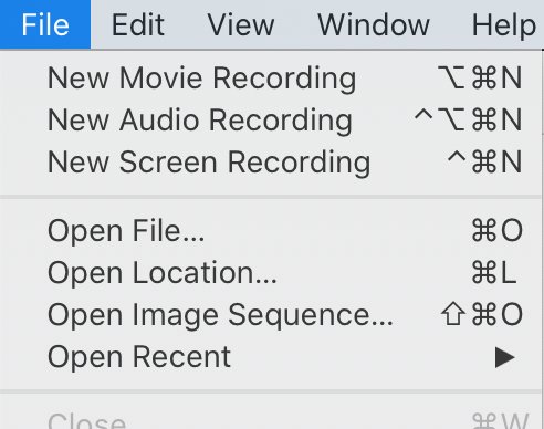
very helpful icons, thank you

I like the mnemonics. Option-Command-“N” for “M”ovie, Control-Option-Command-“N” for “A”udio, Control-Command-“N” for “S”creen. Easy to remember!

Pages:
155...7877767574737271...