Grumpy Website


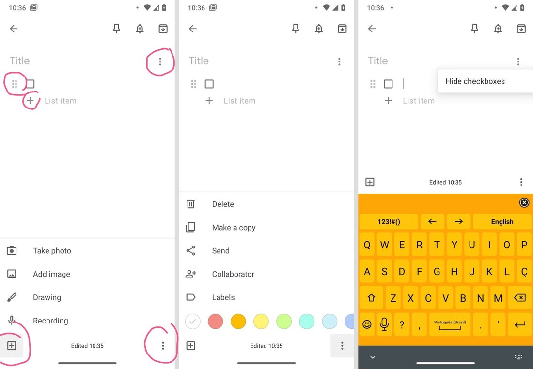
Corners are important. That’s why EVERY corner must have a dropdown menu, with different, arbitrary split, sometimes repeated, set of options.

The rule is simple: one dropdown menu for everything you can’t find place for. Don’t be smart, don’t try to group or categorize your options. You might be thinking logically but users are too impatient to figure your logic out.

Another abuser: grumpy.website/post/0OgGDdk3G

Thanks @souenzzo for pictures for this post

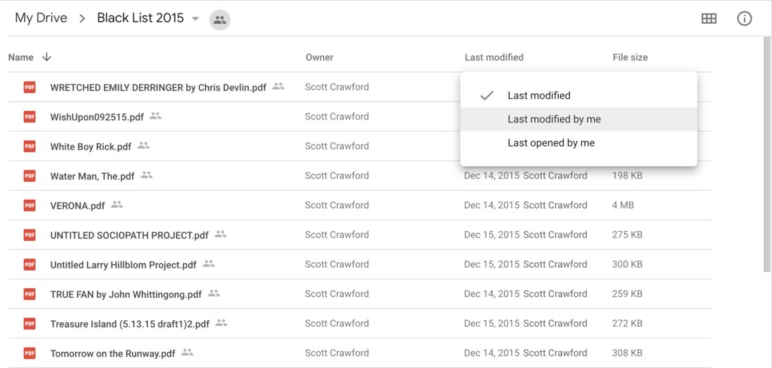
Simple table view is only simple if not designed by Google:

- Header #1 (Name): Changes the sorting from ASC to DESC

- Header #2 and #4 (Owner/File size): do nothing. Can’t sort by them because reasons

- Header #3 (Last Modified): change the type of information you want to see in the column

Thanks @Cypressious for reporting this.

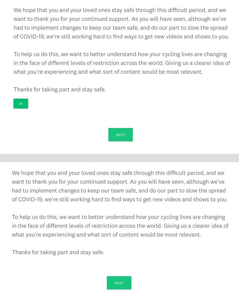
Pressing “OK” does nothing but making that button disappear.

Thanks @grandomeur for the picture

What always amazes me is the lengths to which a company will go to hide information, and the lengths to which it will go to create complex workarounds to show it again.

This is Jira's new design (not to be confused with last year's new design, or with the pervious years' new designs).

When you go into ticket details, all dates are relative. Because remember folks, there's no difference between a shitty social network such as Twitter or Facebook and a productivity/developer tool.

But wait! They *know* it's not what people want. So there's a helpful tooltip to show the actual date.

But wait! They *know* it's still not what people want, so now you can click it and it will convert to actual dates.

But wait! They *know* this is the actual thing people want. That's why there's no tooltip on the actual dates saying "X seconds/days ago".

And yes, these pretend to be links when you hover on them (because yes, a pointer cursor means a link). And of course they are not. To add insult to injury, you are reasonably expecting a permalink to this comment here. Of course, they just removed permalinks to comments entirely.

And yes, your choice doesn't persist. Click to show proper dates, close ticket details, open details again, we're back to relative dates.

And just think how much work went into this: calculate relative dates in real time, click handlers that keep track of all dates on the page and change them back and forth, tooltips with actual dates etc. etc. Probably took two months to design, and two weeks to implement. When it could've just been a regular date.

via @ashaeron

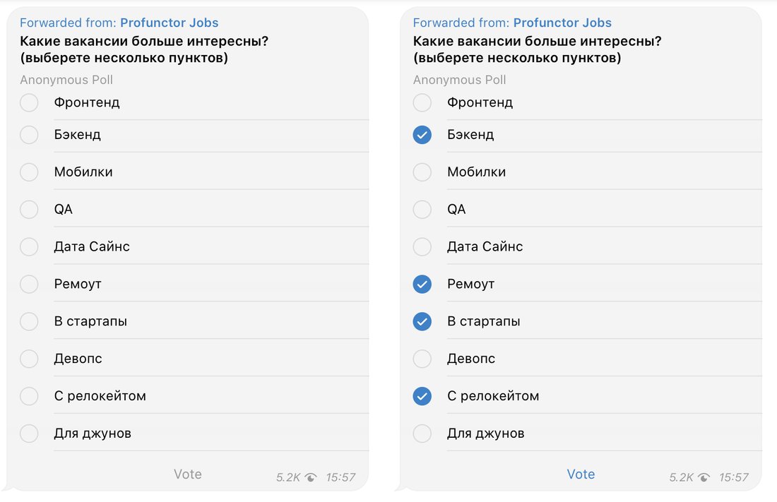
I was going to say: No, you can’t make checkboxes round. They look like radio buttons then! But after yesterday’s post grumpy.website/post/0TbjHl1lR, you know, if we are breaking all the conventions, at least thanks for the checkmarks, I guess?

Ok Premiere, you got me. Which one is selected?

No amount of three-dotted icons is enough

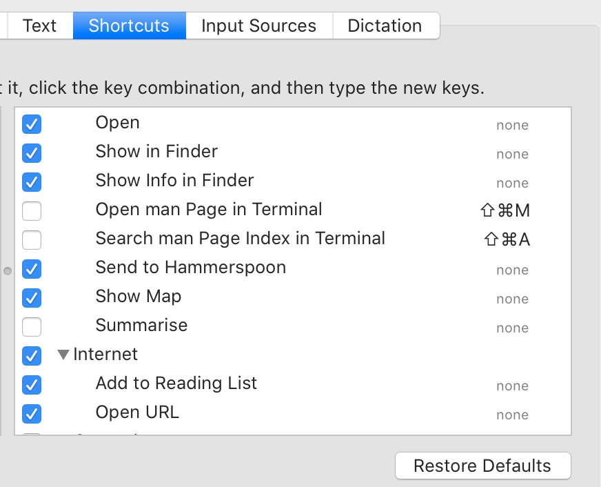
Ambiguous checkboxes. If shortcut is enabled but has no key assigned to it, is it really enabled?

if you call the link “Package tracking”, you won’t have to explain it. You know

Congrats Apple. You are at a point when you can't even make a functioning ToDo list.

Yup, when you press Enter on a todo item, it syncs with iCloud and resets the view. It doesn't do this on iOS. Though it takes a second or two to sync the item and become responsive again on iOS...

Pages:
160...8079787776757473...