
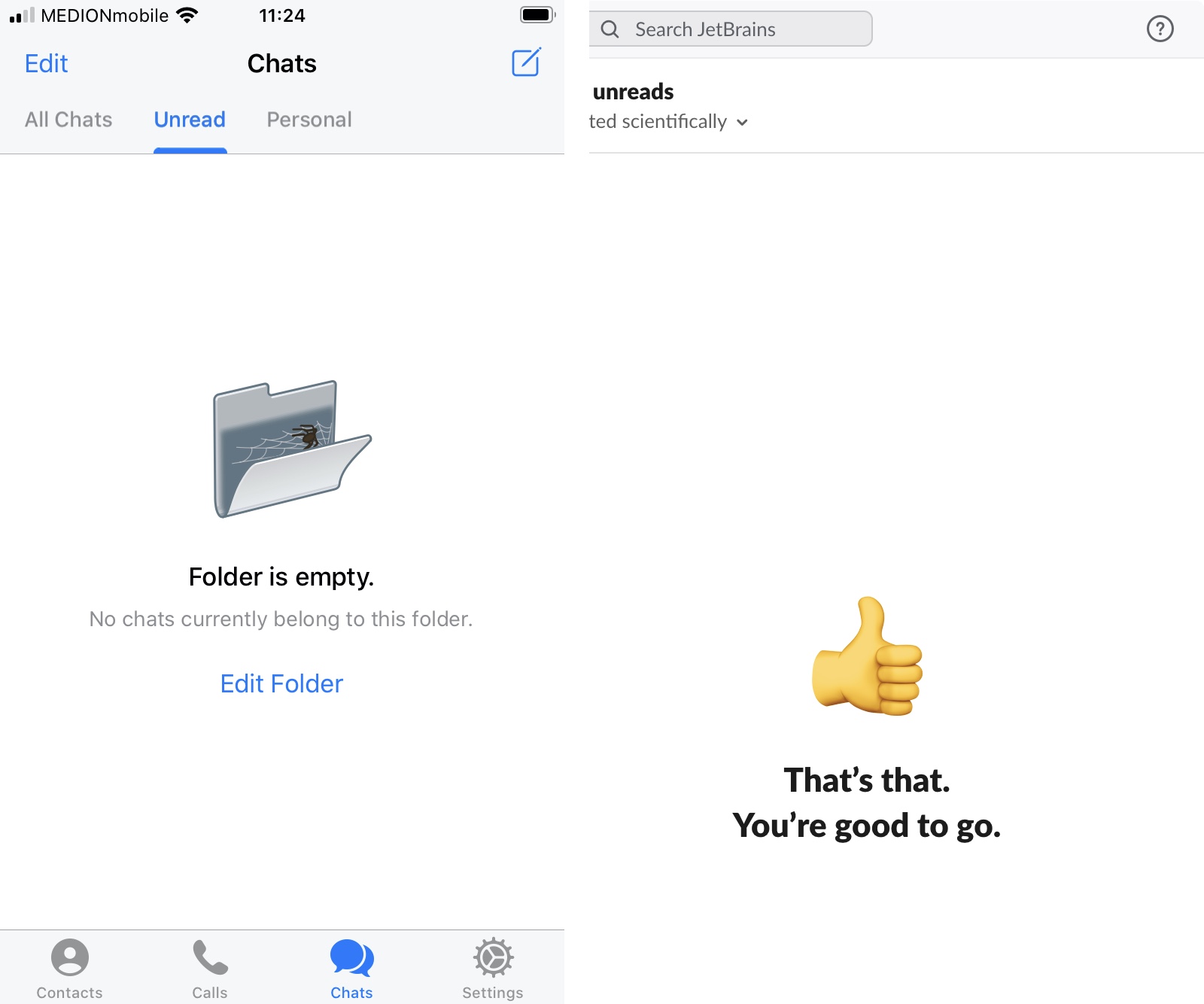
Left: Not the best choice for empty state icon. It suggests that your folder is so dirty that there are webs and spiders living underneath all those unread messages.
Right: happy and encouraging empty state. Much better.
Left: Not the best choice for empty state icon. It suggests that your folder is so dirty that there are webs and spiders living underneath all those unread messages.
Right: happy and encouraging empty state. Much better.
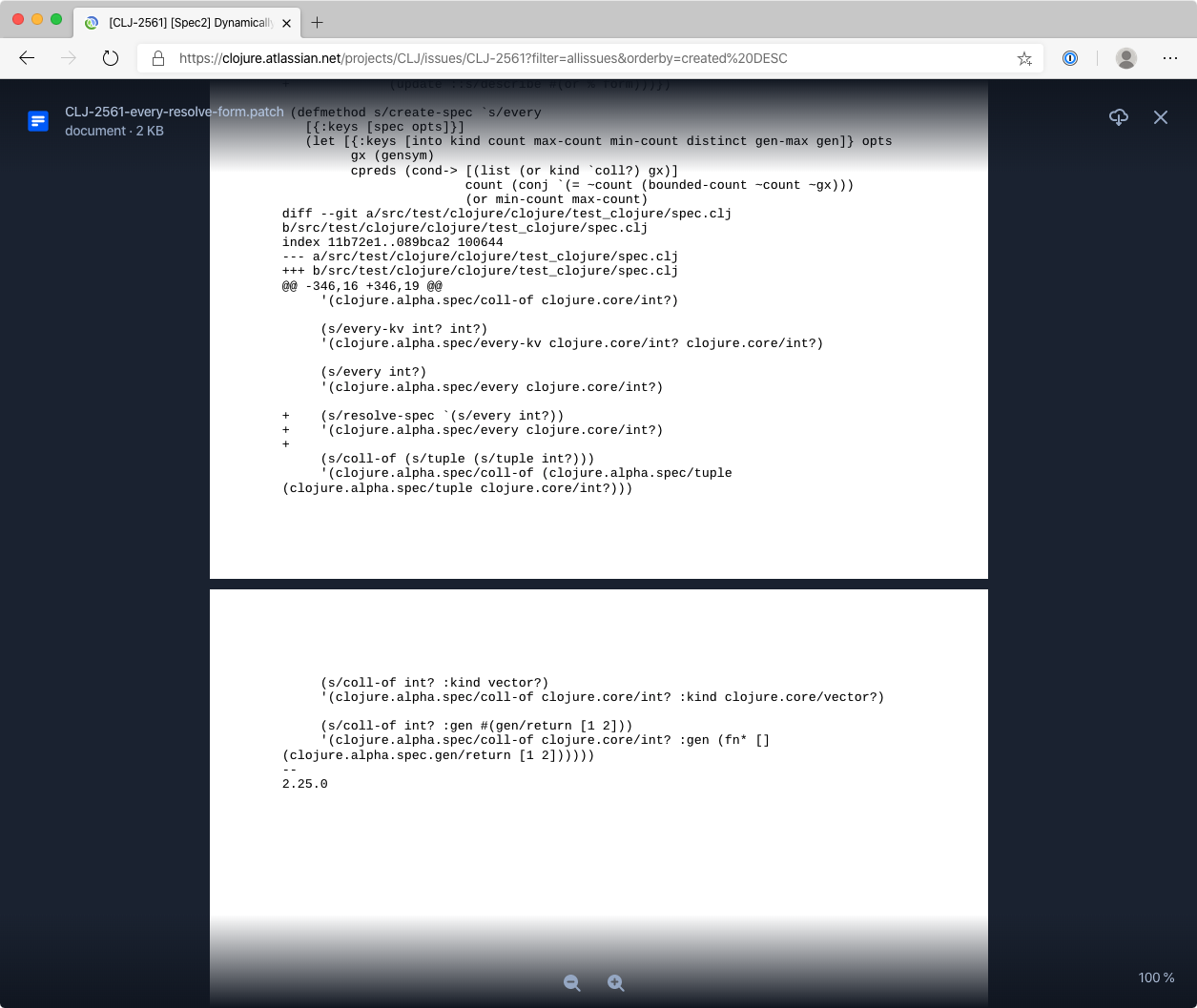
Apparently JIRA displays diffs as printouts, in black and white, emulating even page breaks. This is not printing mode — this is default in-browser display.
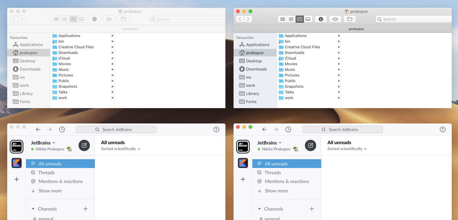
Famous YouTube UI consistency
Thanks @balcitom for the video
Which windows are active? Seems like someone at Slack decided that they are too cool to play OS conventions. Instead, they always render their window inactive and let user figure it out
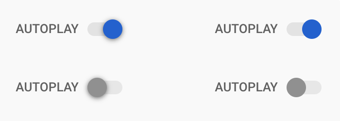
It’s still hard for me to believe that nobody among a few thousands people working on YouTube realises how disgusting Autoplay toggle looks (left). Just remove that ugly shadow and you get +100 to cleanliness the same instant (right). No other element on the page uses shadows anyway, so you get consistency too.
Next step is to fix the toggle shape itself, but that requires taste, so it might be too much to ask from Google. Removing dirty shadow requires just common sense.
UPD: beautiful version from @disablesilence twitter.com/disablesilence/status/1250048928407523329

What's new in my latest Firefox update? Just before clicking it, the gift box icon had blue bulbs persistently asking me to check out. Well, nothing? M-m-key...
Explaining basic controls, take 3 (see also rants about spinners grumpy.website/post/0Q2GqJ4EI and galleries grumpy.website/post/0TXmhwdtP)
The toggle was designed after, well, physical toggle. It’s a piece of plastic with a round bump in it moving inside a hole in an enclosure. Many devices around us have these, and that’s why it’s such a great metaphor. It also should give us a clue to how it should be animated: labels and colored background should move with the toggle, because physically they make up one single piece of material. And that piece moves left and right all at once inside a hole.
Top: wrong, nonsensical animation.
Bottom: perfect understanding.
macOS virtual desktops are notorious for their uselessness. Here are their sins:
1. Switch animation takes unbelievably long.
According to my measurements, it takes 630ms to complete the animation, then 150ms more to just activate the topmost window. That means from the moment you initiated desktop switch you have to wait at least 780ms before you system is responsive again and you can do anything!
How bad is that number? According to Jakob Nielsen nngroup.com/articles/response-times-3-important-limits, 100ms is a limit where users still feel system is responsive. 100ms is ~6 frames of animation on 60Hz display, more that enough to communicate ANY type of motion. MacOS takes 8 (EIGHT) times more time!
2. It uses “Ease out” animation.
Closer to the end animation speed decreases, to the point where it almost stops moving. Yet the animation still goes on, and you have to wait precious 100-200 ms while it advances just few more pixels. It is stupid, annoying as hell and makes it extremely hard to know exactly when it’s finally over. Ok, I can start working... typing something... oh no, still moving, sorry. I’ll wait another hour.
3. While animating, all your keypresses go to your last desktop, not to the new one. This breaks linearity of commands: I am working with the old app, click switch desktop, start start working with the new one. But keypresses still go to the old one! Even though I already issued a switch and system has registered it. Means you can’t start e.g. typing in advance.
4. Once switch animation is fully finished, the front window doesn’t become active for 150 more milliseconds. So it looks like you can start working, but all your keypresses will go to the old desktop anyway, even though you can’t see a single pixel from it anymore. You have to wait for subtle clues like window header changing color from one shade of gray to another, which is extremely hard to do. That means that point when switch is over is really fuzzy and hard to notice reliably.
I am also not sure why this delay even exists in the first place. Switching between windows on the same desktop is instantaneous, as it should be. That makes me believe that this delay was artificially added, but I can’t imagine why.
5. It’s hard to believe, but the wider your display is, the more time it takes to switch it! Almost if they had programmed all this in absolute units instead of relative ones. 780ms on 16:9 display become 1180ms (almost 1.2 seconds!!!) on 21:9. I am scared to imagine how long it takes on 32:9, probably 2 seconds or something.
6. You can’t turn this animation off or change its speed. Not in System settings, not by any terminal commands. The used to be third-party Total Spaces.app that managed to work around that somehow but it has troubles working in Catalina.
Conclusion. Virtual desktops could’ve been a great tool, but current implementation makes them useless for any real day-to-day use. I don’t understand why Apple even bothered at implementing them if they never wanted to make them good. If they just worked LESS HARD on it (no animation, no relation to display size, no app activation delay) it would’ve been only better!
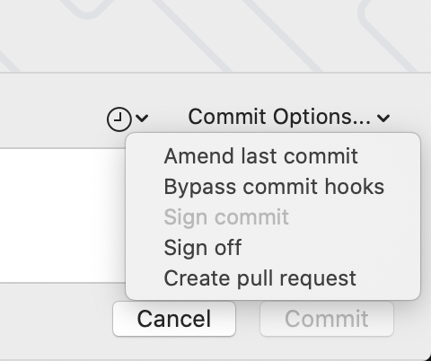
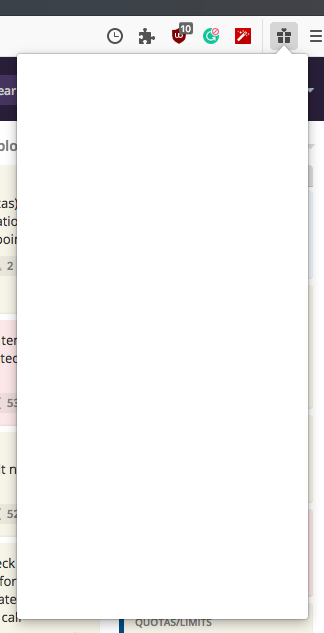
At least two of those are actions, not options (amend and create PR are their own actions, not options on top of commit). As we said it before grumpy.website/post/0RBmjwW8N: do not put actions in a dropdown, and definitely don’t call it Options
Thanks @andrew347 for the picture
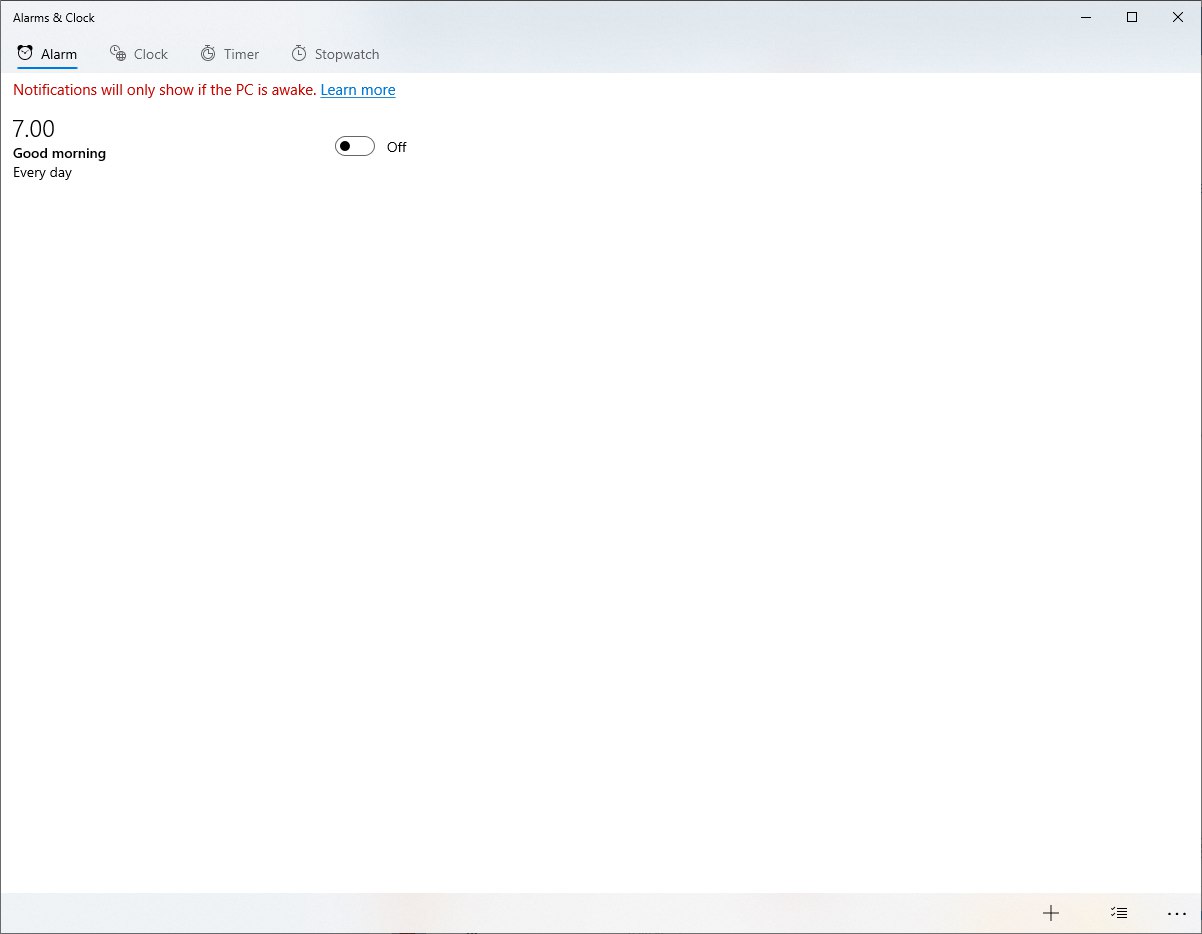
Windows 10 alarm app makes good use of your screen estate
Thanks @outime for the picture