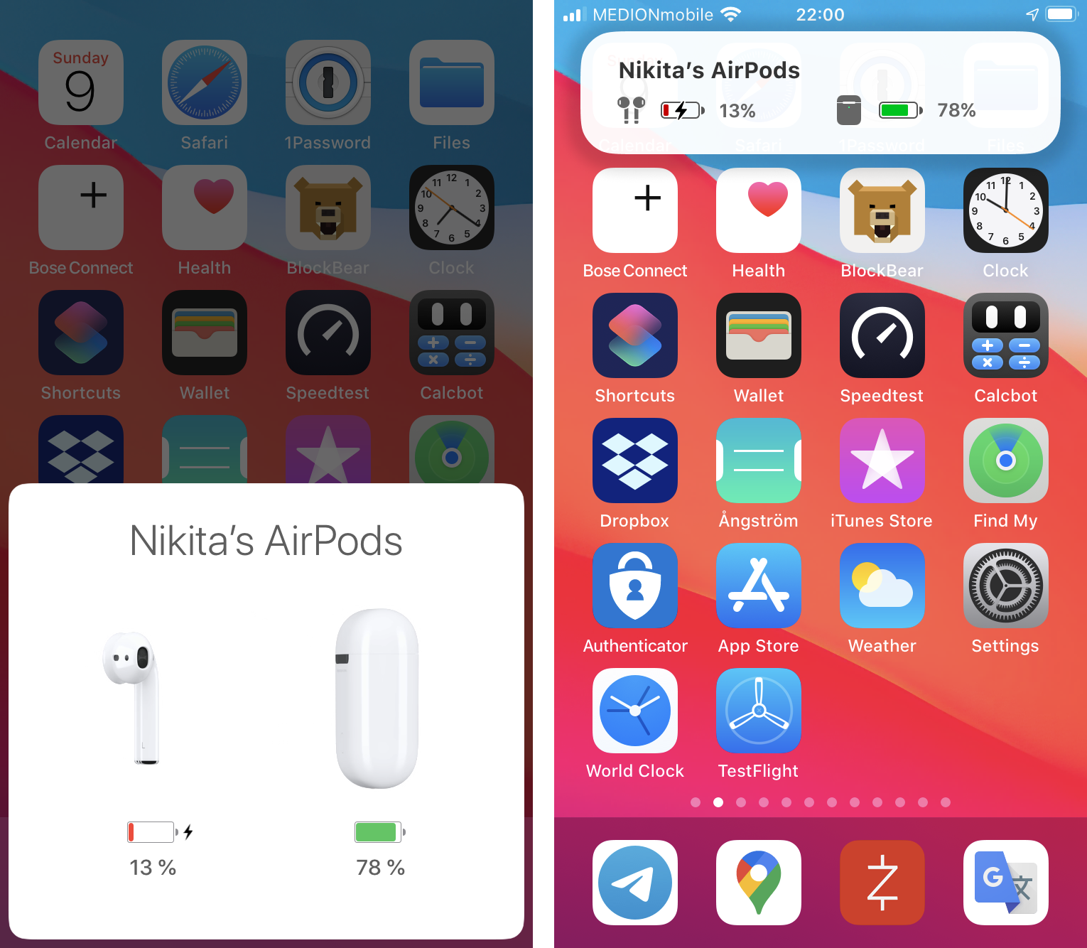
Grumpy Website


Don’t you find it weird that if you need to access your scanner, you have to go to System Preferences? Like, not to change its settings, but to access its main function: to scan. Why isn’t there an app for scanning in Applications? I mean, there IS an app, you just don’t get to call it the way you call all other applications. Or why can’t I see my scanners in Finder sidebar?

Midnight...

Mississippi...

The Commit...

The Life of...

Angela’s...

Madonna...

The Road to...

Come See...

Renegade...

Pink Floyd...

Shoot the...

Irene Cara...

No Hard Feeli...

You are THE internet movie database. You had one job: show us which movies the person took part in. How did you arrive at the design where this crucial, principal use-case is so hopelessly broken? Maybe allocate one more line for the title?

One of the most useless and most annoying UIs in iPhone. This window pop ups on a random phone in the room if you open the case (no, not only on the phones it has been paired to—literally on any phone in proximity).

But then it doesn’t reliably pop up when you actually need it (of course!). Sometimes I spend a few literal minutes opening and closing the case like a fool, putting airpods in or out, turning the phone on or off, in the hope it will finally show. This is stupid, because Airpods are connected via bluetooth to the phone already! I can listen for the audio, but can’t see the battery level, because, well, nobody knows why and there’s no button to press to force it to show.

Finally, look at the size of this thing! It covers the good half of the screen, and it’s the most important half (the bottom) where you are most likely to be doing something. Somehow after 13 years Apple was convinced that volume indicator shouldn’t cover the center of the screen. Next year we will see an incoming call notification that is, well, a tiny notification instead of a whole screen. Maybe eventually they’ll figure that out for airpods too? It only needs to show two numbers, come on!

Simple rule: leave content where it is. Do not move it around.

Here I click on a particular dog image and immediately whole page gets relayouted, every image moves to another random place. It’s like I am looking at the whole new page

The longest trip you can book on Eightydays.me? Well, 50 days, of course.

Thanks @MykolaPetiukh for finding this.

Portrait keyboard v. Landscape keyboard. Because, you know, according to Apple, two completely different people will be using those, so no need for them to be consistent.

Thanks @mateparty1 for the pictures

Hey, user, how do you feel if the useful translation tool:

- would put the text you type in a field a dozen pixels tall?

- would truncate the translation to a few words and require you to click an extra button to see it. And then wouldn't even scroll to the translation?

- show you suggestions from history by covering half of the remaining screen space, *and* at the same truncating said history to a few words a time?

Note though: all of these are *conscious decisions*. There were people who designed this interaction, signed off on it, implemented and shipped. Because it's significantly easier and faster (both for the user and the developer) to just show the full translation in the adjacent pane.

Where do you think is a good place for folder actions? Google thinks it’s right in the breadcrumbs, the component whose primary function always was and is navigation.

Thanks @NickKaramoff for finding this

World’s most confusing toggle found! All websites v. Not all websites?

Dribbble's sign up process, undoubtedly, was designed by someone who showcases their work on the site: superficially pretty, impossible to navigate and riddled with UX errors:

- The cursor doesn't change to pointer on tiny Sign In link (someone literally had to make sure it doesn't by overriding default behaviour)

- When you click the *Sign In* link, you're presented with a *Sign Up* form. You have to click the Sign In link again (and now it is a link with a proper cursor, go figure)

- If you click one of the social login buttons like "Sign in with Google", realise you made a mistake and want to go back, you're not taken back to the same page. You have to click the Back button three times to get back.

It still amazes me how many ways there are to screw up a simple sign in/sign up form. A functionality we've had in computers for more than half a century.

Pages:
155...9089888786858483...