Grumpy Website


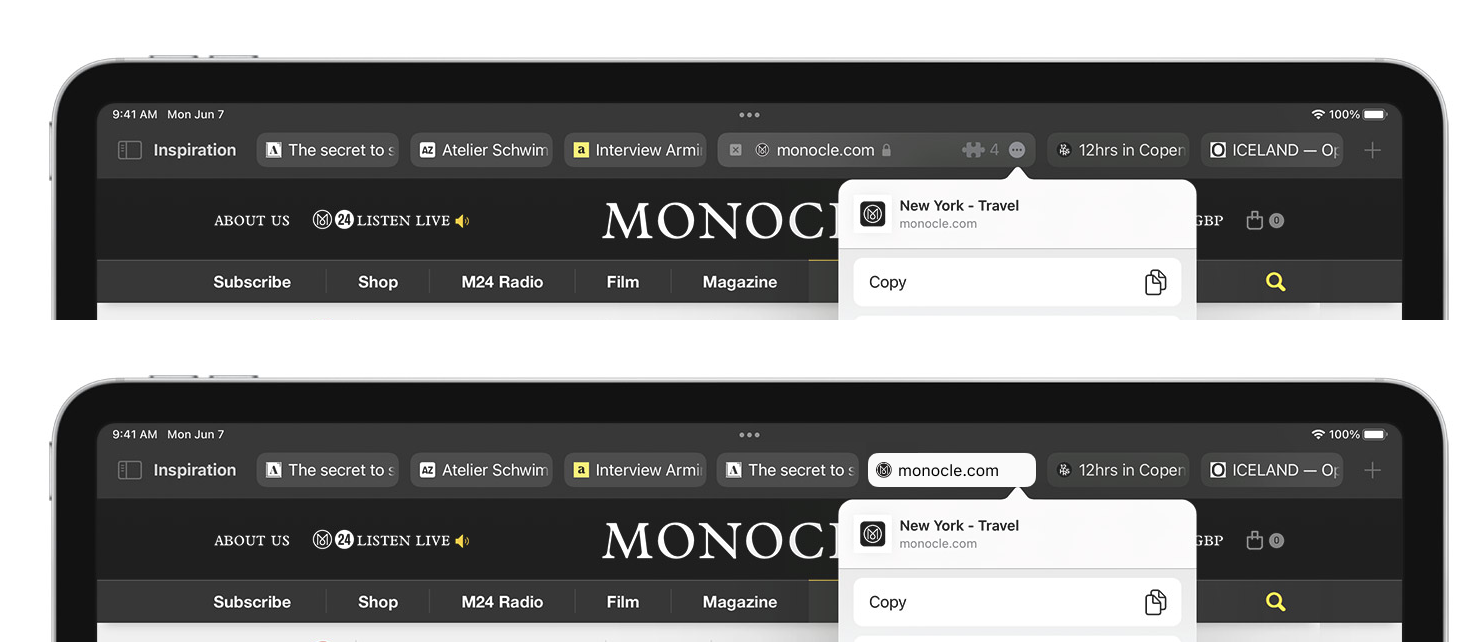
I’m not saying merging tabs and omnibox is a great idea, but...

If you ARE going this route, don’t pretend you can fit the full URL bar when you obviously can’t.

Just make the current tab look like other rectangles in there and be done with it. At least now it’s consistent.

Nice simple form on the left, single Primary action button, clear what to do. What could go wrong?

Well, that button is actually a combo box! Containing three other buttons.

Why make it look simple if it isn’t, in fact, simple? Why hide this choice from user even though EVERY user of this form will have to deal with that choice every time?

Don’t do that.

Any part of the window should be draggable, unless there’s a good reason for it not to be

Thanks @sentreh for the video

Extra click space aroung element is great, but let’s forget the more fundamental principle: if you click INSIDE element, the click shouldn’t go to the next one

Password? Password. Password!

Instagram Shopping isn’t available because of recursion

Thanks @dmitry_k for the picture

Generic table component is great, but one thing it misses is that columns might have a preferred sorting order.

E.g. when I click on Process Name I 99% of the time want ascending. When I click on % CPU, 99% of the time want descending.

These cases are so dominating that I’d go as far as removing ability to reverse the sort order altogether.

Strange that the tool whose main purpose is to crunch numbers tries to cast everything to date before it tries numbers.

Also strange that it disregards and ignores my direct input when I explicitly say I want a number.

I have no idea how people put up with this.

A button... with a scrollbar!

Thanks Eli Schiff for the picture

Sorting countries by popularity instead of alphabetical only works if you really don’t care about country (but then why would you want to select one?). Same goes for years. Insane

Thanks @apust for the pictures

Pages:
155...110109108107106105104103...