
The first rule of highlighting is: you can’t highlight everything. If you highlight every single button, nothing will stand out. To highlight, you have to sacrifice and mute something.
The first rule of highlighting is: you can’t highlight everything. If you highlight every single button, nothing will stand out. To highlight, you have to sacrifice and mute something.
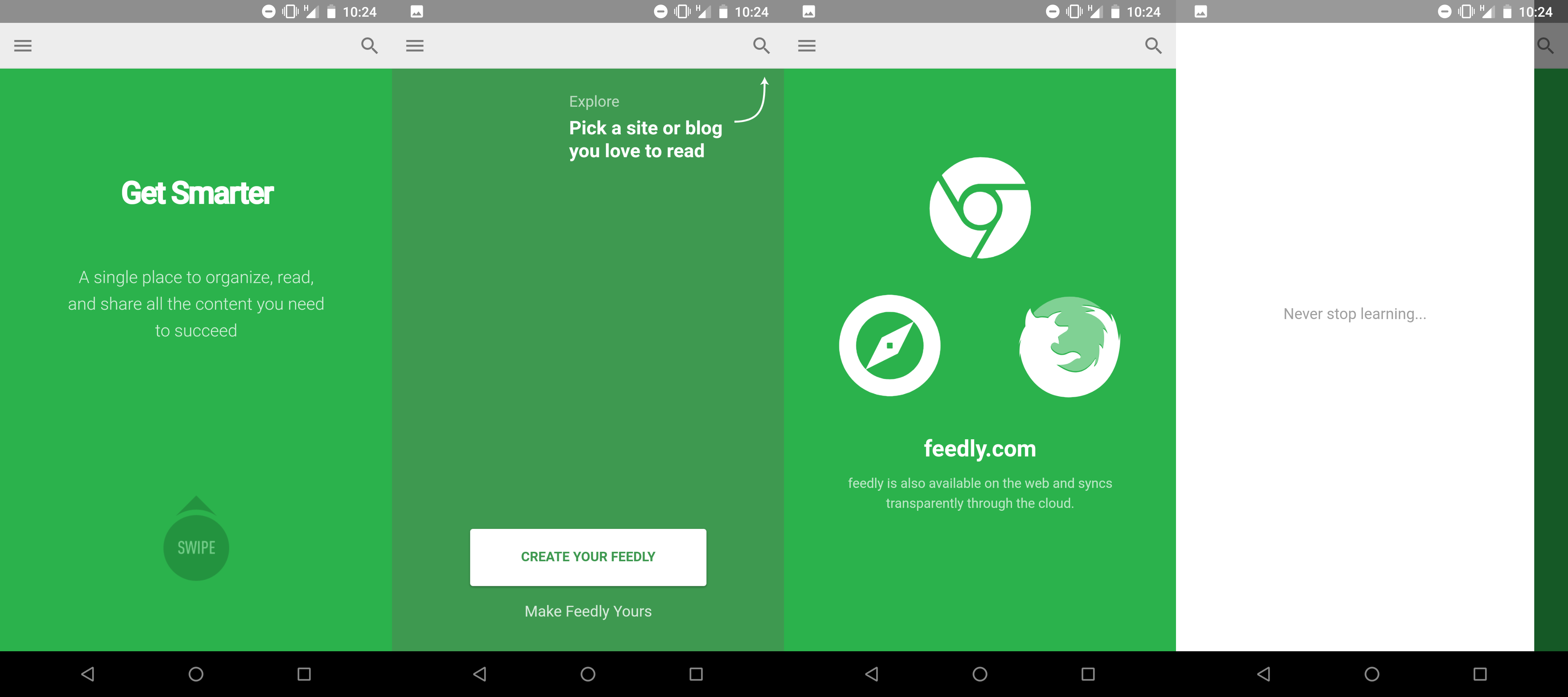
Interesting case: I can’t find a login button in the app despite the fact the it obviously requires you to log in. Turned out “Create your feedly” means “Log in with an existing account” here

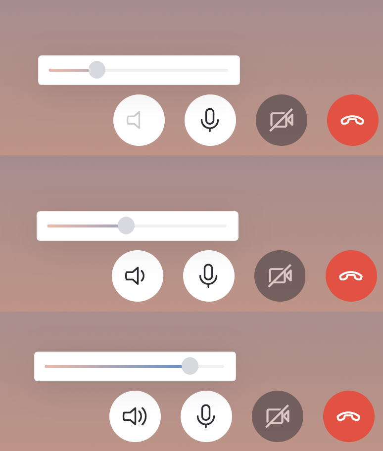
Skype for macOS. The speaker volume icon looks like it's muted (no waves coming out) when volume is below ~30%.
This trips me every time, I think it's muted while in reality it's just comfortably "not too loud".
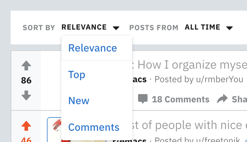
This screenshots is from Reddit, but this is a common set of options when sorting search results: by relevance, by rating, by date and something else.
This always leaves me puzzled… Why would I not want relevance? If I search for something, I only want the most relevant results. And if I then sort by rating or date, I don't want to get irrelevant top or irrelevant newest things.
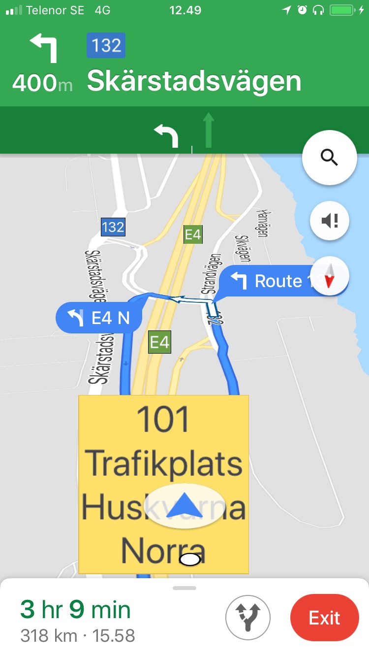
In many Northern and Western European countries highway junctions have both numbers and names. They are usually quite long, like "101 Trafikplats Huskvarna Norra" (Sweden).
When in Navigation mode, Google Maps shows them in huge yellow rectangles on top of everything else! It obstructs the most important elements of the map — lanes, turns and intersections themselves.
Above is an example where I can't really understand where to go, but I can clearly see the absolutely non-important thing: the name of the junction. It doesn't make any sense. It takes a single real-world test to realize that this feature is bad.
Oh, Microsoft. You still haven’t learned how to web

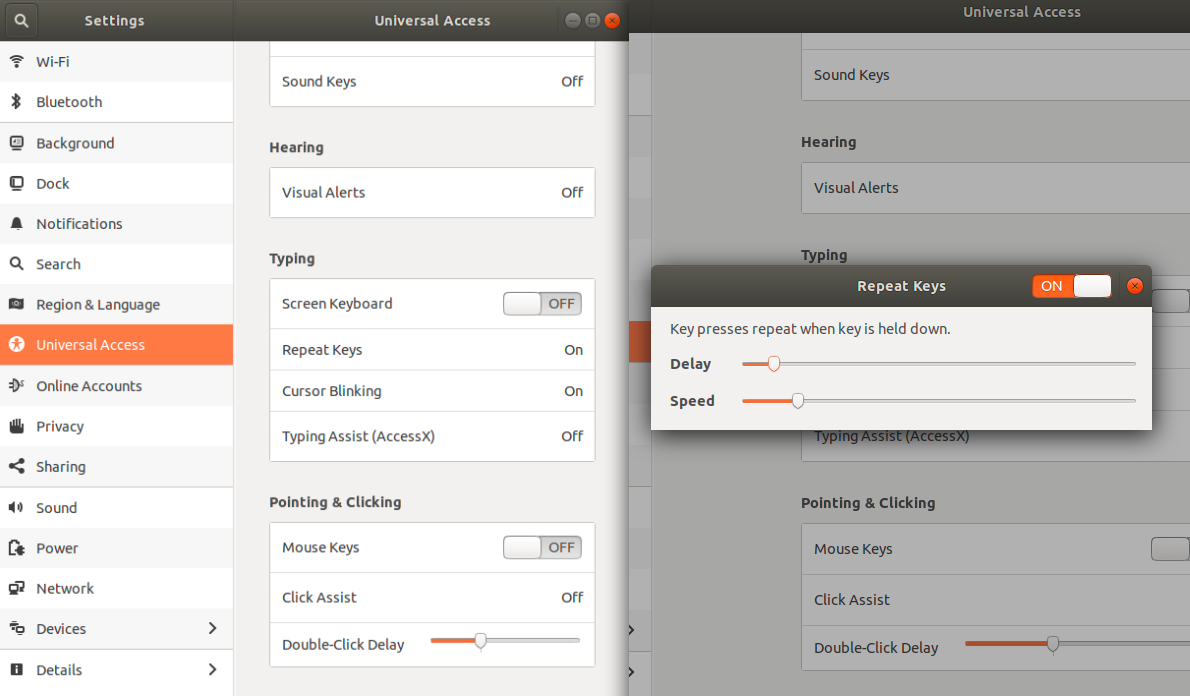
New Ubuntu brings another portion of suffering from UI. For more than one hour, I've been looking for an option to tweak speed and delay of keys when typing. Such a primitive task took so long because of really terrible and unbearable interface.
Well, if you want to tweak the keyboard you'll go to the "Keyboard" section, won't you? But in Ubuntu. It shows just keyboard hotkeys, but where are the delay and speed options, key remapping and all the other stuff? Ah, it turns out they are in the "Universal Access". OK.
That window shows a bunch of settings with their controls. For example, "Repeat Keys" is enabled. But I don't need those ones, I'm scrolling back and forth looking for speed and delay. To be short, here is the main secret of that window: you need to click on one of those white bars to open a child window.
Well, only one click kept me aside from the settings I've been looking for. The easiest way would be to name me an idiot who is accustomed to Mac and stop the discussion. But Ubuntu doesn't give any signals those damned bars can be ever clicked! They don't look like a button. The cursor doesn't turn into a hand figure when hovering on them. There aren't any text tips like "click to see more". Even adding ellipsis would be enough to stress the fact there is something more behind it.
Why cannot Canonical hire at least one good UI designer? I don't know.
Content takes 9% of screen space. No comments.
Another case "please don't move UI" (see grumpy.website/post/0QK3rrd3R). This time it's even worse: Mailchimp shows me an example, but doesn't allow to copy it! It just disappears under my cursor.
Which one is selected? Depending on author’s logic, it can be either. But for a person who just walked in there’s no way to know. When there’re two options, just having different style on a selected one doesn’t work. They _both_ have style different from one another