
Someone discovered that people don’t click buttons they don’t see. Well, they’re not incorrect, but isn’t it kinda obvious though?
Someone discovered that people don’t click buttons they don’t see. Well, they’re not incorrect, but isn’t it kinda obvious though?

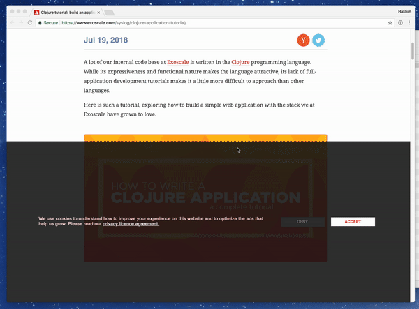
This is a new level of "cookies consent is more important than anything".
I can't even say anything at this point…
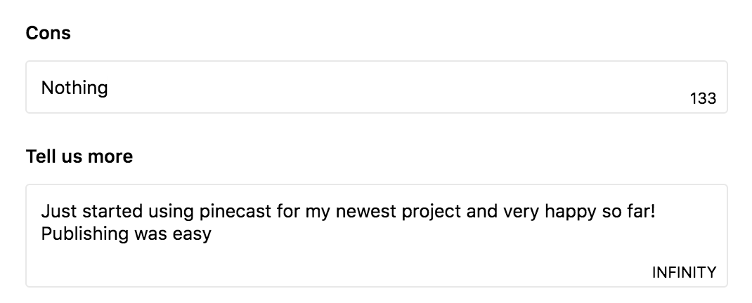
Speaking of character counters: Producthunt review submission form says "Infinity".
Text areas and input fields are infinite by default, you don't have to say it, just don't show any counter! I get that it's explicit in the context of several limited fields, but come on, this is basic web building block. This wasn't broken or confusing, don't "fix" it, please.
Next, let's mark buttons as "clickable" and text as "selectable".
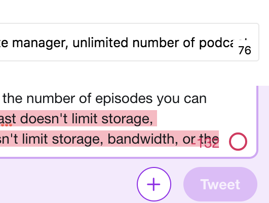
How dare you put your numbers on top of user input!
I understand you have some limits to signal, but time and time again, they are in the way of my text. My text is more important than your counter by definition!
Arghh!.. Nobody should be doing it, yet everybody does. You have perfectly fine product/feature and then you add unnecessary and superfluous functions to it.
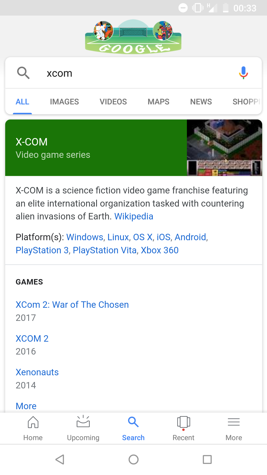
Here is Google search as seen on Android 8 phone. Search is fine—it’s rest of the tabs that worry me.
Home? Home of what? My phone already has home screen, and if Google has different home, I certainly am not interested what’s in there.
Upcoming what? Searches? I’m aware Google knows everything but stuff I’m going to search in the future?
Recent searches? Come on, search is always an in-the-moment thing. Who cares for history? If anything, I can always just search again.
And then there is More! It includes Account switcher (Google might need that to spy on you, but I certainly don’t), Recent (yes, again), Saved (somebody saves searches, not results?), Reminders (come on, now Google Search is a todo list all of a sudden?), Customize (Favorite topics? Life’s too short for that), Settings (which is different from Customize) and Help/Feedback (I guess they have to be put somewhere).
Which of those do I care about? My freaking results! Nothing else. I don’t even care about their daily doodle here, my phone _already_ has Google Google Google written all over it.
Please. Don't. Move. UI.
Just don't move it, please. Don't make us feel like UI elements are running away from us.
When user clicks at (X, Y), the pointer should stay at (X, Y) in the context of current view. By moving UI for the sake of minimalist design you just broke the fundamental expectation. Now when user clicks at (X, Y), the click actually becomes (X, Y) + drag'n'drop to (X, Y+Z)!
Cards are cool. So cool, in fact, that we put more horizontally scrollable cards inside your vertically scrollable cards. And since card borders eat up space, we make them overflow, but kind of still belong insidse. I don't know, I'm out of ideas now, just ship it as it is, somebody will figure it out anyways
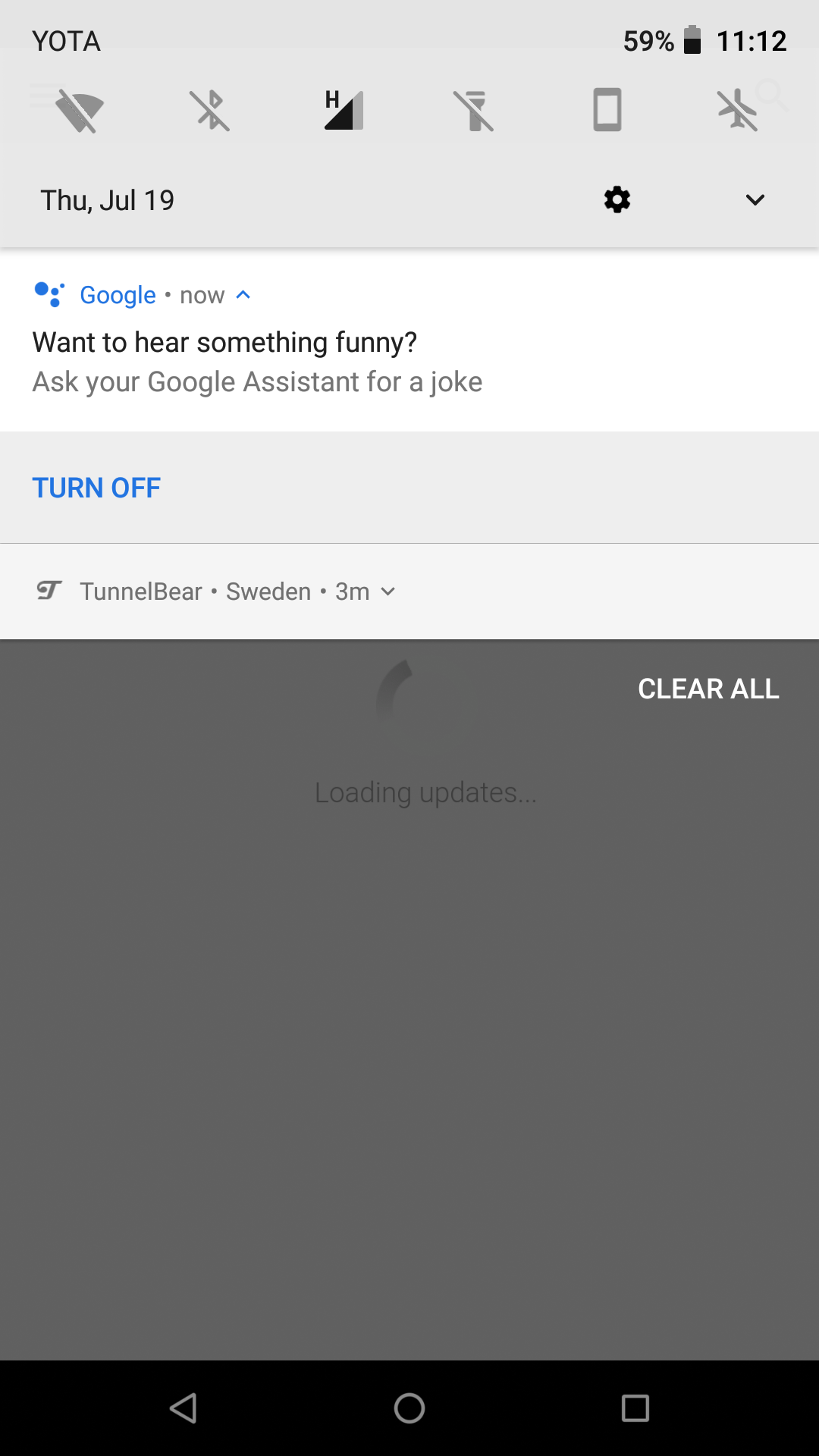
Want to hear something funny? I turned this google assistant popup off like 10 times already (literally ten times), and it keeps coming back like nothing has happened. “Turn off” button placement is spot on: contextual, right where you need it. If only it worked...

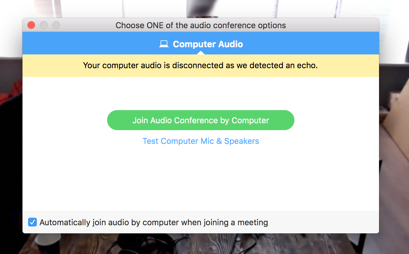
Another daily sync in Zoom when a strange window appears. I'm starring without any clue what's it about.
The window's got plenty of layers each brings its own message. The title says I should choose only ONE something. OK. The blue bar says "Computer Audio". That's strange: can it be non-computer audio? The next one, yellow: audio was disconnected. Well, I see, some sound troubles. But it was enough just to mute me, but not disconnect.
A huge green button "Join Audio conference by Computer" in the centre. Still no idea what it is. I have a video call, not an audio conference. "By Computer" -- are there any non-computer options?
And the footer with a checkbox. I believe they meant automatically mute or unmute then the call starts, but the wording is fuzzy and long.
One click on the green button solves the problem. Was there any reason to interrupt me and show so much of information? The program could handle it automatically with ease.
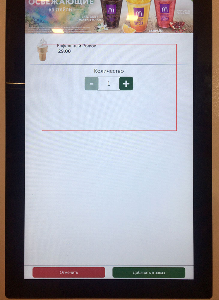
Well, nothing special is here, just an interactive panel in McDonald's. Is there any sense in leaving so much empty space in the centre? For the first moment, I even could not find those two buttons at the bottom.
Remember, you stay close to the machine so your field of view is quite narrow. There is about 30 cm (1 foot) between you and the screen. The red frame shows what exactly you see when interacting with the system. Why did they take so huge panels? They are just useless.
No doubt, this interface has never been tested by its creator in real life.