
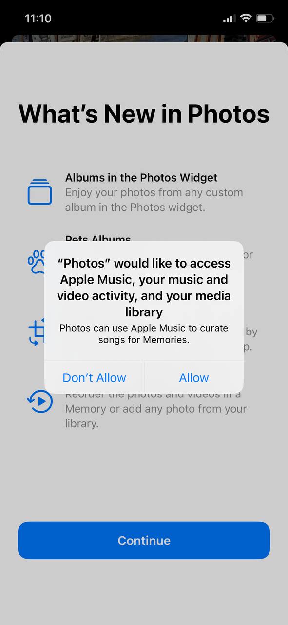
It was very non-obvious to me first few times why I have to press the “Continue” button twice. Turned out they were telling me something in banner area! But the banner that was there before made it hard to notice
It was very non-obvious to me first few times why I have to press the “Continue” button twice. Turned out they were telling me something in banner area! But the banner that was there before made it hard to notice
Minimalism is great, but don’t take it too far. Some things still need borders
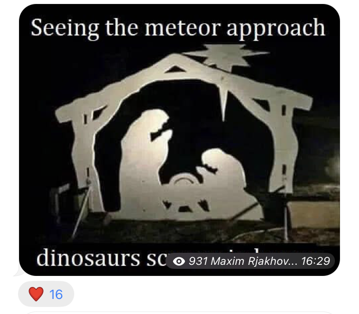
Because why not?
Thanks @sobersolar for the picture
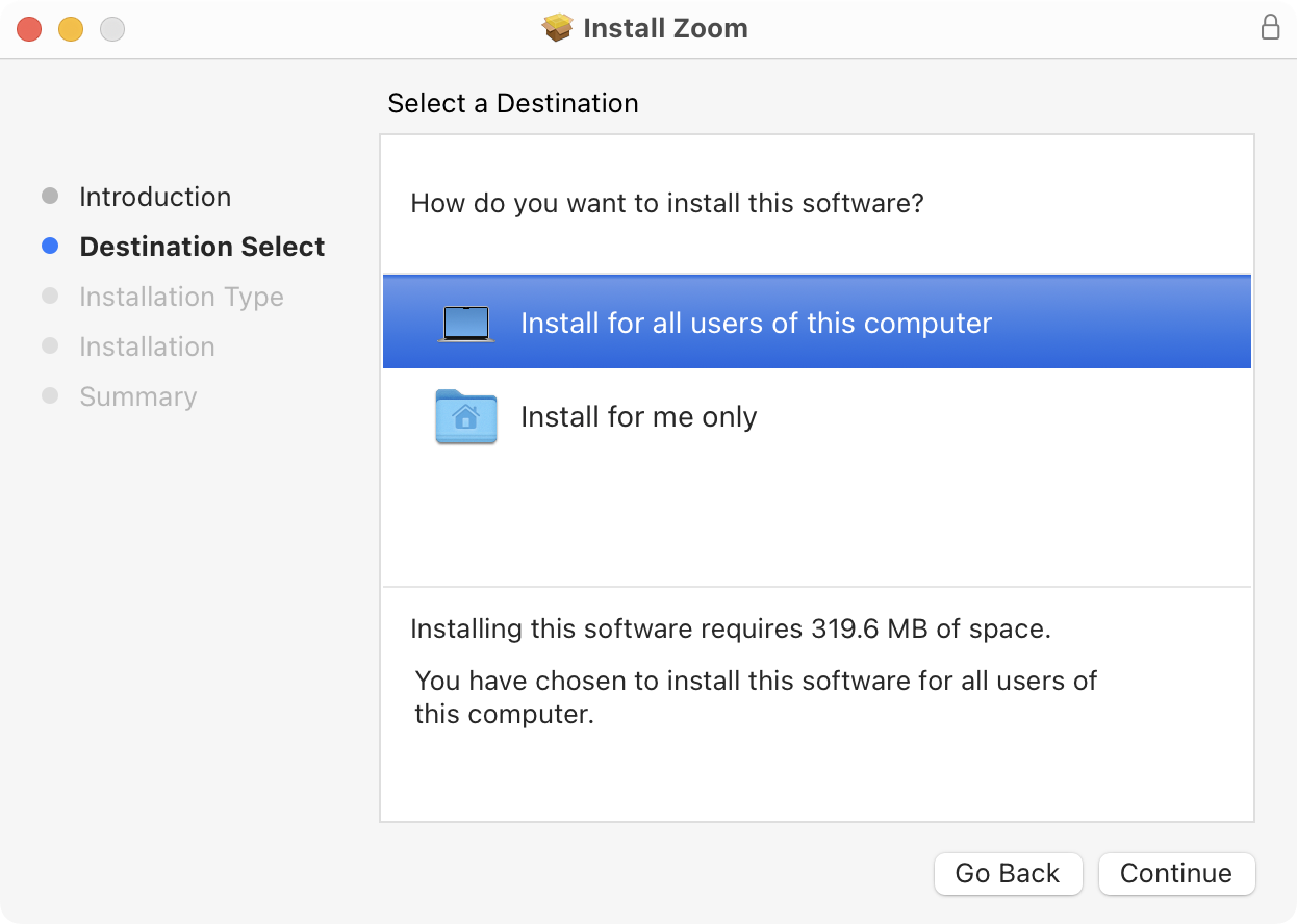
Maybe there should be some special check that removes this screen if I’m the only user of this computer. Which most people are
The amount and layout of various buttons and dropdowns here never did and never will make sense.
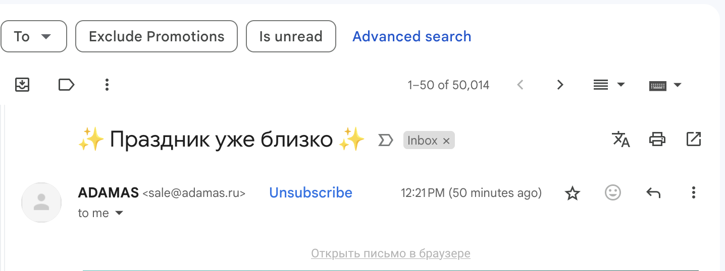
Happy New Year, Gmail!
Can dropdown contain another dropdown?
Google: Yes!
Common sense: No.
UI over content. Just... Why? It’s not like there’s no space. Reactions are outside, why not author/time?
Why do you even ask?
Thanks @toby3d for the picture
If you ask me a question, provide buttons for me to be able to reply
“Go back” arrow should point to the left.
UPD: Second chevron is actually a dropdown list that only works when you click on the chevron itself. First one is navigation indicator and looks identical